Should Old Acquaintance be Forgot: Tidying up Mac Mail
As the year is closing down, why not spend some of the free time to explore your email data using R and the tidyverse? When I learned that Mac OS Mail stores its internal data in a SQLite database file I was hooked. A quick dive in your email archive might uncover some of your old acquaintances. Let’s take a peak.
Obviously, the below is only applicable when you are a regular user of the Mail app for Mac OS. As a first step, you need to locate the file Envelope Index that tends to be located in ~/Library/Mail/V6/MailData/. Copy this file somewhere and adjust the path provided in mail_db to point to this copy. Do not work with the original file.
library(DBI)
library(tidyverse)
library(lubridate)
library(ExPanDaR)
library(ggridges)

mail_db <- "data/EI"

con <- dbConnect(RSQLite::SQLite(), mail_db)
Now you have established a database connection to your copy of Mac OS Mail’s internal data. I you receive an error message, check whether you have the required packages (including RSQLite) installed. With this established connection, we can now see what the database has in store for us.
kable(dbListTables(con), col.names = "List of Tables")| List of Tables |
|---|
| action_ews_messages |
| action_imap_messages |
| action_labels |
| action_messages |
| addresses |
| attachments |
| duplicates_unread_count |
| events |
| ews_copy_action_messages |
| ews_folders |
| imap_copy_action_messages |
| imap_labels |
| imap_messages |
| labels |
| last_spotlight_check_date |
| local_message_actions |
| mailbox_actions |
| mailboxes |
| messages |
| properties |
| recipients |
| sqlite_sequence |
| subjects |
| threads |
Hey, this is an impressive list of tables. For this blog post, I am mostly interested in exploring the development of my email activity in terms of senders and receivers over time. Thus, I focus on the relations messages, addresses and recipients.
messages <- dbListFields(con, "messages")
recipients <- dbListFields(con, "recipients")
addresses <- dbListFields(con, "addresses")
max_members <- max(length(messages),
                   length(recipients),
                   length(addresses))
length(messages) <- max_members
length(recipients) <- max_members
length(addresses) <- max_members
df <- data.frame(messages, recipients, addresses, stringsAsFactors = FALSE)
df[is.na(df)] <- ""
kable(df)| messages | recipients | addresses |
|---|---|---|
| ROWID | ROWID | ROWID |
| message_id | message_id | address |
| document_id | type | comment |
| in_reply_to | address_id | |
| remote_id | position | |
| sender | ||
| subject_prefix | ||
| subject | ||
| date_sent | ||
| date_received | ||
| date_created | ||
| date_last_viewed | ||
| mailbox | ||
| remote_mailbox | ||
| flags | ||
| read | ||
| flagged | ||
| size | ||
| color | ||
| type | ||
| conversation_id | ||
| snippet | ||
| fuzzy_ancestor | ||
| automated_conversation | ||
| root_status | ||
| conversation_position | ||
| deleted |
OK. These relations provide enough data to play. Let’s create a table that is organized by message and contains sender and receiver info as well as sending/receiving time.
sql <- paste("SELECT messages.ROWID as message_id, date_sent,",
             "date_received, a1.address as sender_address,",
             "a1.comment as sender_comment, a2.address as recipient_address,",
             "a2.comment as recipient_comment, snippet",
             "FROM messages left join addresses AS a1 on messages.sender = a1.ROWID",
             "LEFT JOIN recipients on recipients.message_id = messages.ROWID",
             "LEFT JOIN addresses AS a2 on recipients.address_id = a2.ROWID")
res <- dbSendQuery(con, sql)
df <- dbFetch(res)
dbClearResult(res)
dbDisconnect(con)
df[,c("date_sent", "date_received")] <- lapply(df[,c("date_sent", "date_received")],
                                               function(x) as.POSIXct(x, origin = "1970-01-01"))
The resulting data frame contains all messages, including messages sent to multiple recipients (with me on the sending or receiving end). To limit the messages to the ones where I am involved, I match sender_address and receiver_address to a vector my_adresses containing my email addresses (not disclosed here for privacy reasons).
df %>%
  filter(tolower(sender_address) %in% my_addresses |
           tolower(recipient_address) %in% my_addresses) %>%
  distinct(.keep_all = TRUE) %>%
  arrange(date_received) -> emails
In addition, I prepare a panel dataset that contains data at email address year level.
emails %>%
  filter(!tolower(sender_address) %in% my_addresses) %>%
  mutate(address = tolower(sender_address),
         year = year(date_received)) %>%
  group_by(year, address) %>%
  summarise(emails_received_from = n()) -> emails_received

emails %>%
  filter(!tolower(recipient_address) %in% my_addresses) %>%
  mutate(address = tolower(recipient_address),
         year = year(date_received)) %>%
  group_by(year, address) %>%
  summarise(emails_sent_to = n()) -> emails_sent

panel <- full_join(emails_received, emails_sent) %>%
  replace_na(list(emails_sent_to = 0, emails_received_from = 0)) %>%
  arrange(year, -emails_sent_to, -emails_received_from)
Time for a first analysis. How does my email in- and outflow develop over the years?
panel %>%
  group_by(year) %>%
  summarise(sent_mails = sum(emails_sent_to),
            received_mails = sum(emails_received_from)) %>%
  gather(key = "var", value = "count", -year) %>%
  ggplot(aes(year, count)) +
  geom_bar(aes(fill = var), position = "dodge", stat="identity") +
  scale_fill_discrete(name="Direction",
                      labels=c("Emails received", "Emails sent")) +
  xlab("Year") +
  ylab("Number of emails") +
  theme_minimal() +
  theme(legend.position=c(.3, .8))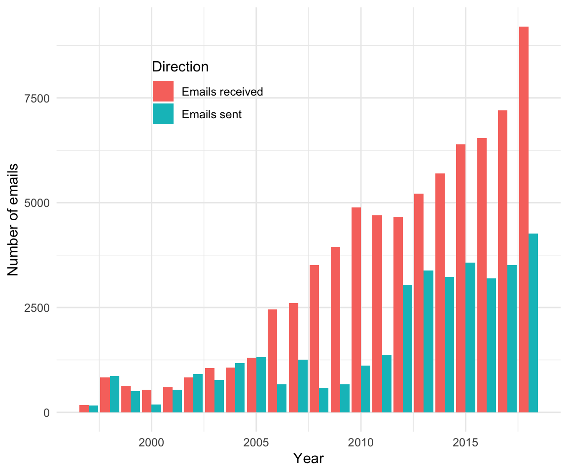
Hmm. I have no interest in extrapolating this time trend… Just for fun and giggles: When do I send emails (by time of day)?
emails %>%
  filter(sender_address %in% my_addresses) %>%
  mutate(sent_tod = hour(date_sent)) %>%
  ggplot() +
  geom_histogram(aes(sent_tod), binwidth=1, fill = "#00376C") +
  xlab("Time of day [24 hours]")  +
  ylab("Number of emails") +
  theme_minimal()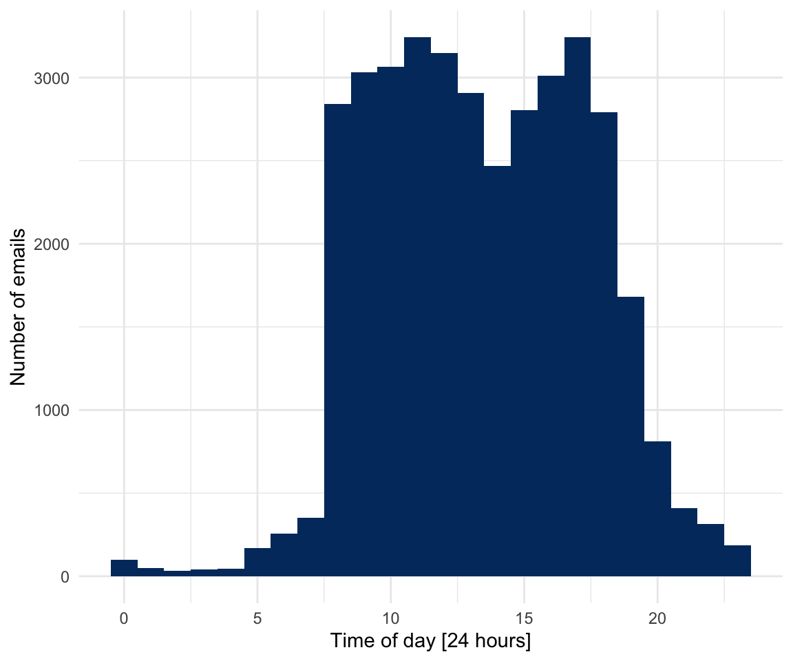
No real surprises here (at least for me), besides that I seem to take a dip in the early afternoon. Does this sending behavior exhibit any interesting time trends?
emails %>%
  filter(sender_address %in% my_addresses) %>%
  mutate(sent_tod = hour(date_sent) + minute(date_sent)/60 + second(date_sent)/3600,
         year = as.factor(year(date_sent))) %>%
  ggplot(aes(x = sent_tod, y = year, fill = ..x..)) +
  geom_density_ridges_gradient(scale =2, rel_min_height = 0.01)  +
  ylab("Year") +
  xlab("Time of day [24 hours]") +
  theme_minimal() +
theme(legend.position = "none") 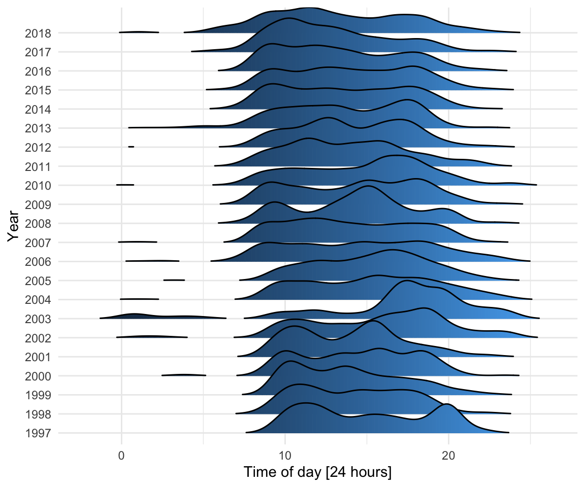
2002 and 2003 stand out (I was based in the U.S. for most of this period) and it seems as if I am gradually becoming more of an early starter.
But enough on this. This is supposed to be about old acquaintances to fit this special end-of-the-year mood. Let’s dive more into the personal sphere. For this, I define an “email contact” as an email address with an email exchange in a given year, meaning that I was both, at the receiving and sending end, at least once.
panel %>%
  group_by(year) %>%
  filter(emails_sent_to > 0,
         emails_received_from > 0) %>%
  summarise(nr_email_contacts = n()) %>%
  ggplot(aes(year, nr_email_contacts)) +
  geom_bar(stat="identity", fill = "#00376C") +
    xlab("Year") +
    ylab("Head count email contacts") +
    theme_minimal()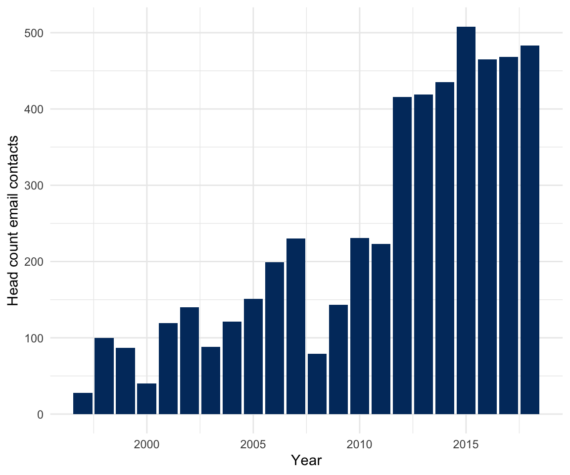
I would never have never guessed that I am exchanging emails with that many people (No, I am not a spammer …, I hope). Who are my “top contacts”?
panel %>%
  filter(emails_sent_to > 0,
         emails_received_from > 0) %>%
  group_by(address) %>%
  summarise(email_contacts = sum(emails_sent_to) + sum(emails_received_from),
            sent_rec_ratio = sum(emails_sent_to) / sum(emails_received_from),
            emails_sent_to = sum(emails_sent_to),
            emails_received_from = sum(emails_received_from)) %>%
  arrange(-email_contacts) -> email_contacts

# print(email_contacts, n = 50)
I am not including this output here for obvious privacy reasons. If you are interested to follow your email contacts over time, you can use my ExPanD shiny app for quick exploration.
panel %>%
  filter(emails_sent_to > 0,
         emails_received_from > 0) %>%
  ExPanD(cs_id = "address", ts_id = "year", components = c(missing_values = FALSE,
                                                           by_group_violin_graph = FALSE,
                                                           by_group_bar_graph = FALSE))
Using ExPanD, I encountered a reasonable amount of my “old acquaintances” when focusing on earlier years of the panel. To do this a little bit more systematically, I prepare a linking table, linking the most prominent email contact addresses in the panel file to real people names in an n(email addresses) to 1(person) look-up table. This table has the name email_contacts_names and the fields address and name. Based on this data I produce a new panel sample containing only those email contacts linked to actual persons that I care about.
panel %>%
  left_join(email_contacts_names) %>%
  filter(!is.na(name)) %>%
  group_by(year, name) %>%
  summarise(emails_sent_to = sum(emails_sent_to),
            emails_received_from = sum(emails_received_from)) %>%
  filter(emails_sent_to > 0,
         emails_received_from > 0) %>%
  mutate(email_contacts = emails_sent_to + emails_received_from,
         sent_rec_ratio = emails_sent_to / emails_received_from) %>%
  arrange(year, -email_contacts) -> panel_email_contacts
Using this data, you can now easily explore how your contacts changed over time. As one example I prepared a graph highlighting the (relative) number of email contacts with a selected group of people over time. The vector people contains the names of these people.
single_out_people <- function(df, names, relative = FALSE) {
  df$relative <-  relative
  palette <-  function(n) {
    hues = seq(15, 375, length = n)
    c("#B0B0B0", hcl(h = hues, l = 65, c = 100)[1:n])
  }
  df %>%
    mutate(name = ifelse(name %in% names, name, "Other")) %>%
    group_by(year) %>%
    mutate(val = ifelse(relative,
                        email_contacts/sum(email_contacts),
                        email_contacts)) %>%
    select(year, name, val) %>%
    group_by(year, name) %>%
    summarise(val = sum(val)) %>%
    spread(key = name, value = val, fill = 0) %>%
    gather(key = name, value = val, -year) %>%
    mutate(name = factor(name, levels = c("Other", rev(names)))) %>%
    arrange(year, name) %>%
    ggplot(aes(x = year, y = val, fill = name)) +
    geom_area() +
    scale_fill_manual(values = palette(length(names))) +
    xlab("Year") +
    ylab(ifelse(relative,
           "Share of annual email contacts",
           "Annual email contacts")) +
    theme_minimal() -> p
  if (relative) p + scale_y_continuous(labels = scales::percent) else p
}

single_out_people(panel_email_contacts, people, FALSE) + theme(legend.position="none")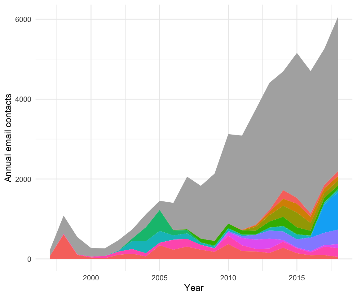
single_out_people(panel_email_contacts, people, TRUE) + theme(legend.position="none")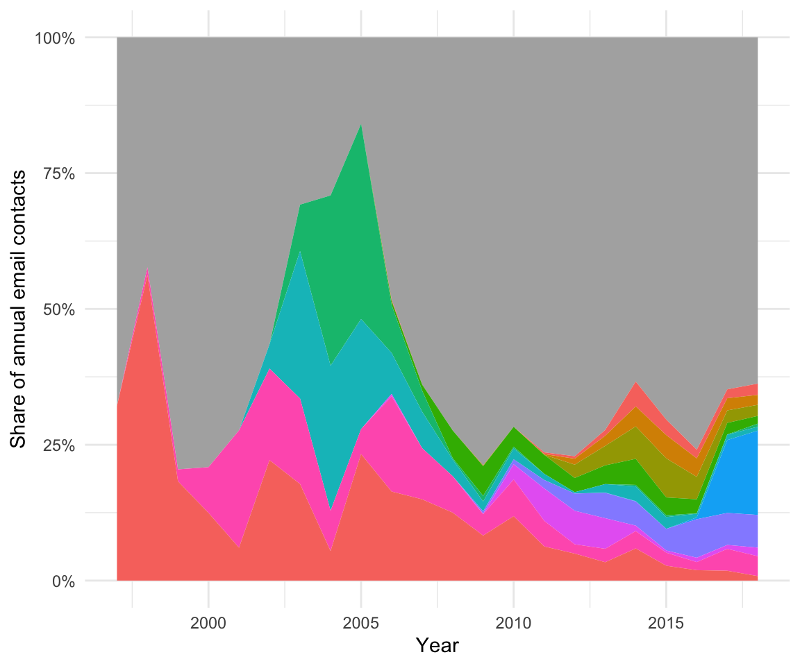
The grayish areas marks “Other”. With legends excluded for privacy reasons, you can follow old and new friends through time with this little display.
While the Envelope Index database seems to offer much more data that is worth exploring, I will it leave it here. Happy New Year everybody and if you are in the mood: Auld Lang Syne.
Enjoy!
