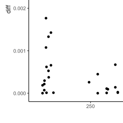
I had it on my long-term to-do list: Understanding how the standard errors that the Stata command ‘reghdfe’ generate differ from the standard errors that various R package for panel fixed effect models generate. Here is what I learned.
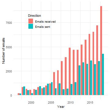
As the year is closing down, why not spend some of the free time to explore your email data using R and the tidyverse? When I learned that Mac OS Mail stores its internal data in a SQLite database file I was hooked. A quick dive in your email archive might uncover some of your old acquaintances. Let’s take a peak.
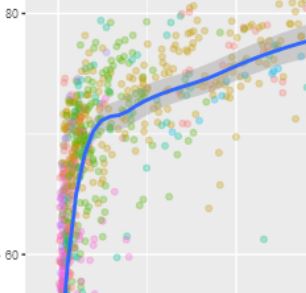
Exploratory data analysis is important, everybody knows that. With R, it is also easy. Below you will see three lines of code that allow you to interactively explore the Preston Curve, the prominent association of country level real income per capita with life expectancy.
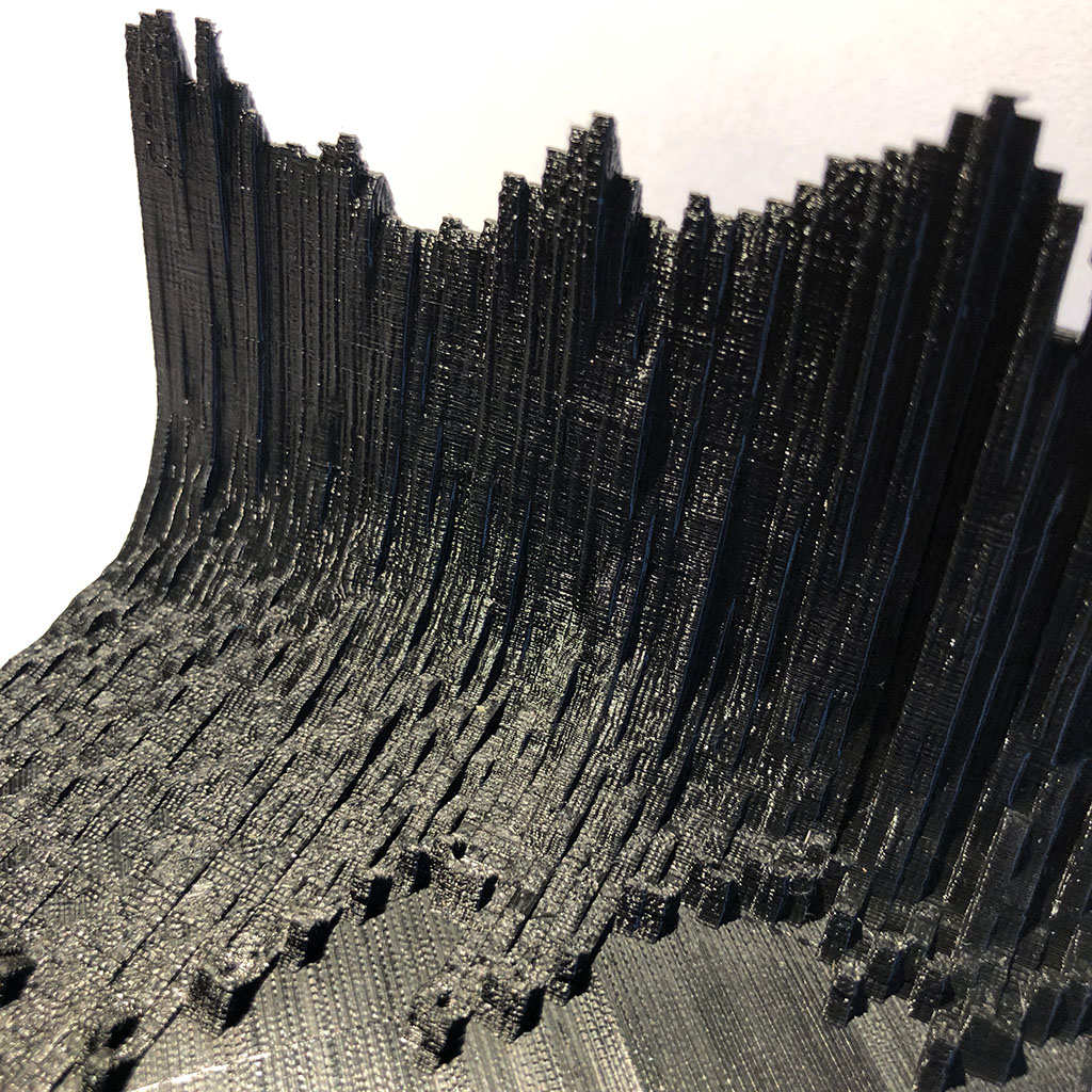
The awesome blog post by Tyler Morgan-Wall on 3d printing maps with his rayshader package rekindled an old desire of mine: Sometimes I would like to touch data. I am a big fan of data visualization and being able to add a third dimension and this haptic feel to the mix was just too much for me to let this idea pass.
While Tyler is keeping teasing us with references to an upcoming rayshader update that will allow the 3d mapping of ggplot output, I could not wait for this to hit GitHub.
Did you ever want to do a quick exploratory pass on a panel data set? Did you ever wish to give somebody (e.g., a reviewer or a fellow researcher), the opportunity to explore your data and your findings but can’t provide your raw data? Do you get bored from producing the same tables and figures over and over again for your panel data project? If your answer to one of the questions above is yes, then the new ExPanDaR R package might be worth a look.
By Joachim Gassen (Humboldt University Berlin, TRR 266 “Accounting for Transparency”) and David Veenman (University of Amsterdam)
“To reduce the impact of outliers on our findings, we winsorize the dependent and independent variables at the top and bottom percentile.” If you do empirical archival research in accounting and/or corporate finance, we bet that you have read and written such a sentence many times throughout your career. We know that outliers exist and that we have to “deal” with them.
The Open Science Data Center of TRR 266 has the objective to facilitate the use of open science methods in the area of accounting. One lesson that we learned over the last year is that many researchers, while generally being very positive towards the principles of open science, struggle to get their projects into shape so that they can share it with others.
Thus, we developed a TRR reproducible emprical accounting research template (treat).
I am an applied economist and economists love Stata. Every time I work with somebody who uses Stata on panel models with fixed effects and clustered standard errors I am mildly confused by Stata’s ‘reghdfe’ function producing standard errors that differ from common R approaches like the {sandwich}, {plm} and {lfe} packages.
Also, I recently had to update my {ExPanDaR} package to use the {plm} package as my favorite fixed effect package {lfe} was temporarily unavailable on CRAN.
I recently included the new Our World in Data data on Covid-19 hospitalizations and the vaccination progress around the world in the {tidycovid19} package. What was meant to be a short info post for package users turned into a mini case on “outliers”.
Thankfully, the OWID team makes their Covid-19 data available in a well-maintained and documented form on Github so that importing and merging it into the data that the package offers is a breeze.
LEGO Mosaics have been around for a while and there is the wonderful {bricksr} package by Ryan Timpe that makes it easy to construct them based on bitmap images. So, when I ran across the relatively new LEGO Art theme sets, I was instantly hooked. The current situation favors contemplative indoor activities and puzzling some mosaics over the Holidays sounded nice.
The only drawback was that the ‘The Beatles’ Art set is the one whose color palette I found most appealing but, having tremendous respect for the fab four and all, I am more of a Stones person.
The idea OK. We are at home. Again. Given that large parts of Europe and the U.S. are currently experiencing a second large wave of Covid-19 cases and that most European jurisdictions have reacted with more or less rigorous lockdown regulations, one wonders about the effects of these regulations on social distancing compared to the one in March/April. In a recent TRR 266 workshop on data visualization, we (Astrid and Joachim) used this setting to discuss a workflow on how to let data speak graphically.
A recent update to the {tidycovid19} package brings data on testing, alternative case data, some regional data and proper data documentation. Using all this, you can use the package to explore the associations of (the lifting of) governmental measures, citizen behavior and the Covid-19 spread.
Installation The Package is hosted on Github. As the underlying data sources change their format and access methods often, I have no plans to publish the package on CRAN for the time being.
As a package maintainer you might be observing an increasing number of questions raised by people that have recently migrated to R 4.0.0 and are now trying to get your package to work. Yet, rhub::check_with_rrelease() currently still uses R 3.6.3 as test base. While migrating to a new R version is always tempting maybe you don’t feel like disrupting your development environment just now as you have even more fun things to do.
As the Covid-19 pandemic is affecting more and more countries around the globe, I included additional visualizations options into the {tidycovid19} package so that it becomes easier to compare the spread of the virus across countries. Also, I use this post to take a quick look on some countries that start lifting their governmental measures. See for yourself:
As we all know, the Covid-19 pandemic spreads around the globe. While traditional time-series based displays (like the ones provided by plot_spread_covid19() and show-cased in this blog post and this shiny app are very helpful to study the spread of the virus over a limited set of countries, the graphs quickly become overwhelming when you want to compare multiple countries.
Yesterday, I came across the Google “COVID-19 Community Mobility Reports“. In these reports, Google provides some statistics about changes in mobility patterns across geographic regions and time. The data seem to be very interesting to assess the extent of how much governmental interventions and social incentives have affected our day-to-day behavior around the pandemic. Unfortunately, the data comes in by-country PDFs. What is even worse, the daily data is only included as line graphs in these PDFs.