
3D printing your data with rayshader
The awesome blog post by Tyler Morgan-Wall on 3d printing maps with his rayshader package rekindled an old desire of mine: Sometimes I would like to touch data. I am a big fan of data visualization and being able to add a third dimension and this haptic feel to the mix was just too much for me to let this idea pass.
While Tyler is keeping teasing us with references to an upcoming rayshader update that will allow the 3d mapping of ggplot output, I could not wait for this to hit GitHub. Instead, I whipped up a short function to create a density ridge based on panel data.
create_by_year_density_hmap <- function(df, ts_id, var, x = 1024, y = 1024) {
  pds <- unique(df[, ts_id])
  npds <- length(pds)
  xcount <- 1
  hmap <- matrix(rep(0, x * y), nrow = x, byrow = TRUE)
  for (pd in pds) {
    d <- density(df[df[, ts_id] == pd, var], n = y,
                 from = min(df[, var], na.rm = TRUE),
                 to = max(df[, var], na.rm = TRUE))
    hmap[xcount:(xcount + x %/% npds - 1), 1:y] <- rep(d$y, each = x %/% npds)
    xcount <- xcount + x %/% npds
  }
  hmap
}
As data, I used a large panel of U.S. public firm cash flow data, with 280,141 observations spanning the years 1964 to 2014. I use this data in a current project that tries to promote replication and open science in empirical accounting research. The key takeaway that I want to communicate is simple: The cash flow distribution of U.S. public firms, deflated by their total assets, has changed substantially in the 80s and the 90s. In particular, many cash-burning IPO firms entered the market during this period. These firms widened and skewed the distribution. I believe that this simple observation is more influential for some findings in the current accounting literature than common wisdom thinks it is.
To communicate this idea in the paper, I use a ggridges plot.
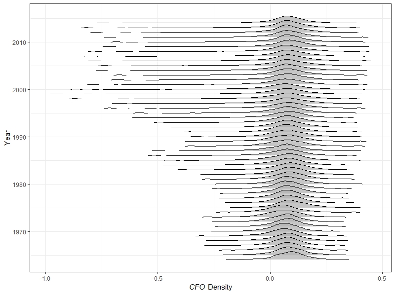
Figure based on ggridges
While this looks nice in the paper, I want to hold this plot in my own hands. Building on the function above and the rayshader package, this is easily achieved.
hmap <- create_by_year_density_hmap(test_sample, "year", "cfo")

hmap  %>%
  sphere_shade(texture = "bw") %>%
  add_shadow(hmap, 0.7) %>%
  plot_3d(hmap, zscale = 0.01)

save_3dprint("cfo_ridge_3d.stl", maxwidth = 100, unit = "mm")
This code leaves me with a STL file that I can import into my 3D printing software (Cura in my case).
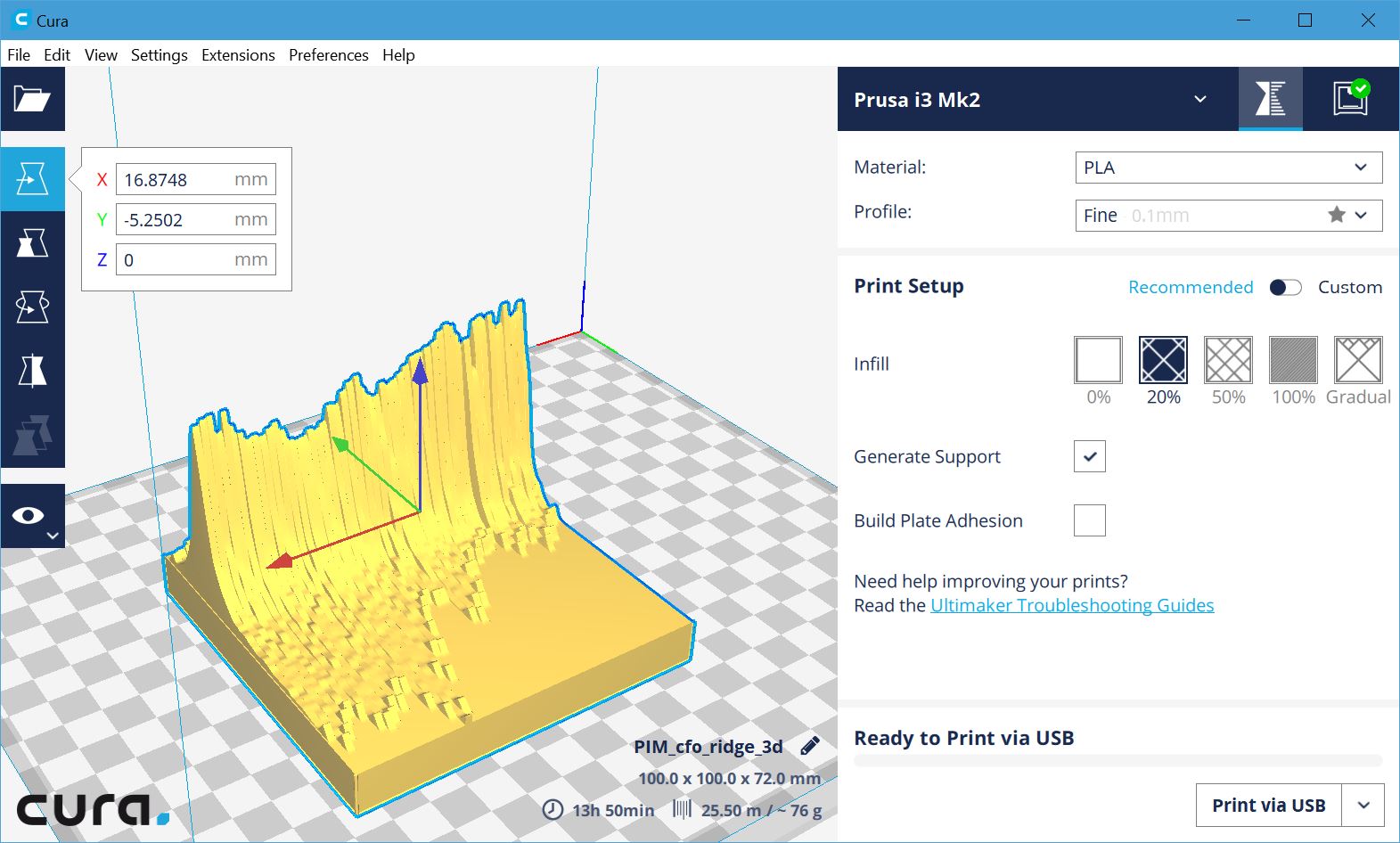
A screenshot of the STF file in Cura, ready to be printed
As you can glimpse from the screen shot, printing takes a while (13+ hours) but, hey, as long it is not taking my time… Anyway, below you see some photos of the printing process.

3d printing… Step one
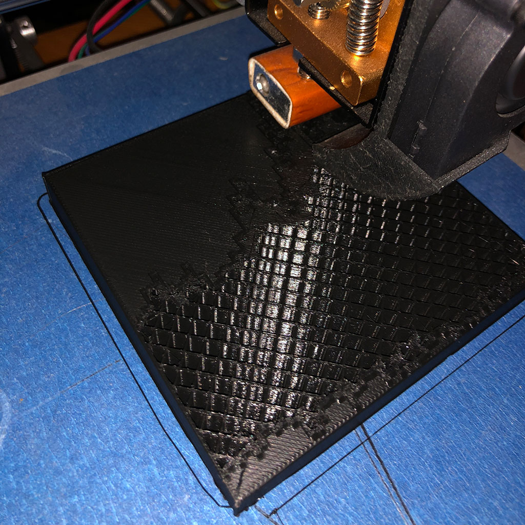
3d printing… Step two
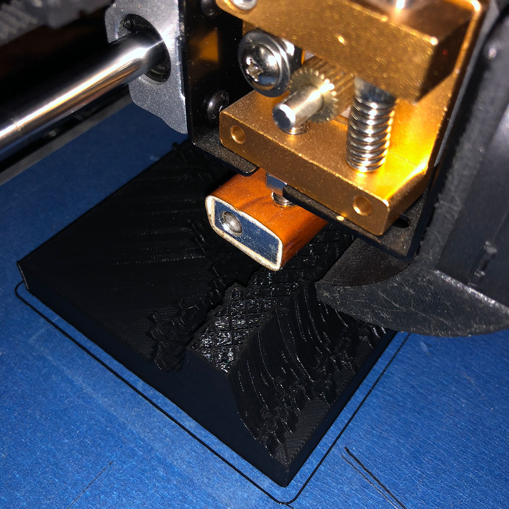
3d printing… Step three
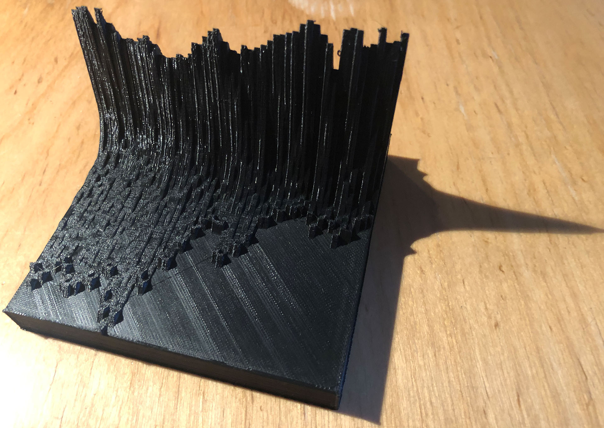
3d printing… done!
And here is the final outcome. While it lacks legends and thus is far from self-explanatory, it helps to communicate the basic takeaway. Think about taking something like this with you for a seminar talk. Pass it around the audience to make sure that they will remember your key finding. Time for a coffee!
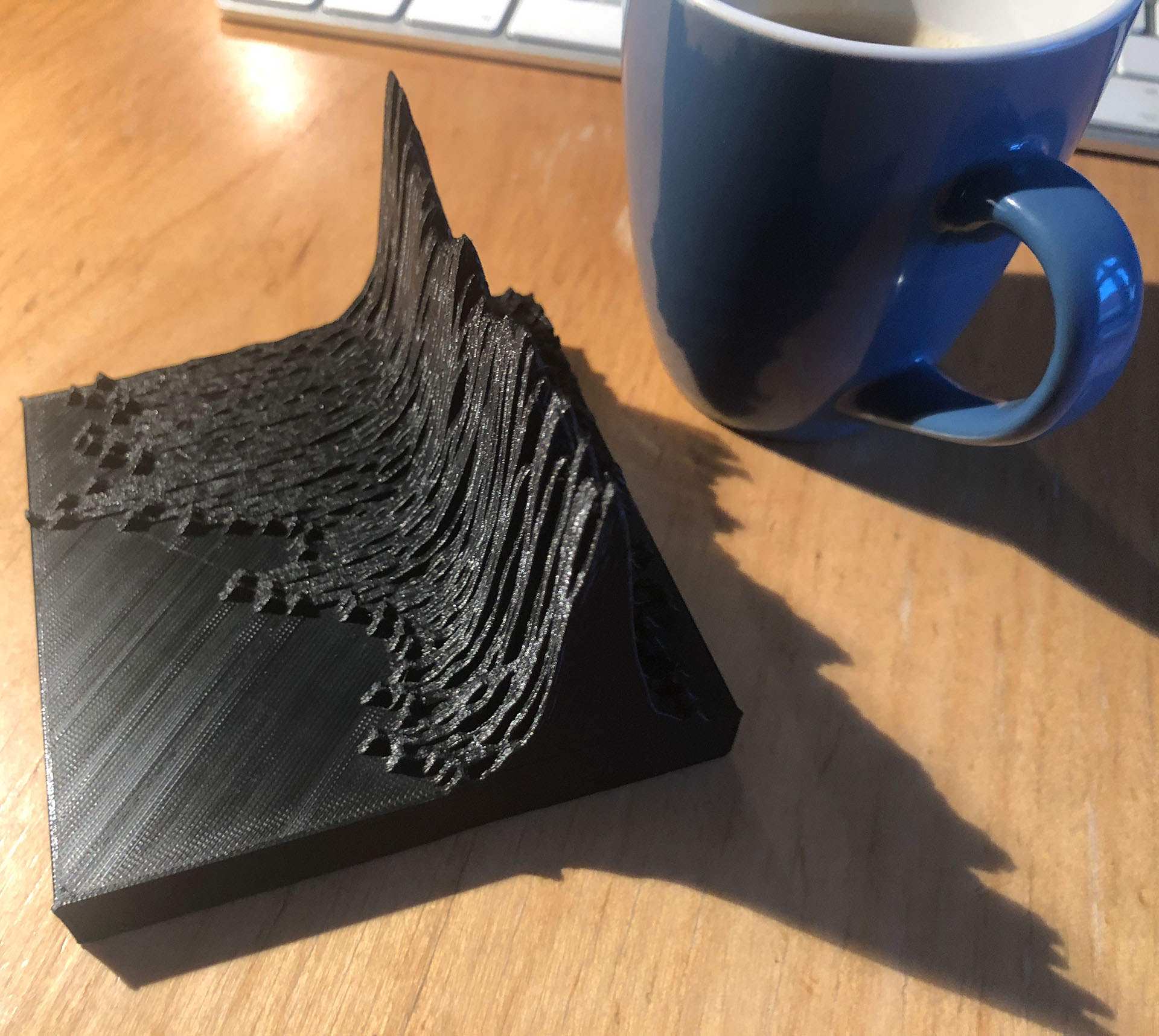
Hmmm… Coffee!
I know that it is somewhat nerdy, but I love the final product. First time I have something in my hand that is made entirely out of data and R. Thanks to Tyler Morgan-Wall and the entire R community for making this happen!

