
Vaccination Data: An Outlier Tale
I recently included the new Our World in Data data on Covid-19 hospitalizations and the vaccination progress around the world in the {tidycovid19} package. What was meant to be a short info post for package users turned into a mini case on “outliers”.
Thankfully, the OWID team makes their Covid-19 data available in a well-maintained and documented form on Github so that importing and merging it into the data that the package offers is a breeze. By the way: The dataset provided by Our World in Data also contains some additional data items that might be of interest, so I encourage everybody to take a look at their data repository on Github directly besides (or instead) relying on the data that is provided by the {tidycovid19} package.
As you can see below, the data coverage is currently limited to a small set of countries and short time series.
library(tidyverse)
library(tidycovid19)
library(kableExtra)
library(ggridges)
library(stargazer)

df <- download_merged_data(cached = TRUE, silent = TRUE)

nobs <- df %>%
  group_by(iso3c) %>%
  summarise(
    nobs_hosp = sum(!is.na(hosp_patients)),
    nobs_icu = sum(!is.na(icu_patients)),
    nobs_vacc = sum(!is.na(total_vaccinations)),
    .groups = "drop"
  ) %>%
  filter(
    nobs_hosp != 0 | nobs_icu != 0 | nobs_vacc  != 0
  ) %>%
  arrange(iso3c)

kable(nobs) %>% kable_styling()| iso3c | nobs_hosp | nobs_icu | nobs_vacc |
|---|---|---|---|
| ARE | 0 | 0 | 3 |
| ARG | 0 | 0 | 4 |
| AUT | 277 | 277 | 2 |
| BEL | 295 | 295 | 2 |
| BGR | 273 | 273 | 7 |
| BHR | 0 | 0 | 18 |
| CAN | 305 | 305 | 27 |
| CHL | 0 | 0 | 7 |
| CHN | 0 | 0 | 3 |
| CRI | 0 | 0 | 3 |
| CYP | 301 | 301 | 1 |
| CZE | 309 | 309 | 2 |
| DEU | 0 | 290 | 13 |
| DNK | 0 | 0 | 14 |
| ESP | 93 | 93 | 4 |
| EST | 313 | 313 | 12 |
| FIN | 177 | 177 | 5 |
| FRA | 316 | 315 | 4 |
| GBR | 285 | 280 | 3 |
| GIN | 0 | 0 | 1 |
| GRC | 0 | 0 | 13 |
| HRV | 264 | 0 | 6 |
| HUN | 261 | 0 | 9 |
| IRL | 303 | 282 | 3 |
| ISL | 266 | 224 | 1 |
| ISR | 0 | 0 | 22 |
| ITA | 315 | 315 | 14 |
| KWT | 0 | 0 | 1 |
| LTU | 47 | 0 | 12 |
| LUX | 294 | 315 | 1 |
| LVA | 277 | 0 | 9 |
| MEX | 0 | 0 | 11 |
| MLT | 0 | 0 | 1 |
| NLD | 217 | 312 | 4 |
| NOR | 263 | 0 | 9 |
| OMN | 0 | 0 | 12 |
| POL | 263 | 0 | 11 |
| PRT | 307 | 307 | 6 |
| ROU | 0 | 278 | 13 |
| RUS | 0 | 0 | 3 |
| SAU | 0 | 0 | 1 |
| SVK | 249 | 0 | 3 |
| SVN | 300 | 300 | 7 |
| SWE | 0 | 280 | 1 |
| USA | 297 | 288 | 12 |
As an economist, I am interested in the effect of economic wealth on health issues, so an obvious first question to ask the data is: How does the association between vaccination status (measured by total vaccinations by 100,000 inhabitants) to GDP per capita look like.
clevel <- df %>%
  group_by(iso3c) %>%
  filter(any(!is.na(total_vaccinations))) %>%
  mutate(
    vacc_1e5pop = 1e5*(total_vaccinations/population),
    cases_1e5pop = 1e5*(confirmed/population),
    deaths_1e5pop = 1e5*(deaths/population)
  ) %>%
  summarise(
    vacc_1e5pop  = max(vacc_1e5pop, na.rm = TRUE),
    cases_1e5pop = max(cases_1e5pop, na.rm = TRUE),
    deaths_1e5pop = max(deaths_1e5pop, na.rm = TRUE),
    gdp_capita = max(gdp_capita, na.rm = TRUE),
    .groups = "drop"
  ) %>%
  na.omit()

plot_clevel_vacc_by_x <- function(df, xvar, xlab) {
  xvar <- enquo(xvar)
  ggplot(df, aes(x = !!xvar, y = vacc_1e5pop)) +
    geom_point() +
    scale_x_log10() +
    scale_y_log10() +
    theme_minimal() +
    labs(
      x = xlab,
      y = "Vaccinations per 100,000 inhabitants"
    ) +
    ggrepel::geom_text_repel(aes(label = iso3c)) +
    geom_smooth(method = "lm", formula = "y ~x")
}

plot_clevel_vacc_by_x(clevel, gdp_capita, "National income per capita (2010 US-$)")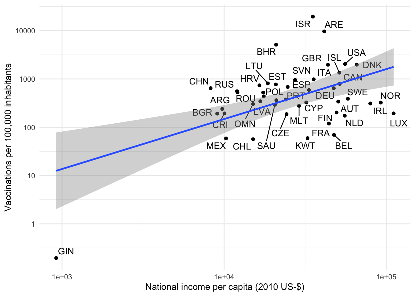
Based on the above one would make the (unfortunate) observation that GDP per capita is positively associated with vaccination progress. While this does not imply causality, it is certainly in line with a lot of prior evidence that “richer” countries have access to better medical care and the failure on the international community to allocate the medical resources to the areas where they are needed most.
But hey, I hear you say, this looks like a textbook example of an “Outlier” and also like a “bad leverage point” that is highly-influential for the regression coefficient. Let’s see how the plot looks like without the 25 vaccinations that the OWID team reports for Guinea.
plot_clevel_vacc_by_x(
  clevel %>% filter(iso3c != "GIN"),
  gdp_capita, "National income per capita (2010 US-$)"
)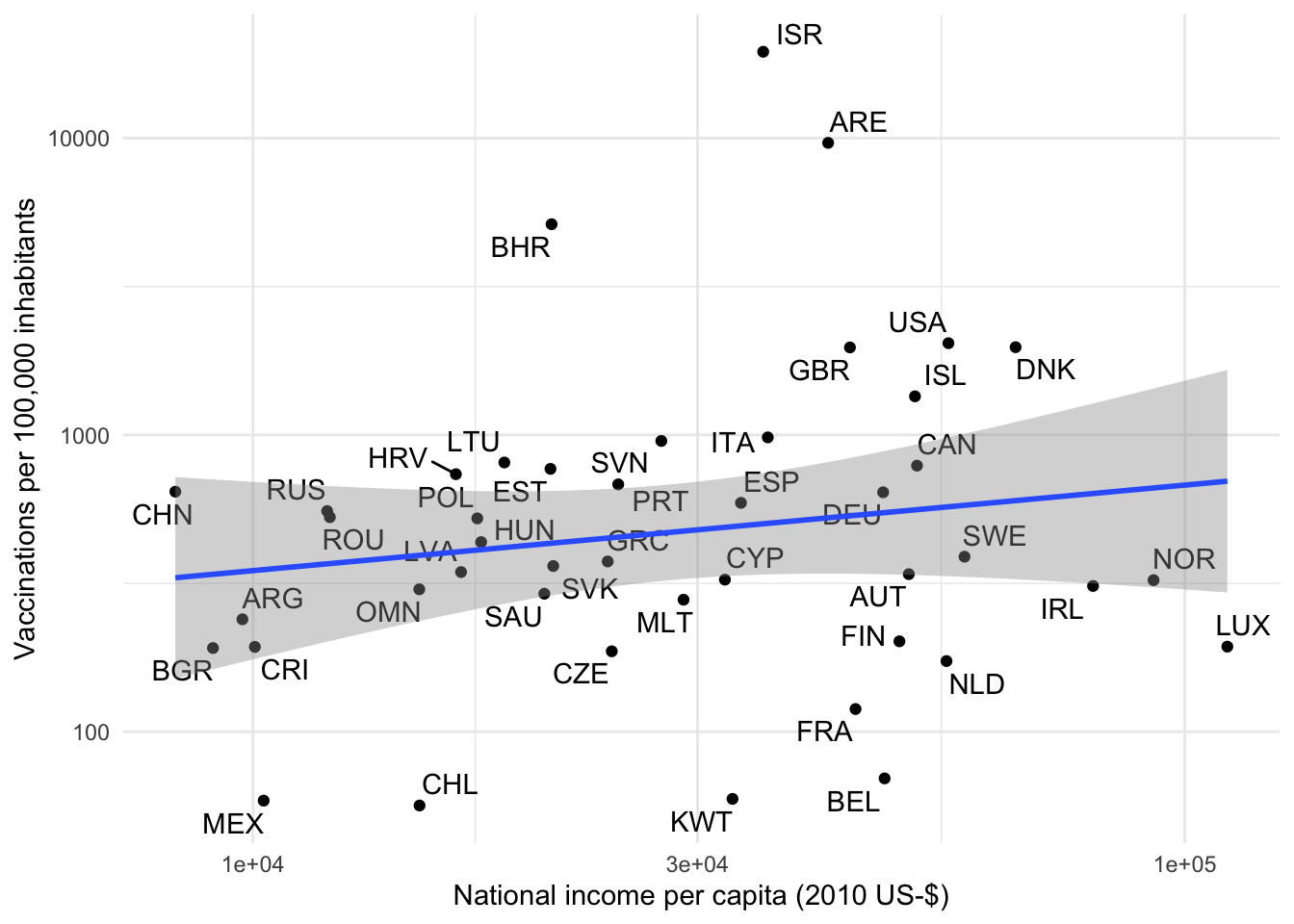
Different, huh? Now it looks as if there is no meaningful association between GDP and vaccination progress. The problem with outliers is that we often do not know whether they represent valid data points hinting at an under-observed part of the distribution or whether they are an erroneous artifact of the data generating process. In economics and other observational sciences we often deal with them in an ad hoc manner by truncating or winsorizing.1 In this case, however, we have good reasons to assume that Guinea is not a data error but simply an under-observed but completely valid observation. There are two reasons why countries might not be reported in the OWID data:
- They have not started their vaccination program yet
- They do not publicly report their vaccination data
Both reasons can be assumed to be more likely for poorer countries. Let’s look at the resulting selection problem by comparing countries that have vaccination data available with the ones that don’t.
has_vacc_data <- df %>%
  select(iso3c, total_vaccinations, gdp_capita, deaths, confirmed, population) %>%
  group_by(iso3c) %>%
  filter(
    !all(is.na(confirmed)) & !all(is.na(deaths)) & !all(is.na(population)) &
    !all(is.na(gdp_capita))
  ) %>%
  summarise(
    has_vacc_data = sum(!is.na(total_vaccinations)) > 0,
    gdp_capita = mean(gdp_capita),
    cases = max(1e5*(confirmed/population), na.rm = TRUE),
    deaths = max(1e5*(deaths/population), na.rm = TRUE),
    .groups = "drop"
  )

plot_sel_bias <- function(df, xvar, xlab) {
  xvar <- enquo(xvar)
  ggplot(
    data = df,
    aes(
      x = !!xvar, y = has_vacc_data,
      fill = has_vacc_data, height = stat(density)
    )
  ) +
    geom_density_ridges(
      stat = "binline", bins = 20, scale = 0.95
    ) +
    scale_x_log10(labels = scales::comma_format(accuracy = 0.1)) +
    labs(
      x = xlab,
      y = "",
      title = "OWID provides vaccination data"
    ) +
    theme_ridges() +
    theme(
      legend.position = "none",
      plot.title.position = "plot"
    )
}

plot_sel_bias(has_vacc_data, gdp_capita, "GDP per capita (in 2010 US-$, log-scaled)")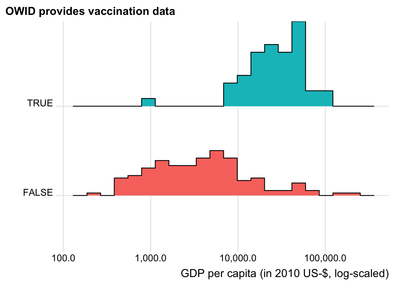
Now this confirms our expectations. With the sole exception of Guinea, only relatively wealthy countries are currently included in the OWID vaccination data. This by no means implies criticism of the OWID data collection process but is most likely just an outcome of them having the financial means to start the vaccination process and the governance infrastructure to report reliable data on it.
Let us see whether at least also countries that are more heavily affected by Covid-19 are more likely to show up in the vaccination data.
plot_sel_bias(has_vacc_data, cases, "Covid-19 cases per 100,000 inhabitants (log-scaled)")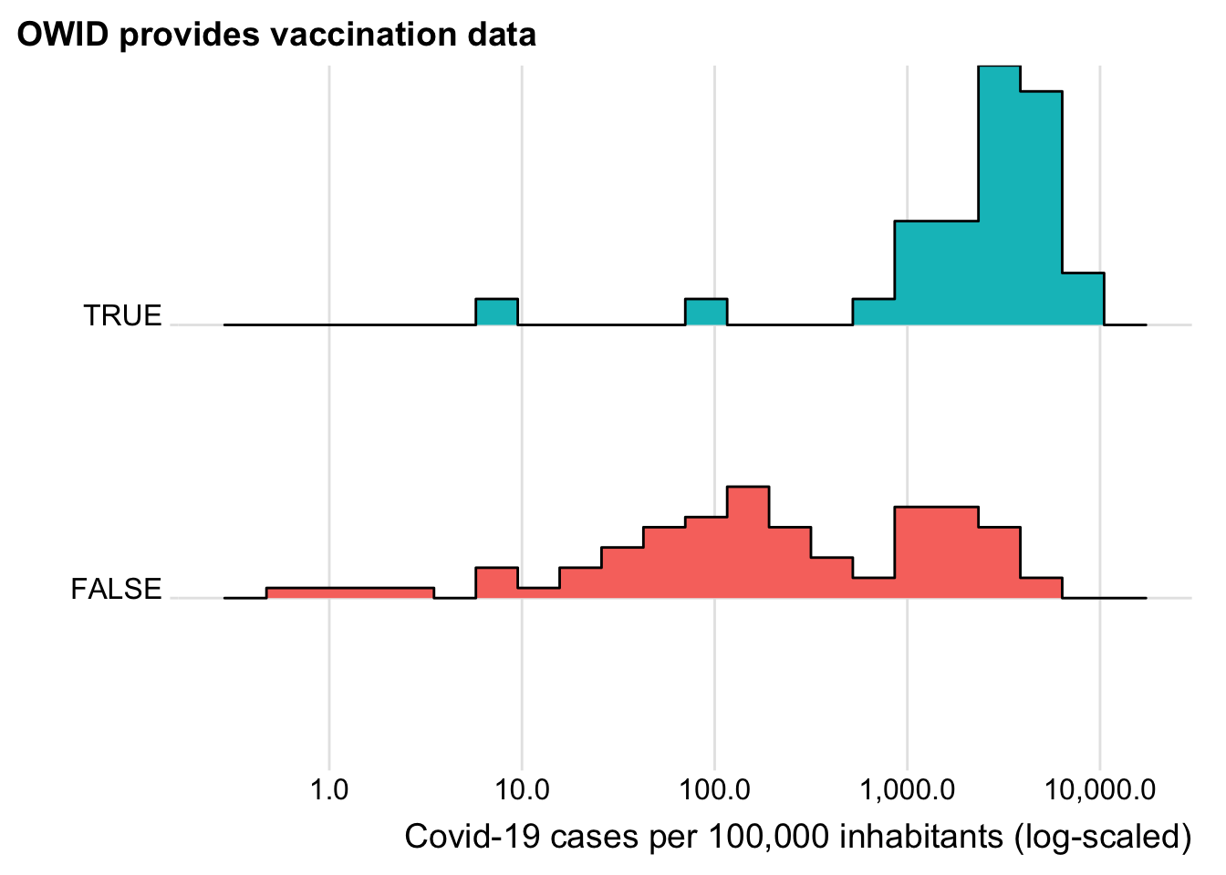
plot_sel_bias(has_vacc_data, deaths, "Covid-19 deaths per 100,000 inhabitants (log-scaled)")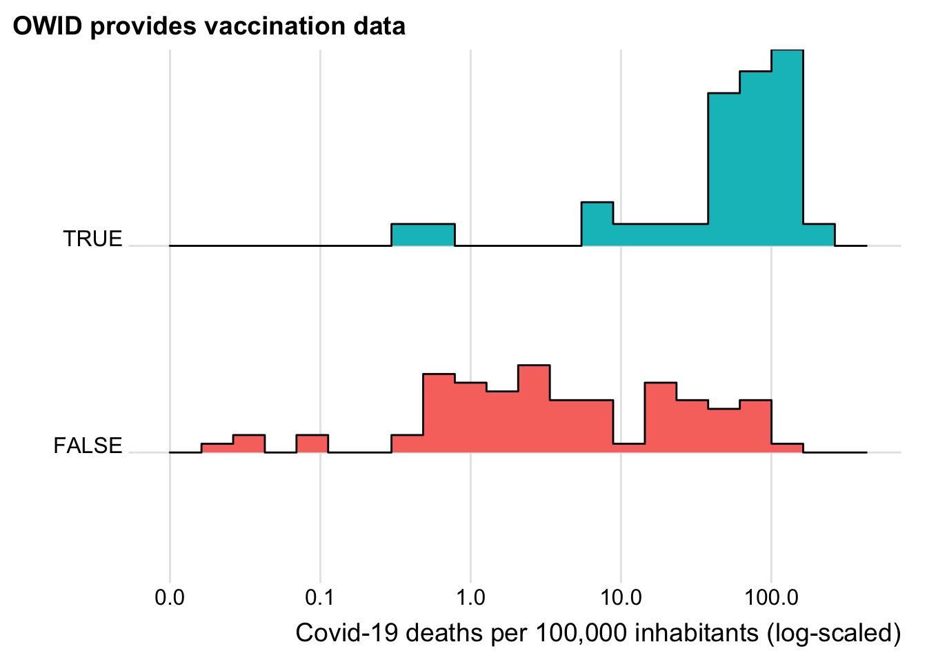
Now this looks reassuring. The vaccinations seem to be starting in those countries hardest hit by Covid 19. Does this also holds when we control for GDP? We focus on deaths here as deaths and cases are highly correlated
mod <- glm(
  has_vacc_data ~ log(gdp_capita) + log(deaths),
  data = has_vacc_data %>% filter(deaths > 0),
  family = "binomial"
)

stargazer(mod, type = "html")| Dependent variable: | |
| has_vacc_data | |
| log(gdp_capita) | 1.457*** |
| (0.332) | |
| log(deaths) | 0.598*** |
| (0.228) | |
| Constant | -16.070*** |
| (3.374) | |
| Observations | 112 |
| Log Likelihood | -33.091 |
| Akaike Inf. Crit. | 72.182 |
| Note: | p<0.1; p<0.05; p<0.01 |
Good. Even after controlling for GDP, countries which suffer more from Covid-19 have started the vaccination process earlier. While this might also be driven by differences in data quality across countries, I take this as a piece of well needed good news these days. Last question: How does that look like for the intensive margin, meaning for the number of vaccinations for the countries that have vaccination data available?
mod <- lm(
  log(vacc_1e5pop) ~ log(gdp_capita) + log(deaths_1e5pop),
  data = clevel
)

stargazer(mod, type = "html")| Dependent variable: | |
| log(vacc_1e5pop) | |
| log(gdp_capita) | 1.004*** |
| (0.282) | |
| log(deaths_1e5pop) | 0.059 |
| (0.182) | |
| Constant | -4.446 |
| (2.727) | |
| Observations | 45 |
| R2 | 0.265 |
| Adjusted R2 | 0.230 |
| Residual Std. Error | 1.469 (df = 42) |
| F Statistic | 7.589*** (df = 2; 42) |
| Note: | p<0.1; p<0.05; p<0.01 |
Nope. And after omitting Guinea?
mod <- lm(
  log(vacc_1e5pop) ~ log(gdp_capita) + log(deaths_1e5pop),
  data = clevel %>% filter(iso3c != "GIN")
)

stargazer(mod, type = "html")| Dependent variable: | |
| log(vacc_1e5pop) | |
| log(gdp_capita) | 0.301 |
| (0.276) | |
| log(deaths_1e5pop) | -0.241 |
| (0.162) | |
| Constant | 3.992 |
| (2.879) | |
| Observations | 44 |
| R2 | 0.074 |
| Adjusted R2 | 0.029 |
| Residual Std. Error | 1.203 (df = 41) |
| F Statistic | 1.647 (df = 2; 41) |
| Note: | p<0.1; p<0.05; p<0.01 |
Still not. In addition, you see that the GDP coefficient is now also insignificant. Outliers matter. Everybody, see for yourself by pulling the data using the {tidycovid19} package or directly from the Our World in Data Repository.
Stay healthy and enjoy!

