
Scraping Google Covid-19 community movement data from PDF figures
Yesterday, I came across the Google “COVID-19 Community Mobility Reports“. In these reports, Google provides some statistics about changes in mobility patterns across geographic regions and time. The data seem to be very interesting to assess the extent of how much governmental interventions and social incentives have affected our day-to-day behavior around the pandemic. Unfortunately, the data comes in by-country PDFs. What is even worse, the daily data is only included as line graphs in these PDFs. Well, who does not like a challenge if it is for the benefits of open science?
The Google Community Mobility Reports (thank you to Yan Ouaknine for pointing me to them) have a lot of potential, at least to those researchers that do not have direct access to cellular movement data. However, why Google choose to make this interesting data available only as PDFs is beyond me. Here is a snapshot of the first page of the German report.
# remotes::install_github("joachim-gassen/tidycovid19")
suppressPackageStartupMessages({
  library(tidyverse)
  library(tidycovid19)
  library(pdftools)
  library(png)
})

pdf_url <- "https://www.gstatic.com/covid19/mobility/2020-04-05_DE_Mobility_Report_en.pdf"

pdf_convert(pdf_url, pages = 1, filenames = "google_cmr_de_p1.png", verbose = FALSE)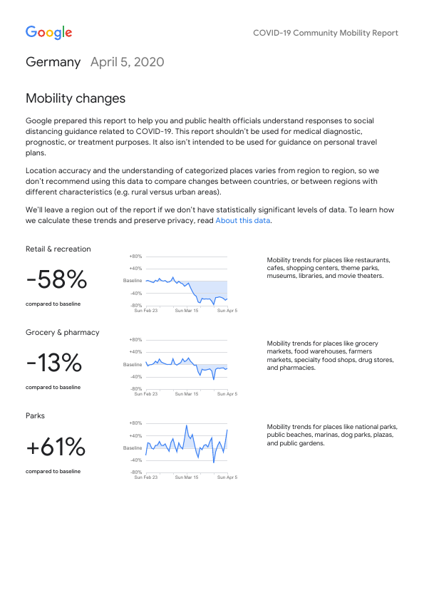
Each PDF reports the data for one country (or state if the U.S.). The movement data is reported relative to a normal baseline for the following categories:
- Retail & recreation
- Grocery & pharmacy
- Parks
- Transit stations
- Workplaces
- Residential
My initial idea was to just scrape the overall changes relative to the baselines (the large percentage figures in the picture above) and be done with it. But then again, the tidycovid19 package provides country-day longitudinal data and the reports obviously contain this data, albeit in one of the least tidiest form that one could imagine. In principle, one can extract this data and I quickly found a Javascript based project that does this. But unfortunately, currently it does not provide the data from the most up-to-date reports. Also, for the package, I would like to use authoritative sources whenever possible. So, I decided to give it a spin.
I won’t go in to too much detail on how I scraped the PDFs (the code is in the Github repository of the package, file is R/scrape_google_cmr_data.R) but in principle I follow the following steps
- Get the download links from Google’s webpage
- Download a PDF for a country
- Scrape the text components of the PDF for the country averages
- Render the PDF page-wise into a bitmap object
- Identify line graphics in this bitmap by their vertical grids. Cut each graphic in a separate small bitmap object so that a multi page PDF file becomes a list of bitmaps (actually a list of lists as each page generates its own list)
- Parse the country-level bitmaps for the six categories by identifying the data line by its color and averaging its row position by column of the bitmap object.
- Map these values to the reported dates.
- Tidy everything together in two data frames one holding country-level data and a long one holding country-day level data.
The outcome looks reasonably clean but obviously I could not test all 131 countries so use with care. Here you see an example. This is the cut bitmap of the German ‘Retail and Recreation’ data.
bitmaps <- tidycovid19:::extract_line_graph_bitmaps(pdf_url, 1)
png_file <- tempfile("bitmap_", fileext = ".png")
writePNG(bitmaps[[1]][[1]], "bitmap.png")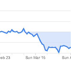
And this is the same plot based on the scraped data.
df <- tidycovid19:::parse_line_graph_bitmap(bitmaps[[1]][[1]])

ggplot(data = df, aes(x = date, y = measure)) +
  geom_line(size = 2, color = "blue") +
  geom_ribbon(
    aes(ymin = ifelse(measure > 0, 0, measure), ymax = 0),
    fill = "blue", alpha = 0.2
  ) +
  theme_minimal() +
  scale_y_continuous(
    name="Retail & recreation", limits=c(-0.8, 0.8),
    breaks = c(-0.8, -0.4, 0, 0.4, 0.8)
  ) +
  theme(
    panel.grid.minor = element_blank(),
    panel.grid.major.x = element_blank()
  )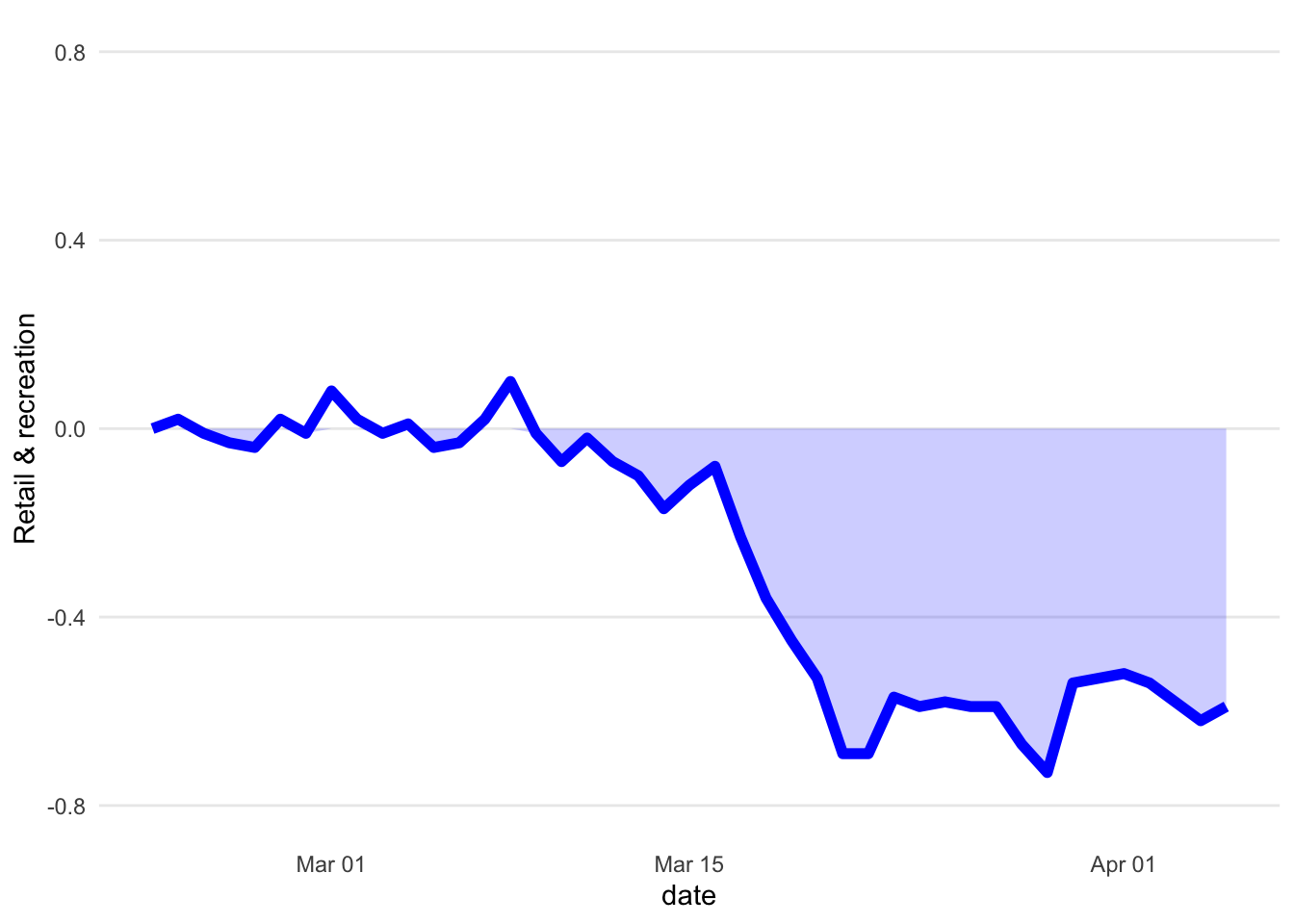
Looks reasonably close to me. If you just want to work with the data you can download and scrape it using the functions of the package. As a proof of concept let’s look how government interventions and community movement co-move in Germany:
merged_dta <- download_merged_data(cached = TRUE, silent = TRUE)

merged_dta %>%
  filter(iso3c == "DEU", date >= "2020-02-23") %>%
  mutate(gov_interventions = (soc_dist + mov_rest)/
           max(soc_dist + mov_rest, na.rm = TRUE),
         lockdown = lockdown == 1) %>%
  select(date, lockdown, gov_interventions, starts_with("gcmr_")) %>%
  pivot_longer(cols = c(3:9), names_to = "measure", values_to = "value") %>%
  na.omit() -> dta

ggplot(dta, aes(x = date, y = value, group = measure, color = measure)) +
  theme_minimal() +
  annotate("rect", xmin = min(dta$date[dta$lockdown]), xmax = max(dta$date),
           ymin = -Inf, ymax = Inf,
           fill = "lightblue", color = NA, alpha = 0.2) +
geom_line() 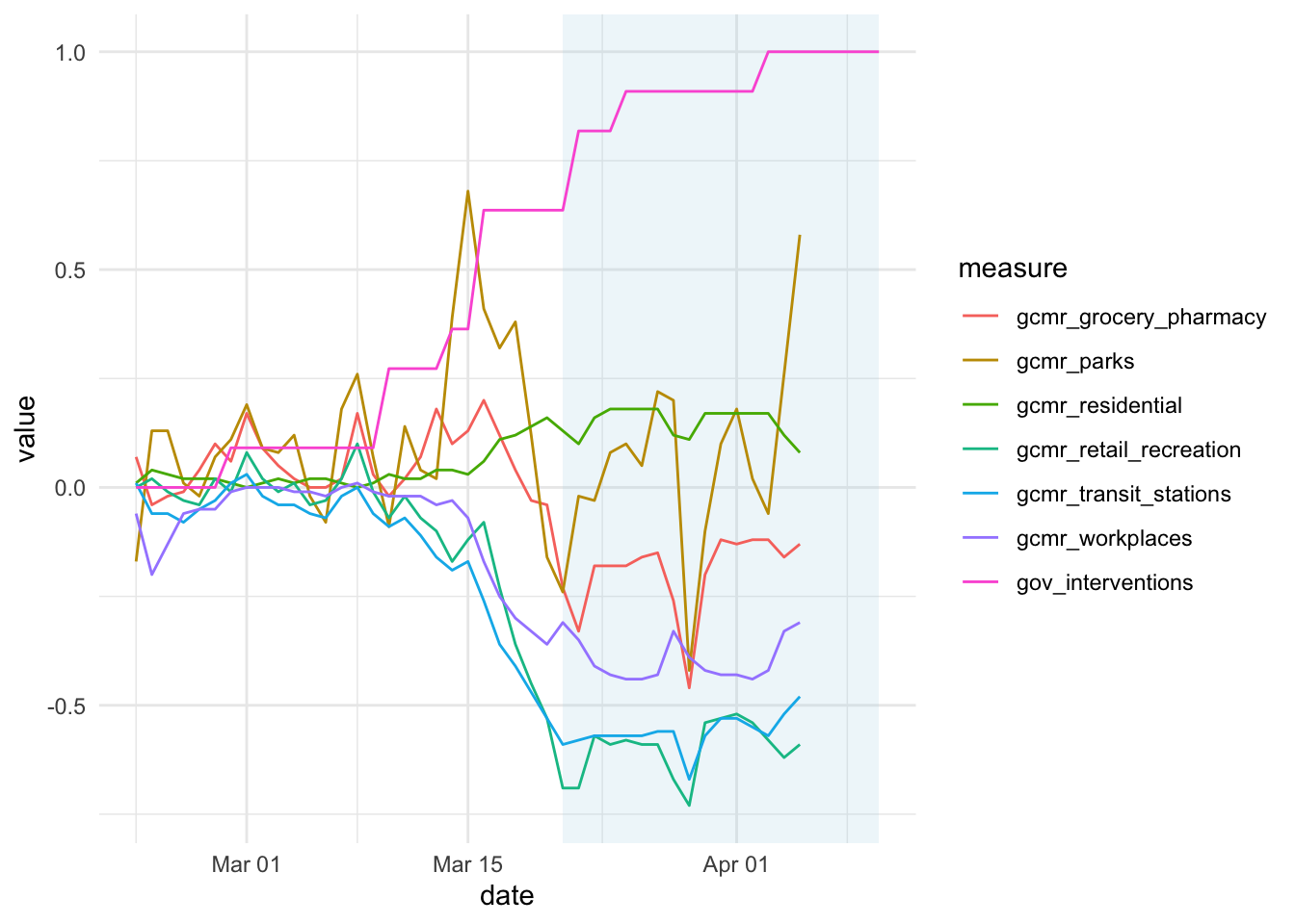
Nice. The high-lghted area indicates the ‘lockdown’ period. It seems as if, in general, us Germans are an obedient bunch of people (what a surprise!). The increase in residential movement is the consequence of the movement restrictions and thus to be expected. The ‘parks’ data look messy and a little bit all over the place. I am tempted to link it to the weather ;-).
Now I turn to the country level data that I collected via simple PDF text parsing. It summarizes the overall change in movement relative to the baseline up until April 5. I compare the correlation between the extent of governmental interventions with movement restrictions across countries.
gcmr_cl_data <- scrape_google_cmr_data(cached = TRUE, silent = TRUE, daily_data = FALSE)

merged_dta %>%
  filter(!is.na(soc_dist), !is.na(mov_rest)) %>%
  mutate(
    gov_interventions = (soc_dist/max(soc_dist, na.rm = TRUE) +
           mov_rest/max(mov_rest, na.rm = TRUE) + lockdown)/3
  ) %>%
  group_by(iso3c) %>%
  summarise(gov_interventions = mean(gov_interventions)) %>%
  ungroup() %>%
  mutate(gov_interventions = percent_rank(gov_interventions)) %>%
  left_join(gcmr_cl_data, by = "iso3c") %>%
  mutate(mn_gcmr = (retail_recreation + grocery_pharmacy +
                      transit_stations + workplaces)/4) %>%
  na.omit() %>%
  ggplot(aes(x = gov_interventions, y = mn_gcmr)) +
  geom_point() +
  theme_minimal() +
  geom_smooth(method = "lm", formula = "y ~ x")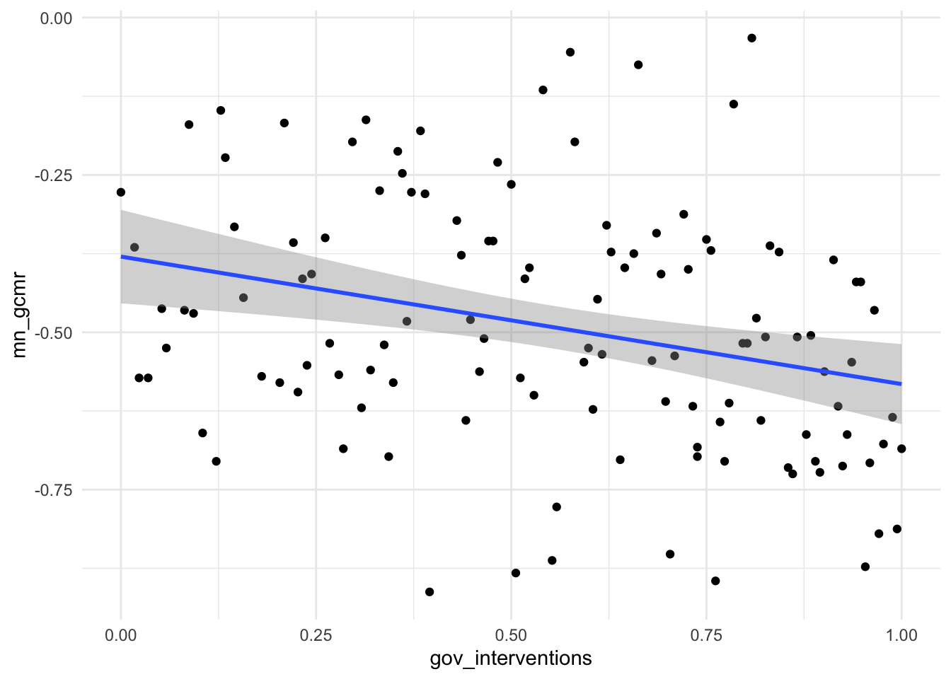
Hhmm. The correlation could be stronger. But keep in mind that comparing governmental interventions across countries is inherently hard and my measure for that is very much ad hoc. As a last graph I thus simply compare the countries with and without ‘lockdown’.
merged_dta %>%
  filter(!is.na(lockdown)) %>%
  group_by(iso3c) %>%
  summarize(lockdown = max(lockdown) == 1) %>%
  ungroup() %>%
  left_join(gcmr_cl_data, by = "iso3c") %>%
  mutate(mn_gcmr = (retail_recreation + grocery_pharmacy +
                      transit_stations + workplaces)/4) %>%
  na.omit() %>%
  ggplot(aes(x = lockdown, y = mn_gcmr)) +
  geom_boxplot(outlier.shape = NA) +
  geom_jitter(position = position_jitter(width=.3, height=0)) +
  theme_minimal()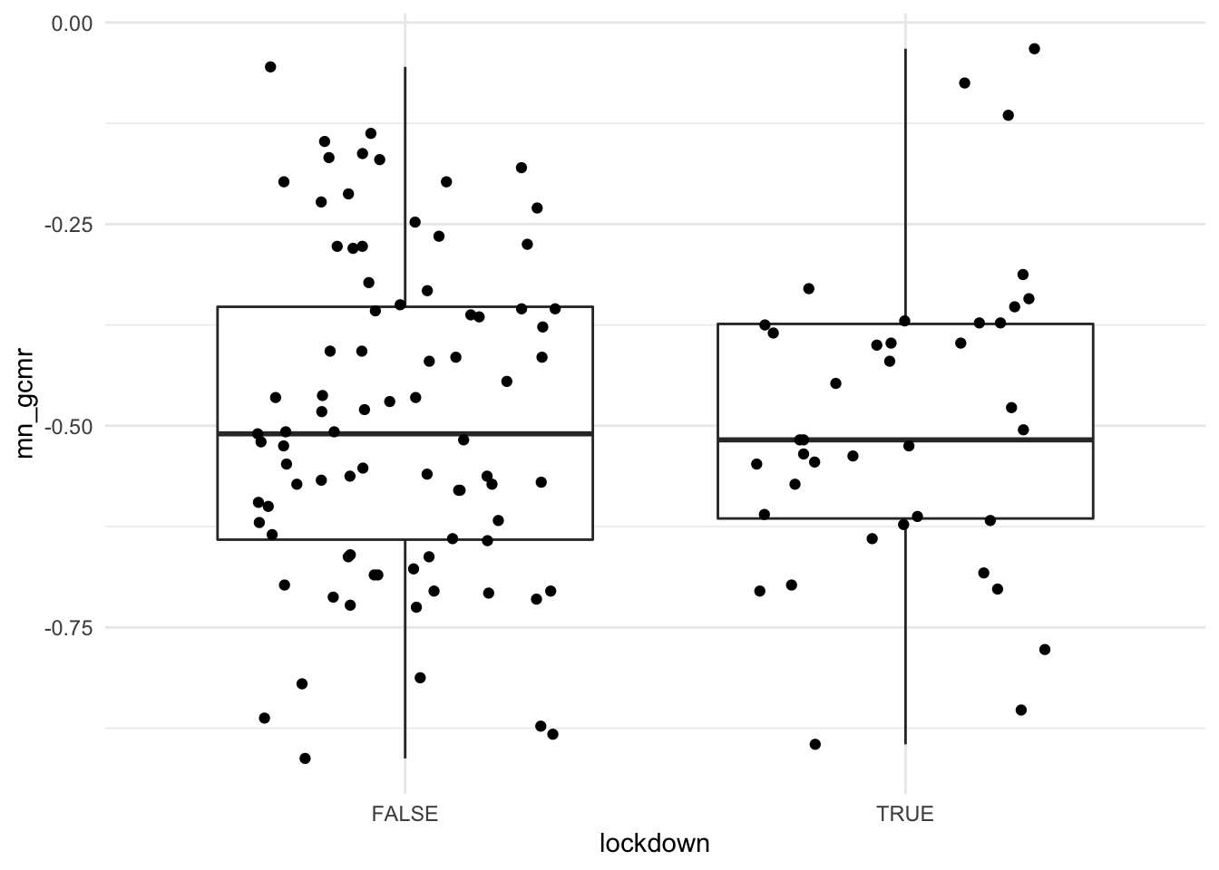
Also surprisingly little difference here. As the country-level effects are based on the difference over the whole period of the crisis up until now, my guess is that the country-day data will allow much cleaner and more powerful analyses. Seems like parsing these PDF figures was worth the effort!
This is it. If you feel like using the data for your own analyses, take a look at my tidycovid19 package package containing all the download and parsing code.
Everybody: Enjoy, stay well and keep #FlattenTheCurve!

