Create a Notebook to Explore Country-Level CO2 Emissions With a Few Clicks
Assume that you have some new data that you want to explore. The new CRAN version of the ‘ExPanDaR’ package helps by providing a (customized) R notebook containing all building blocks of an exploratory data analysis with a few clicks.
Install the Package and Start ExPanD
First, you need to install the package. I recommend installing the Github development version of the package as it fixes some small bugs that I discovered directly after submitting to CRAN (sigh…).
# Install the current development version
devtools::install_github("joachim-gassen/ExPanDaR")

# Install from CRAN
# install.packages("ExPanDaR")
Next, you start ExPanD(), the shiny app of the package that is designed for
interactive data exploration. When you start ExPanD with the parameter
export_nb_option = TRUE, it allows you to export an R notebook containing
the current state of your analysis from within the ExPanD app.
To explore country-level CO2 emissions we will use the World Bank data that
comes with the package but you can do the same with just about every data frame
that contains at least two numerical variables by simply calling
ExPanD(data_frame, export_nb_option = TRUE).
library(ExPanDaR)

ExPanD(worldbank, df_def = worldbank_data_def, var_def = worldbank_var_def,
       export_nb_option = TRUE)
Explore Your Data Interactively
After a little bit of a wait, you will see a shiny app that lets you explore
a country-year panel of World Bank data. Select some visuals to display the
distribution of CO2 emissions, measured in metric tons per inhabitant
(cO2_emissions_capita). You will see that the distribution is log-normal: Many
countries have relatively low levels of emissions while few countries have very
high levels. You can define a logged variant of cO2_emissions_capita in the
app to see that this variable is more normally distributed.
Let’s assume that at some point, you are done interactively exploring the data and want to export your findings for future study. One thing that you can do is that you can save your current app choices (scroll down, hit save). For the lazy: The code below reads my choices and starts ExPanD with them so that you can follow the analysis below (the even lazier can also just access the shiny app online here).
config_co2 <- readRDS(url("https://joachim-gassen.github.io/data/ExPanD_config_co2.RDS"))

ExPanD(worldbank, df_def = worldbank_data_def,
       var_def = worldbank_var_def,
       config_list = config_co2, export_nb_option = TRUE)
Export a Notebook Containing Your Analysis
While this allows you to restart ExPanD with your current analysis at a later point, you most likely want to extend the analysis by hand, e.g. by estimating more refined models or by adding more visuals. For this, you can export a Notebook containing the analysis. To do so, scroll to the bottom of the ExPanD app and click on the button below.

You should be rewarded with a file download dialog, asking you to store a file
named ExPanD_nb.zip. Store and unzip it wherever you like. It contains two
files
- A notebook file
ExPanD_nb_code.Rmdand - a data file
ExPanD_nb_data.RDatacontaining data and variable definitions.
Exploring the Notebook Code
Use RStudio to open the notebook file. You can directly knit it
(Preview/Knit to HTML) but in order to work with and extend it, it is useful
to take a deeper look at its code first. The new vignette
of the package contains more detailed information on the Notebook code. In this
blog post, I will focus on an example for how to extend the analysis.
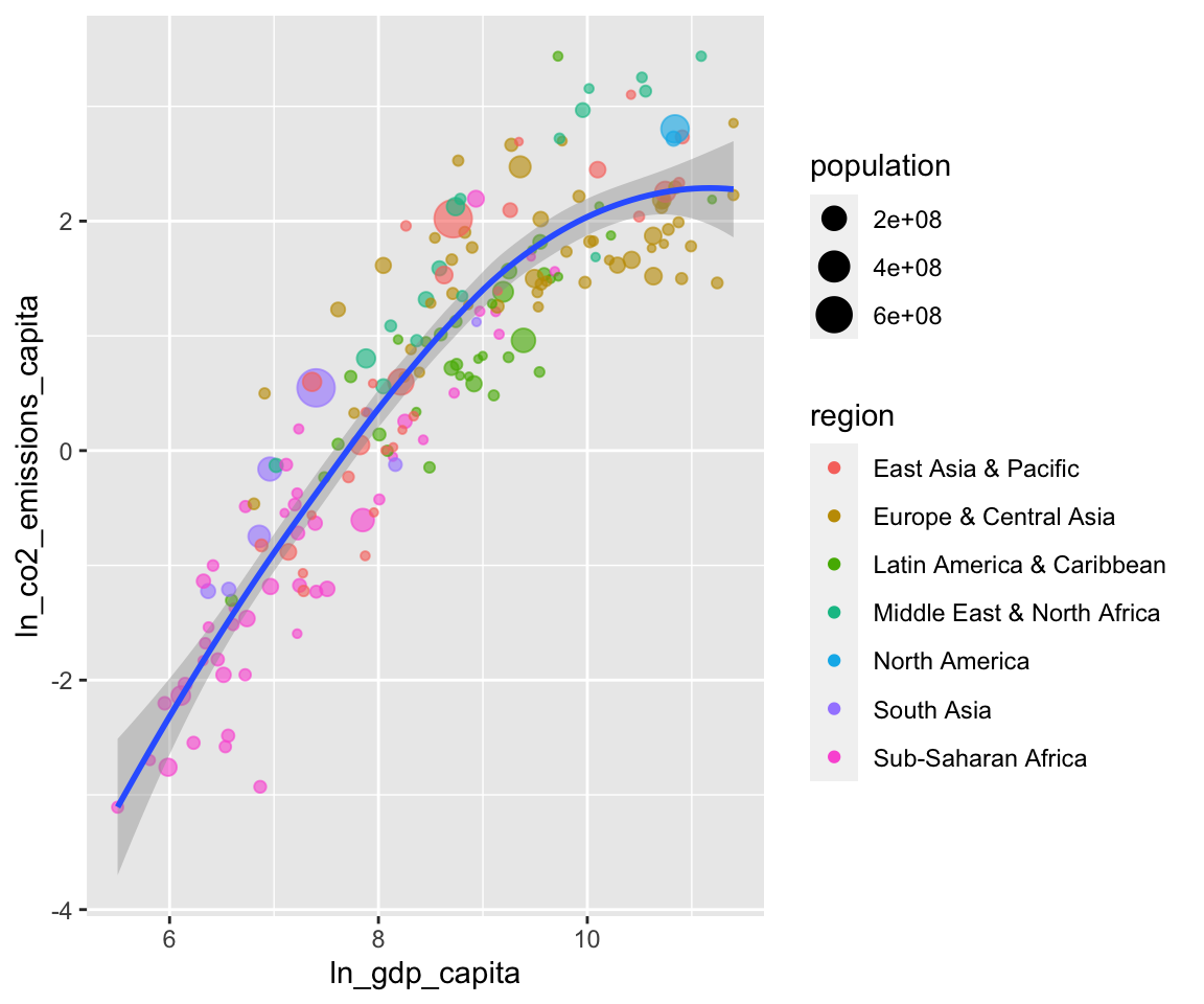
When you scroll down the notebook, you will see the chunk that creates the scatter plot. In my analysis, I used it to document that the log of CO2 emissions per capita is almost perfectly proportional to the log of GDP per capita. See below:
df <- smp
df <- df[df$year == "2014", ]
df <- df[, c("country", "year", "ln_gdp_capita",
             "ln_co2_emissions_capita", "region", "population")]
df <- df[complete.cases(df), ]
df$region <- as.factor(df$region)
prepare_scatter_plot(df, "ln_gdp_capita", "ln_co2_emissions_capita",
                     color = "region", size = "population", loess = 1)
## `geom_smooth()` using method = 'loess' and formula 'y ~ x'
You see that the code of the chunk uses prepare_scatter_plot() of the
‘ExPanDaR’ package to quickly produce a scatter plot visualizing up to four data
dimensions. See the help pages of the package and the vignette “Using the
functions of the ExPanDaR package”
for more information on how to use the EDA functions that come with the package.
Also, you can always take a look at their code (just call their name without the
brackets) to see what they do under the hood and to extend or modify them.
Modifying and Extending the Notebook
The finding above makes intuitive sense. Economic activity uses resources. Thus,
we would expect countries with higher levels of economic activity to generate
higher levels of CO2 emissions. As you can see above, the analysis is based on
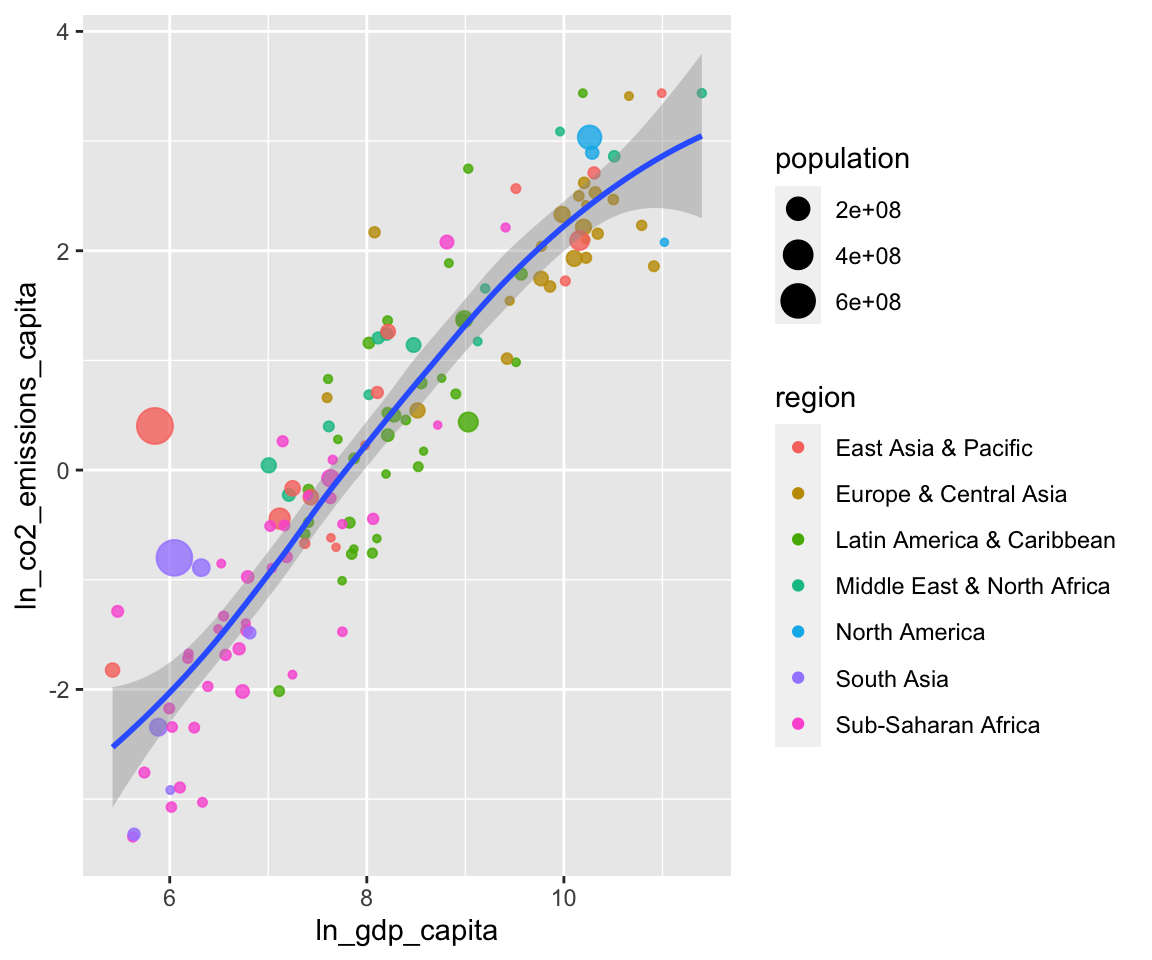
observations from 2014. Based on our argument above, the relation should also
hold over longer periods. Let’s see how it looks like when we look at 1980. To
do so, just copy and paste the chunk above and change the sample screen to be
"1980".
df <- smp
df <- df[df$year == "1980", ]
df <- df[, c("country", "year", "ln_gdp_capita",
             "ln_co2_emissions_capita", "region", "population")]
df <- df[complete.cases(df), ]
df$region <- as.factor(df$region)
prepare_scatter_plot(df, "ln_gdp_capita", "ln_co2_emissions_capita",
                     color = "region", size = "population", loess = 1)
## `geom_smooth()` using method = 'loess' and formula 'y ~ x'
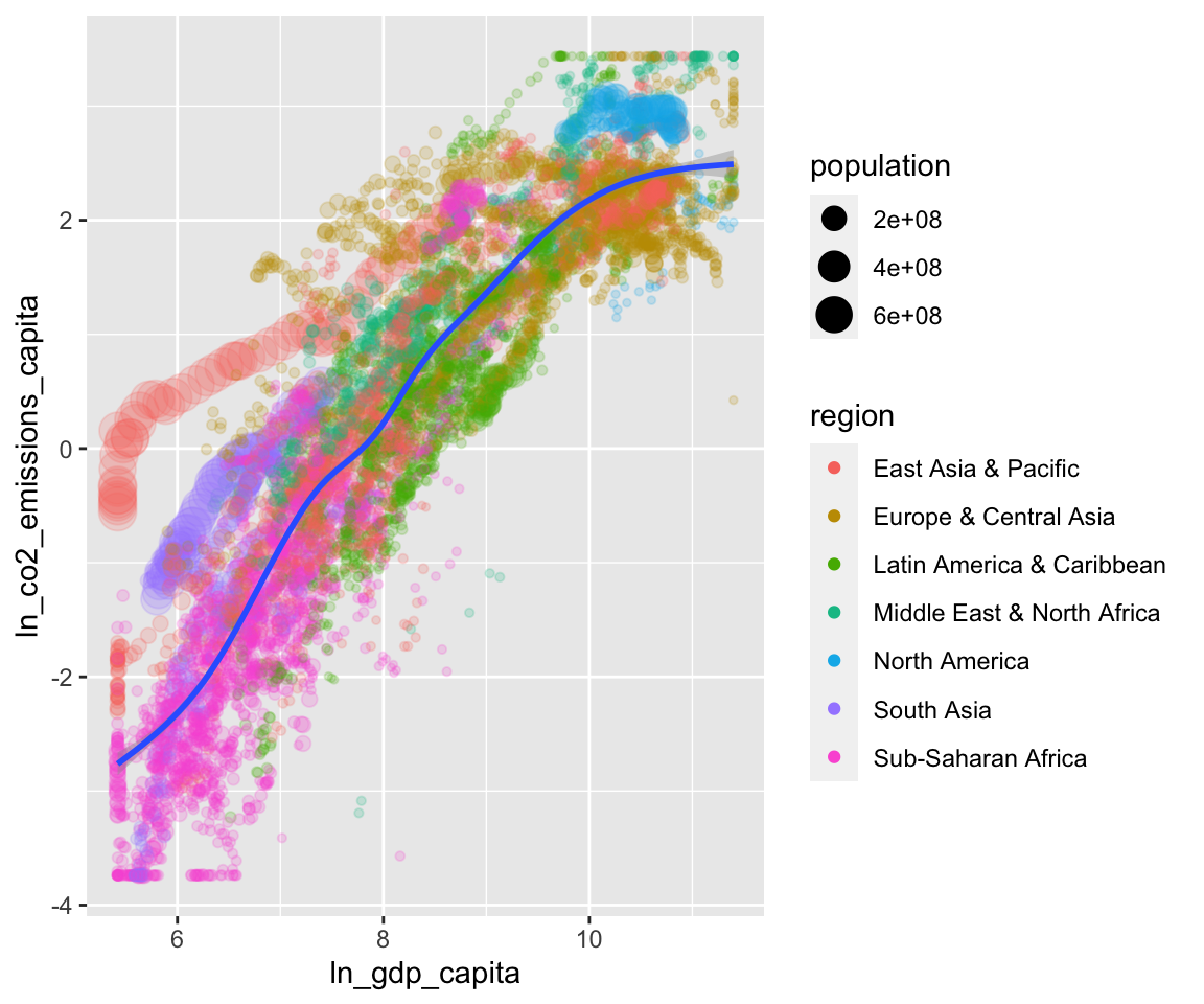
Seems to be the case. How does it look when we use all data (just remove the screen)?
df <- smp
df <- df[, c("country", "year", "ln_gdp_capita",
             "ln_co2_emissions_capita", "region", "population")]
df <- df[complete.cases(df), ]
df$region <- as.factor(df$region)
prepare_scatter_plot(df, "ln_gdp_capita", "ln_co2_emissions_capita",
                     color = "region", size = "population", loess = 1)
## `geom_smooth()` using method = 'gam' and formula 'y ~ s(x, bs = "cs")'
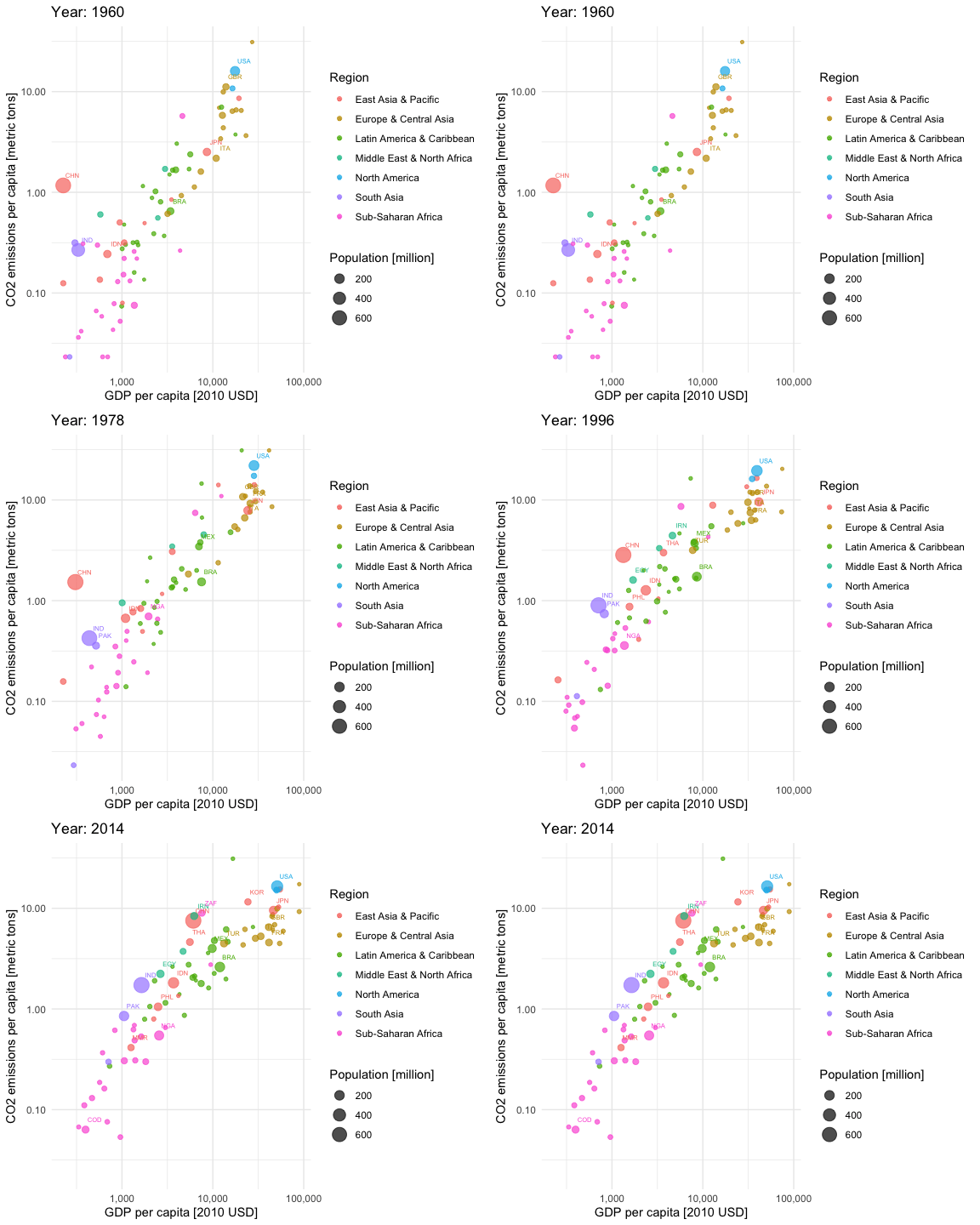
Looking at the whole data frame, the trajectories of the individual countries become apparent. The big red caterpillar to the left is China, the purple one below that is India and the Blue blob in the upper right is the U.S. This calls for a niced-up “Hans-Rosling-style” animation. Let’s do this.
library(gganimate)## Warning: package 'gganimate' was built under R version 3.6.2iso3c <- worldbank %>% select(iso3c, country) %>% distinct()
df <- smp %>% left_join(iso3c, by = "country")
df <- df[, c("iso3c", "country", "year", "gdp_capita",
"co2_emissions_capita", "region", "population")]
df <- df[complete.cases(df),] %>%
filter(year <= 2014) %>%
group_by(country) %>%
mutate(nobs = n()) %>%
ungroup() %>%
filter(nobs == max(nobs))
df$region <- as.factor(df$region)
df$year <- as.integer(as.character(df$year))
df$population <- df$population / 1e6
aplot <- ggplot(df, aes(gdp_capita, co2_emissions_capita,
size = population, colour = region)) +
geom_point(alpha = 0.7) +
scale_x_log10(labels = scales::comma) +
scale_y_log10(labels = scales::comma) +
scale_size_continuous(labels = scales::comma) +
labs(title = 'Year: {frame_time}',
x = 'GDP per capita [2010 USD]',
y = "CO2 emissions per capita [metric tons]",
color = "Region",
size = "Population [million]") +
theme_minimal() +
geom_text(data = subset(df, population > 50), aes(label = iso3c),
nudge_x = 0.1, nudge_y = 0.1, size = 2) +
transition_time(year) +
ease_aes('linear')
animate(aplot, start_pause = 20, end_pause = 20)
You see that most of the countries are moving to the upper right over time. This is good (higher economic productivity) and bad (higher CO2 emissions per capita) at the same time. Only very few European countries seem to be moving slightly downwards in later years, indicating reducing CO2 emissions per capita. It is a pity that the CO2 data provided by the World Bank currently stops in 2014.
Anyhow, you see that a notebook generated with a few clicks based on the interactive ExPanD analysis can serve as a starting point for a more in-depth analysis. Now it is your turn. Feel free to modify and extend your analysis along all possible dimensions. Code away and enjoy!
