It started as a Christmas present and ended up to be a fun case study on the productive boost of the open source community. Use R and shiny to hack the LEGO Art Beatles set to become a Stones set!
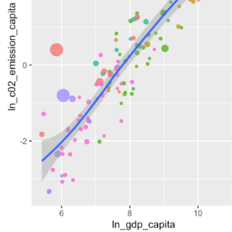
Assume that you have some new data that you want to explore. The new CRAN version of the ‘ExPanDaR’ package helps by providing a (customized) R notebook containing all building blocks of an exploratory data analysis with a few clicks. Let me show you how to do this by taking a quick look at country-level CO2 emissions.
Closing down for the year, I finally wrapped up a new ‘ExPanDaR’ version that now allows exploring all sorts of data interactively and generates notebooks containing the analysis on the fly. So here comes my little Christmas present for the wonderful RStats community!
When starting a course you want to learn something about the background of your students. What do you do when the course is too large for an introduction round? Run a shiny survey!
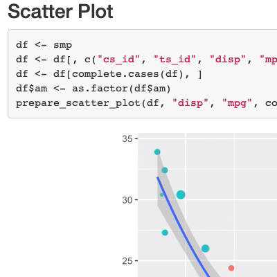
The new version of the ‘ExPanDaR’ package will include the option to export your explorative data analysis to an R Notebook. This Notebook can then be used to extend your analysis. Let me show you how to do this.
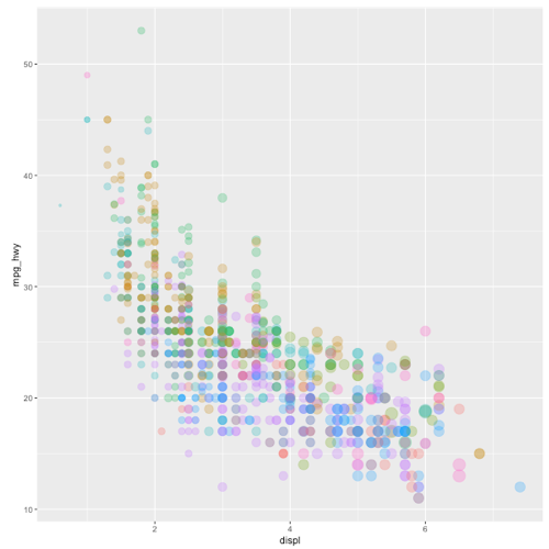
Interactive EDA is nice but customized interactive EDA is even nicer. To celebrate the new CRAN version of my ‘ExPanDaR’ package I prepare a customized variant of ‘ExPanD’ to explore the U.S. EPA data on fuel economy
Classroom experiments are a great way to communicate insights and shiny is a fantastic tool to develop interactive data displays. Linking the two together, you can build a unique experience for your students!
I recently included the new Our World in Data data on Covid-19 hospitalizations and the vaccination progress around the world in the {tidycovid19} package. What was meant to be a short info post for package users turned into a mini case on “outliers”.
Thankfully, the OWID team makes their Covid-19 data available in a well-maintained and documented form on Github so that importing and merging it into the data that the package offers is a breeze.
LEGO Mosaics have been around for a while and there is the wonderful {bricksr} package by Ryan Timpe that makes it easy to construct them based on bitmap images. So, when I ran across the relatively new LEGO Art theme sets, I was instantly hooked. The current situation favors contemplative indoor activities and puzzling some mosaics over the Holidays sounded nice.
The only drawback was that the ‘The Beatles’ Art set is the one whose color palette I found most appealing but, having tremendous respect for the fab four and all, I am more of a Stones person.
The idea OK. We are at home. Again. Given that large parts of Europe and the U.S. are currently experiencing a second large wave of Covid-19 cases and that most European jurisdictions have reacted with more or less rigorous lockdown regulations, one wonders about the effects of these regulations on social distancing compared to the one in March/April. In a recent TRR 266 workshop on data visualization, we (Astrid and Joachim) used this setting to discuss a workflow on how to let data speak graphically.
A recent update to the {tidycovid19} package brings data on testing, alternative case data, some regional data and proper data documentation. Using all this, you can use the package to explore the associations of (the lifting of) governmental measures, citizen behavior and the Covid-19 spread.
Installation The Package is hosted on Github. As the underlying data sources change their format and access methods often, I have no plans to publish the package on CRAN for the time being.
As a package maintainer you might be observing an increasing number of questions raised by people that have recently migrated to R 4.0.0 and are now trying to get your package to work. Yet, rhub::check_with_rrelease() currently still uses R 3.6.3 as test base. While migrating to a new R version is always tempting maybe you don’t feel like disrupting your development environment just now as you have even more fun things to do.
As the Covid-19 pandemic is affecting more and more countries around the globe, I included additional visualizations options into the {tidycovid19} package so that it becomes easier to compare the spread of the virus across countries. Also, I use this post to take a quick look on some countries that start lifting their governmental measures. See for yourself:
As we all know, the Covid-19 pandemic spreads around the globe. While traditional time-series based displays (like the ones provided by plot_spread_covid19() and show-cased in this blog post and this shiny app are very helpful to study the spread of the virus over a limited set of countries, the graphs quickly become overwhelming when you want to compare multiple countries.
Yesterday, I came across the Google “COVID-19 Community Mobility Reports“. In these reports, Google provides some statistics about changes in mobility patterns across geographic regions and time. The data seem to be very interesting to assess the extent of how much governmental interventions and social incentives have affected our day-to-day behavior around the pandemic. Unfortunately, the data comes in by-country PDFs. What is even worse, the daily data is only included as line graphs in these PDFs.
Setting up the stage Everybody seems to be starring at plots outlining the spread of the pandemic these days. One thing that caught my interest is how relative small differences in design choices can influence the message that a visual displays. Using the ‘Financial Times Plots’ graphs developed by John Burn-Murdoch as an example, I explore the visualizer degrees of freedom.
I use my {tidycovid19} package to pull and plot the data.
Exploring and Benchmarking Oxford Government Response Data Assessing the impact of Non-Pharmaceutical Interventions on the spread of Covid-19 requires data on Governmental measures. Luckily, the Assessment Capacities Project (ACAPS) and the Oxford Covid-19 Government Response Tracker both provide such data. In this blog post, I explore the new data provided by the Oxford initiative and compare it against the data provided by ACAPS that is already included in my {tidycovid19} package that offers download handles and some visualization tools for Covid-19 related data.
I have decided that the world needs another Covid-19 related R package. Not sure whether you agree, but the new package facilitates the direct download of various Covid-19 related data (including data on governmental measures) directly from authoritative sources. It also provides a flexible function and accompanying shiny app to visualize the spreading of the virus. Play around with the shiny app here if you like or hang around to learn more about the package.