Merge Covid-19 Data with Governmental Interventions Data
Update 2020-03-30: I have decided that the world needs another Covid19 related R package. Not sure whether you agree, but the new package facilitates the direct download of various Covid-19 related data (including data on governmental measures) directly from the authoritative sources. A short blog post about it can be found here. It also provides a flexible function and accompanying shiny app to visualize the spreading of the virus. Play around with the shiny app here if you like. The repo below stays in place for those of you that rather want to take data collection in their own hands. Please feel free to fork and explore. Stay well and keep #FlattenTheCurve!
Disclaimer: I am not an epidemiologist so I will abstain from analyzing the spread of the disease or estimating the effects of non-pharmaceutical interventions. As an applied economist, however, I study the economic effects of regulatory interventions, and thus feel confident to make some general remarks about why it is complicated to assess the causal effect of regulatory interventions.
Besides this, I am leading the Open Science Data Center (OSDC) of the collaborative research center TRR 266 Accounting for Transparency, which is funded by the German Science Foundation (DFG). The OSDC has the objective to make research transparent in a way that others can contribute and collaborate. This is the spirit that motivated me to write this blog post and to set up its repository. I hope that it might be helpful for others that are interested in doing research on the Covid 19 pandemic by promoting the benefits of open science.
While analyzing the data on the virus spread from the Johns Hopkins University can be insightful, one of the most pressing questions that we currently face is whether the non-pharmaceutical inventions (NPIs) that we observe around the globe will eventually be effective to contain the spread of the virus, aka to #FlattenTheCurve.
While it is most likely too early to tell (also see below), one key requirement for such analyses is the availability of both, high quality data on the virus spread at country and regional level as well as finely grained data on governmental measures that implement (and enforce) these non-pharmaceutical interventions.
Data on the spread of SARS-CoV-2 is readily available, thanks to the effort of the Johns Hopkins CSSE team. However, it is much harder to obtain high quality information on NPIs. While I was searching through various web resources, luckily, I received the new edition of the fabulous ‘Data are Plural’ newsletter by Jeremy Singer-Vine. It contained two pointers to NPI data and after a quick screening of those along the ones that I was able to detect (full list in the Github repository), I decided to settle with the data provided by the Assessment Capacities Project (ACAPS) as this dataset seems well maintained and also reasonably well documented.
The code to pull the data is provided in the Github repository that I generated along with this post. Besides the data sources mentioned above it also includes additional country level information provided by the World Bank. These data allow researchers to calculate per capita measures of the virus spread and to assess the association of macro-economic variables with the development of the virus.
The code directory in the repository contains the following R code files:
import_jhu_csse_covid19_data.RImports the JHU CSSE data on the global spread of the Covid-19 pandemic, aggregates the data at the country level, and adds ISO3c country indicators. See this blog post for more information on the code.import_acaps_npi.RImports the ACAPS Government measures data, and fixes some minor inconsistencies in the category labels.import_wbank_data.RImports current country-level World Bank data.merge_data.RMerges data from the three data sources into a country-day panel data set.descriptive_analyses.R: Generates some descriptive visualizations of the data, some of which you see below. You can use it as a starting point for your own analyses.
While I will not replicate the data retrieval and merging code in this blog post I will show you what you can do with the merged data by providing some descriptives on governmental NPIs.
My analysis is based on the data as generated by the code of the repository at March 27, 2020. While these data are not included in the repository, you can download them as indicated by the code below.
suppressPackageStartupMessages({
  library(tidyverse)
  library(lubridate)
  library(gghighlight)
  library(ggrepel)
})
## Warning: package 'ggplot2' was built under R version 3.6.2## Warning: package 'tibble' was built under R version 3.6.2## Warning: package 'tidyr' was built under R version 3.6.2## Warning: package 'readr' was built under R version 3.6.2## Warning: package 'purrr' was built under R version 3.6.2## Warning: package 'dplyr' was built under R version 3.6.2## Warning: package 'lubridate' was built under R version 3.6.2merged <- read_csv("https://joachim-gassen.github.io/data/merged_data_2020-03-27.csv",
col_types = cols()) %>%
mutate(date = ymd(date))
read_csv("https://joachim-gassen.github.io/data/npi_acaps_2020-03-27.csv",
col_types = cols()) %>%
mutate(npi_date = ymd(date_implemented)) %>%
rename(npi_type = category) %>%
mutate(
npi_regional = !is.na(admin_level_name),
npi_targeted_pop_group = targeted_pop_group == "Yes",
npi_lockdown = str_detect(measure, "General lockdown")
) %>%
select(iso3c, npi_date, npi_type, npi_regional,
npi_targeted_pop_group, npi_lockdown) -> npiAs a first question, let’s see how these interventions distribute across calendar time.
ggplot(npi, aes(x = npi_date, fill = npi_type)) +
  geom_bar(position = "stack") + theme_minimal() +
  labs(title = "Implementation of Interventions over Calendar Time",
       x = "Date",
       y = "Number of interventions")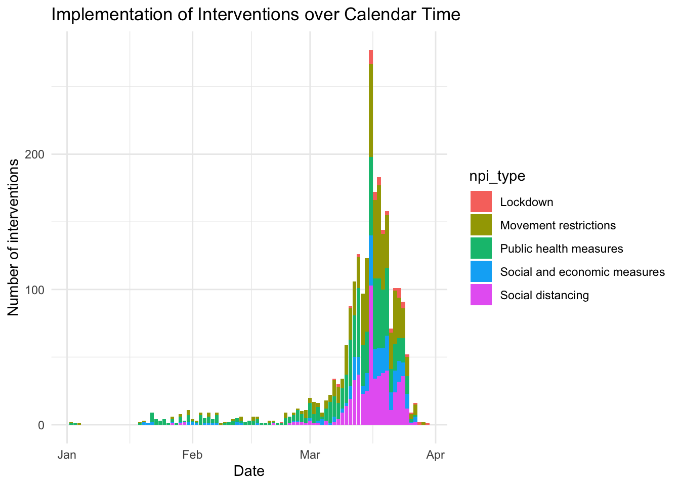
And now: How does this look in event time, meaning normalized to the respective country’s outbreak timing? I use the day where the number of deaths reaches 10 as event day zero.
merged %>%
  group_by(iso3c) %>%
  filter(deaths >= 10) %>%
  summarise(edate = min(date)) -> ctry_edate
## `summarise()` ungrouping output (override with `.groups` argument)merged %>%
select(iso3c, country) %>%
unique() -> ctry_names
npi %>%
left_join(ctry_edate, by = "iso3c") %>%
filter(!is.na(edate)) %>%
mutate(npi_edate = as.numeric(npi_date - edate)) %>%
left_join(ctry_names, by = "iso3c") %>%
select(iso3c, country, npi_date, npi_edate, npi_type, npi_lockdown) -> npi_edates
lab_x <- "Days relative to the date where the number of deaths reached 10"
ggplot(npi_edates, aes(x = npi_edate, fill = npi_type)) +
geom_bar(position = "stack") + theme_minimal() +
labs(title = "Implementation of Interventions over Time",
x = lab_x,
y = "Number of interventions")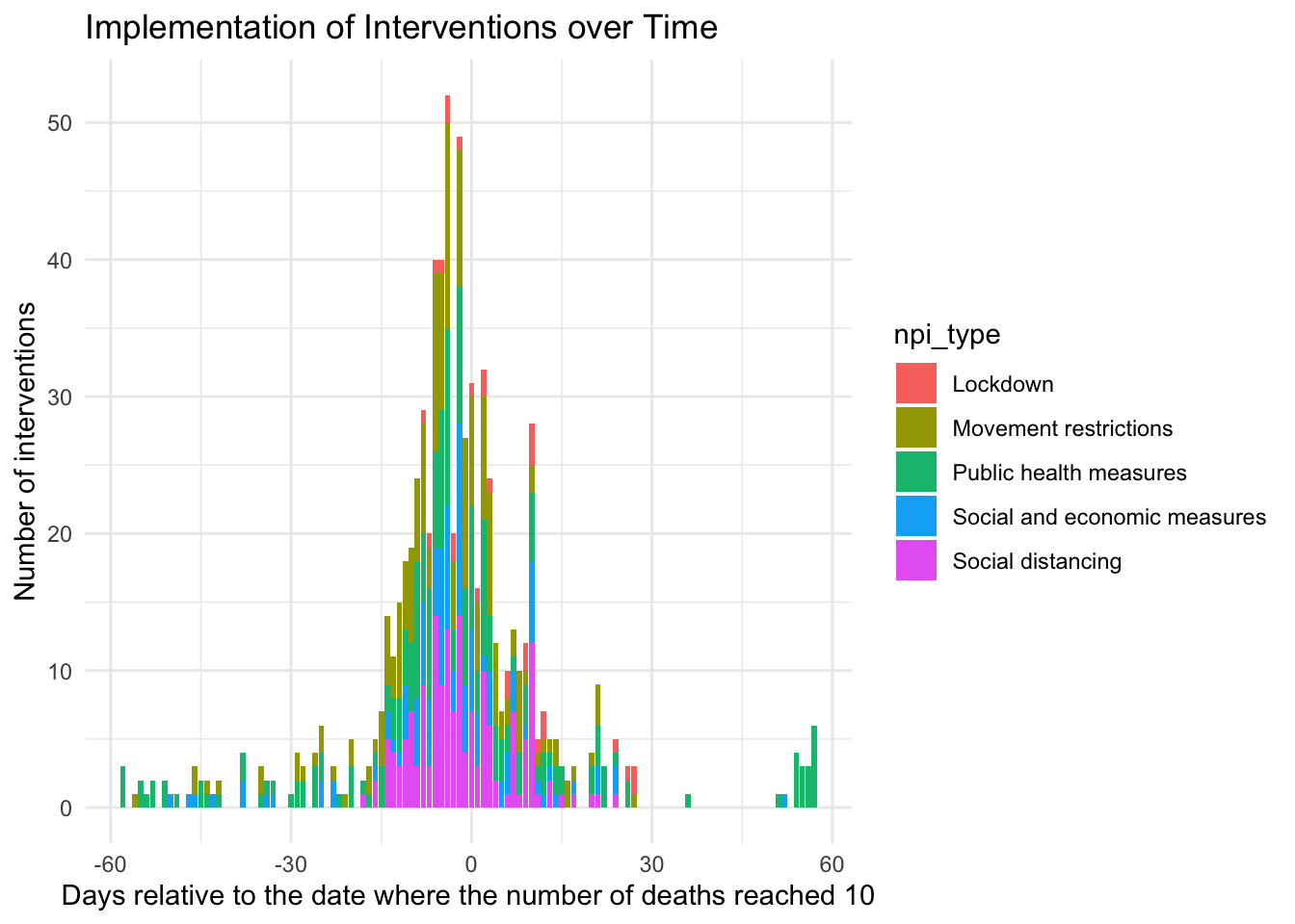
You can clearly see from the histograms that NPIs are clustered both in calendar time and event time. This makes it harder to separate their effects from each other, yielding a lower test power. Based on the graphs, it is hard to tell the different interventions types apart. For this, you can use the next display.
npi_edates %>%
  group_by(npi_edate, npi_type) %>%
  summarise(
    npi_count = n()
  ) %>%
  ungroup() %>%
  arrange(npi_type, npi_edate) %>%
  group_by(npi_type) %>%
  mutate(npi_count =  cumsum(npi_count)) %>%
  complete(npi_edate = min(npi_edates$npi_edate):max(npi_edates$npi_edate)) %>%
  fill(npi_count) %>%
  replace_na(list(npi_count = 0)) %>%
  ggplot(aes(x = npi_edate, fill = npi_type, y = npi_count)) +
  theme_minimal() + labs(
    x = lab_x,
    y = "Percentage share of all interventions at event date",
    fill = "Intervention type"
  ) +
  geom_area(position = "fill") +
  scale_y_continuous(labels = scales::percent)
## `summarise()` regrouping output by 'npi_edate' (override with `.groups` argument)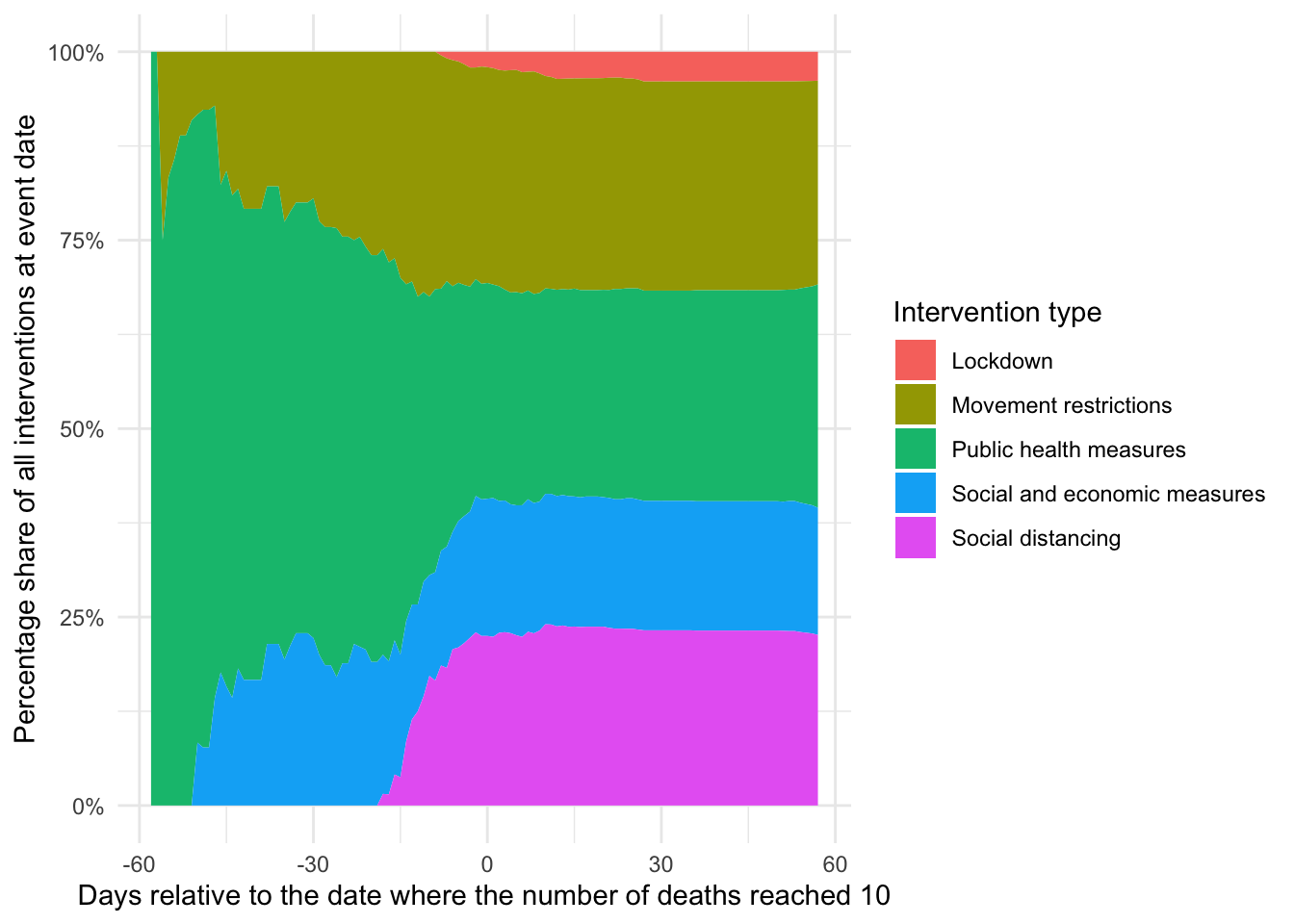
You can see that, in particular, lockdown and social distancing measures are heavily clustered around the two weeks of day zero while socio-economic and public health measures are mostly taken earlier, similar to movement restrictions. This is in inline with governments taking less intrusive measures earlier and hints at the non-randomness of interventions (more on that below).
I will now focus on two types of measures that have been argued to be particular important to flatten the curve: Social distancing and the general lockdown of a country. First let’s see, based on ACAPS data, which countries have more social distancing measures in place and which countries have implemented a lockdown?
merged %>%
  inner_join(ctry_edate, by = "iso3c") %>%
  mutate(edate = as.numeric(date - edate)) %>%
  group_by(iso3c) %>%
  mutate(
    lockdown_ctry = max(lockdown) > 0,
    soc_dist_ctry = max(soc_dist)
  ) %>%
  ungroup() %>%
  mutate(soc_dist_ctry = soc_dist_ctry > median(soc_dist_ctry)) -> df

df %>%
  select(country, soc_dist_ctry, lockdown_ctry) %>%
  unique() %>%
  arrange(country) -> npi_ctry

ggplot(npi_ctry, aes(x = soc_dist_ctry, y = lockdown_ctry)) +
  geom_label_repel(aes(label = country)) +
  theme_minimal() +
  labs(
    x = "More than median amount of social distancing measures",
    y = "Lockdown initiated",
    caption = paste0(
      "Government intervention measures as provided by ",
      "Assessment Capacities Project (ACAPS). Data as of March 27, 2020.\n",
      "All countries with 10 or more reported deaths are included. ",
      "Code: https://github.com/joachim-gassem/tidy_covid19"
    )
  )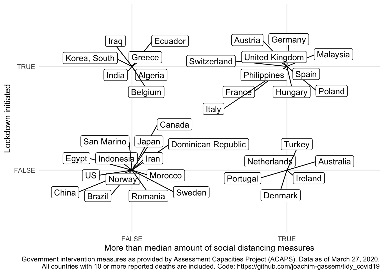
When you look at the data and are somewhat familiar with the activities that several countries have taken, you might be surprised by some of the data points. As an example: No lockdown in China? It seems important to note that coding NPIs is far from trivial and that the ACAPS data provide much more detail on the measures than I use here. You are encouraged and advised to use this richness of the data for your own analyses. In particular, I hope that more regional-level analyses will allow us to assess the effects of NPIs in the future.
As a last step, I would like to provide to visuals to explain why it seems too early (for me) to assess the effectiveness of NPIs at the country level. For that, I use the grouping of countries of the last chart and plot the event daily mean percentage increase in recorded deaths for each group. I require each group to have at least five countries and I calculate the averages by event date as, luckily, there seems to be an overall declining trend of death growth rates over time in the data.
First, let’s compare countries with more social distancing measures with countries that have less social distancing measures in place.
compare_death_growth <- function(df, var) {
  lab_caption <- paste0(
    "Deaths data as provided by Johns Hopkins University Center for Systems Science ",
    "and Engineering (JHU CSSE).\nGovernment intervention measures as provided by ",
    "Assessment Capacities Project (ACAPS). Data as of March 27, 2020.\n",
    "At least five daily country-level observations required by group for ",
    "estimation. Code: https://github.com/joachim-gassem/tidy_covid19"
  )
  lab_color <- case_when(
    var == "soc_dist_ctry" ~
      "More than median amount of\nsocical distancing measures",
    var == "lockdown_ctry" ~ "Lockdown initiated",
    TRUE ~ var
  )
  df %>%
    mutate(pct_inc_deaths = deaths/lag(deaths) - 1) %>%
    filter(edate >= 0) %>%
    group_by(edate, !! sym(var)) %>%
    filter(n() >= 5) %>%
    summarise(
      mean = mean(pct_inc_deaths),
      std_err = sd(pct_inc_deaths)/sqrt(n()),
      n = n()
    ) %>%
    ggplot(aes(x = edate, y = mean, color = !! sym(var))) +
    geom_pointrange(
      aes(ymin = mean-1.96*std_err, ymax = mean+1.96*std_err),
      position=position_dodge(0.4)
    ) + labs(
      x = lab_x,
      y = "Average daily percentage increase in reported deaths by group",
      caption = lab_caption,
      color = lab_color
    ) +
    theme_minimal() +
    theme(
      legend.position = c(0.75, 0.75),
      plot.title.position = "plot",
      plot.caption.position =  "plot",
      plot.caption = element_text(hjust = 0),
      axis.title.x = element_text(hjust = 1),
      axis.title.y = element_text(hjust = 1),
    ) +
    scale_y_continuous(labels = scales::percent)
}

compare_death_growth(df, "soc_dist_ctry")
## `summarise()` regrouping output by 'edate' (override with `.groups` argument)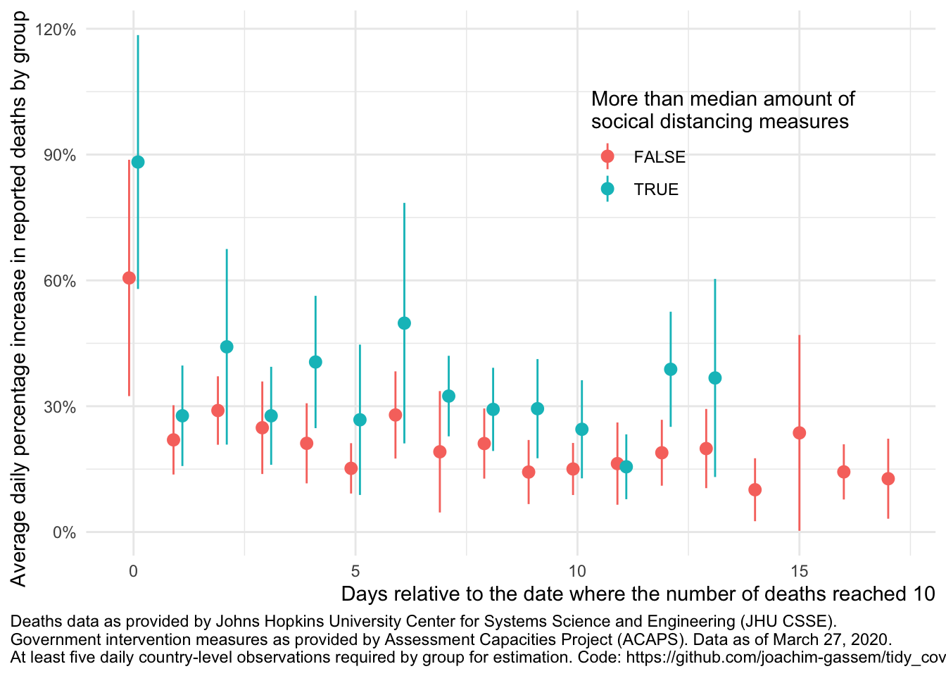
The first thing that you see is that we only have very few data points with overlapping data (13 to be precise). Also, you see the wide and overlapping standard errors. This translates to: At least using such highly aggregated data, it is much too early to assess the impact of government measures on the spread of the virus.
Another thing that you can glance from the data is that, on average, countries with more social distancing measures seem to have higher death growth rates. Why is that? While I want to abstain from interpreting exploratory displays a potential explanation is that countries facing a faster spread of the virus are likely to adopt more rigid measures of social distancing. This non-randomness of governmental interventions is a common issue in regulatory intervention studies and makes it harder to assess the causal effect of regulatory interventions.
Finally, let’s compare this to the graph separating the death growth rates of countries with and without governmental lockdowns:
compare_death_growth(df, "lockdown_ctry")## `summarise()` regrouping output by 'edate' (override with `.groups` argument)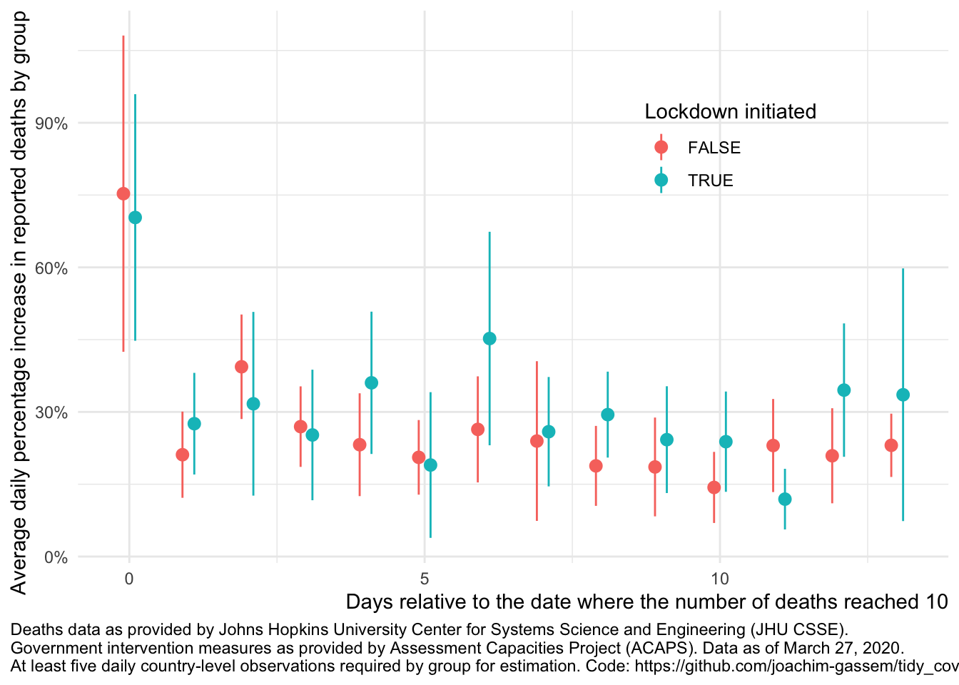
As you can see, the graph looks reasonably similar. We will have to wait until we eventually can learn how the interventions have affected the spread of the virus.
Wrapping up
All the code to pull the data and to run the analyses of this post and also my prior post are available in the Github repository of this post. I designed the repository in a way that should make it straight-forward for you to base your own analysis on it. Just fork it and code away. However, please remember:
- Predicting the development of the virus and assessing the effects of NPIs requires domain knowledge. Let’s keep this job with the Epidemiologists!
- Open Science implies that you share and contribute. If you find something odd in the underlying data or my code, please share it with the responsible parties.
- Give credit where credit is due. Always provide references to the original data suppliers.
- And finally: Stay healthy and continue to help #FlattenTheCurve!
