German Female Corporate Officers: Where Are You?
Last week, the German NGO Open Knowledge Foundation Deutschland e.V. has made German Trade Resister data available via the project OffeneRegister.de, together with the British NGO opencorporates. In my last blog post I checked the general accessibility of the data. In this quick follow-up post I follow an idea inspired by a tweet by Johannes Filter to map the gender balance of German corporate officers.
Here is the code for generating the necessary data. I focus on non-dismissed officers and use a first name list which originates from a list provided by a German computer magazine (c’t) and maintained by Matthias Winkelmann. This is not perfect but the best that I can do, given the data. I eliminate names that have duplicate gender classifications.
library(DBI)
library(tidyverse)
library(ggmap)
library(rgdal)
library(rgeos)

# You will also need the packages R.utils, maproj, and RSQLite to run this code

tmp <- tempdir()
download.file("https://daten.offeneregister.de/openregister.db.gz",
              destfile = file.path(tmp, "openregister.db.gz"))
db <- R.utils::gunzip(file.path(tmp, "openregister.db.gz"))
con <- dbConnect(RSQLite::SQLite(), db)
sql <- "select id, company_number as company_id, current_status, retrieved_at, registered_address from company"
res <- dbSendQuery(con, sql)
company <- dbFetch(res)
dbClearResult(res)
sql <- "select id as officer_id, company_id, firstname, start_date, end_date, dismissed from officer"
res <- dbSendQuery(con, sql)
officer <- dbFetch(res)
dbClearResult(res)
dbDisconnect(con)
company %>%
filter(current_status == "currently registered",
!is.na(registered_address)) %>%
mutate(plz = str_extract(registered_address, "\\d{5}")) %>%
filter(plz != "") %>%
select(company_id, plz) -> company_plz
officer %>%
filter(firstname != "",
!is.na(firstname),
is.na(dismissed)) -> officer_firstname
company_plz %>%
left_join(officer_firstname) %>%
filter(!is.na(firstname)) -> company_firstname
nl <- read_csv2("https://raw.githubusercontent.com/MatthiasWinkelmann/firstname-database/master/firstnames.csv") %>%
rename(firstname = name) %>%
select(firstname, gender) %>%
group_by(firstname) %>%
filter(n() == 1) %>%
ungroup()
company_firstname %>%
left_join(nl) %>%
filter(gender == 'M' | gender == 'F') -> plz_name_genderThe overall share of female officers in Germany based on this classification is 17%. How does this share vary across German regions? Let’s get some OSM shape data.
# Shape file is based on OSM data.
# Source: https://www.suche-postleitzahl.org/downloads

download.file("https://www.suche-postleitzahl.org/download_files/public/plz-gebiete.shp.zip",
              file.path(tmp, "shape5.zip"))
unzip(file.path(tmp, "shape5.zip"), exdir = tmp)
plz5_polys <- readOGR(file.path(tmp, "plz-gebiete.shp"))

download.file("https://www.suche-postleitzahl.org/download_files/public/plz-2stellig.shp.zip",
              file.path(tmp, "shape2.zip"))
unzip(file.path(tmp, "shape2.zip"), exdir = tmp)
plz2_polys <- readOGR(file.path(tmp, "plz-2stellig.shp"))
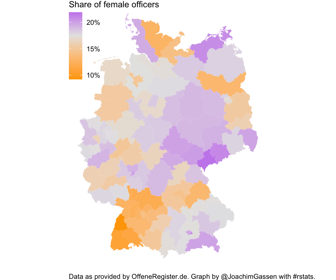
Now we can create maps. First at the post area level (identified by the first to digits of the PLZ).
plz_name_gender %>%
  mutate(plz2 = substr(plz, 1, 2)) %>%
  group_by(plz2) %>%
  summarise(nobs = n(),
            female = sum(gender == 'F')/n()) -> plz2_female_share

plz_map <- fortify(plz2_polys, region = "plz") %>%
  left_join(plz2_female_share, by = c("id" = "plz2"))

plz2_map <- ggplot(plz_map, aes(x = long, y = lat, group = group, fill = female)) +
  geom_polygon(colour = NA, lwd=0, aes(group = group)) +
  scale_fill_gradient2(name = "Share of female officers",
                       low = "orange", mid = "gray90", high = "purple",
                       midpoint = median(plz2_female_share$female, na.rm = TRUE),
                       breaks = 0.05*(2:4), labels = scales::percent(0.05*(2:4),
                                                                   accuracy = 1)) +
  coord_map() +
  theme_void() +
  theme(legend.justification=c(0,1), legend.position=c(0,1), plot.caption = element_text(hjust = 0)) +
  labs(caption = "Data as provided by OffeneRegister.de. Graph by @JoachimGassen with #rstats.")

plz2_map
This does not look good for Baden-Wuerttemberg. Also, the female officer share is larger in former East Germany (16.4 % vs. 17.8 %, Chi-Square test is highly significant). Without further analysis I can only guess that regions with significant tourist industry (Northern Mecklenburg-Vorpommern, Southern Bavaria) tend to have a higher share of female officers while areas with a significant agricultural sector (e.g., Northern Brandenburg) have lower female representation.
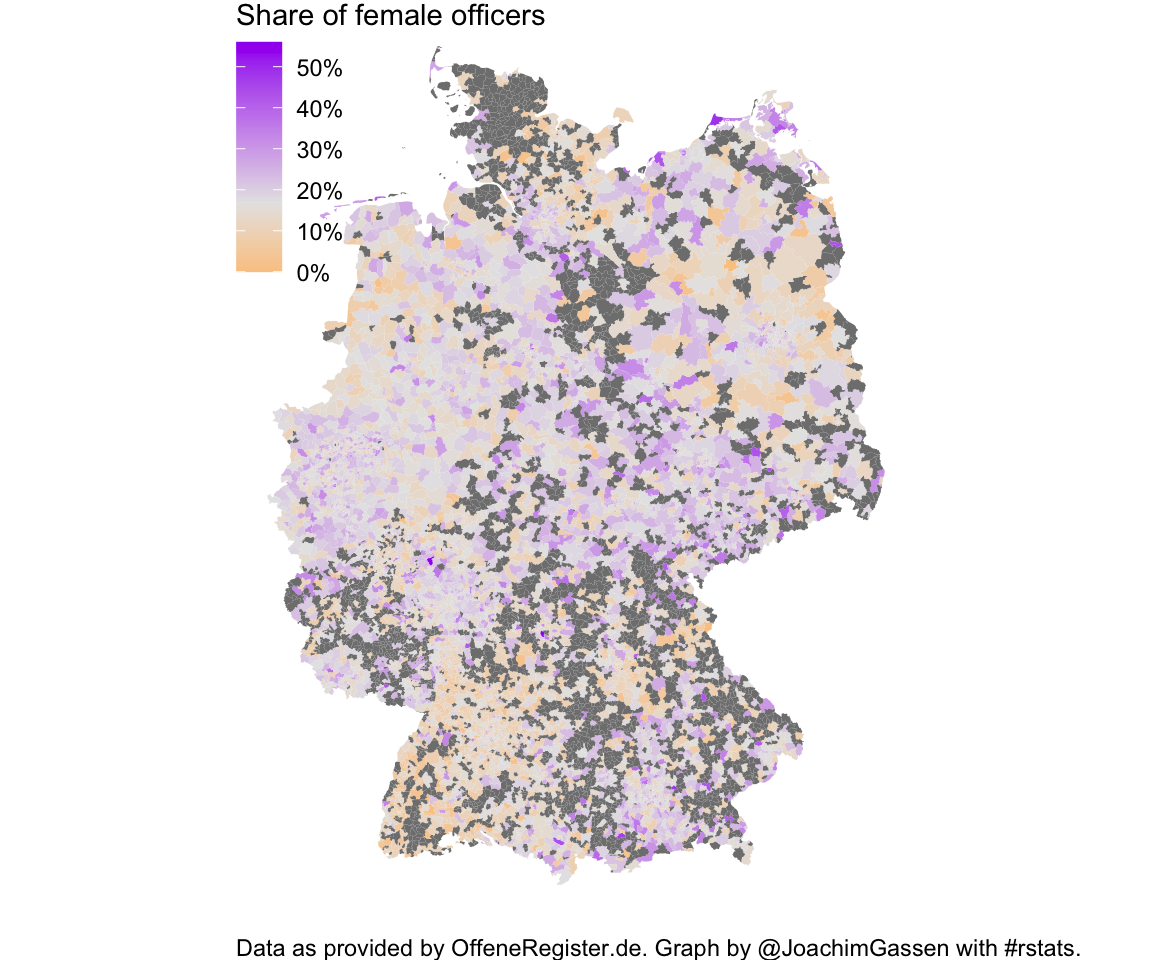
Can we say something when we look at a more granular level (PLZs instead of two digit PLZ regions)? Here I limit the data to PLZs that list at least 30 officers.
plz_name_gender %>%
  group_by(plz) %>%
  summarise(nobs = n(),
            female = sum(gender == 'F')/n()) %>%
  filter(nobs >= 30) -> plz_female_share

plz_map <- fortify(plz5_polys, region = "plz") %>%
  left_join(plz_female_share, by = c("id" = "plz"))

plz5_map <- ggplot(plz_map, aes(x = long, y = lat, group = group, fill = female)) +
  geom_polygon(colour = NA, lwd=0, aes(group = group)) +
  scale_fill_gradient2(name = "Share of female officers",
                       low = "orange", mid = "gray90", high = "purple",
                       midpoint = median(plz_female_share$female, na.rm = TRUE),
                       breaks = 0.1*(0:5), labels = scales::percent(0.1*(0:5),
                                                                   accuracy = 1)) +
  coord_map() +
  theme_void() +
  theme(legend.justification=c(0,1), legend.position=c(0,1), plot.caption = element_text(hjust = 0)) +
  labs(caption = "Data as provided by OffeneRegister.de. Graph by @JoachimGassen with #rstats.")

plz5_map
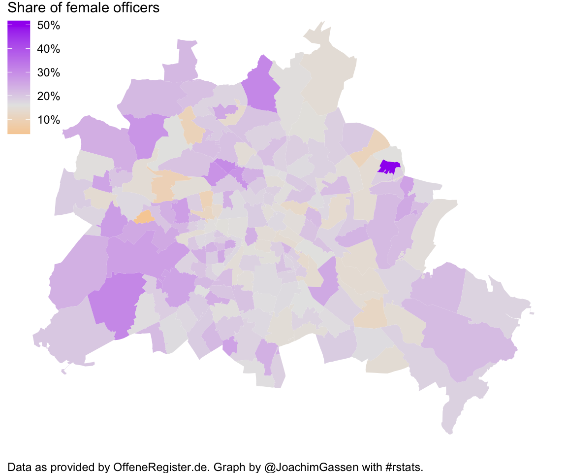
A similar but significantly more patchy picture surfaces. How does this look like when we focus on cities (e.g., Berlin)?
plz_name_gender %>%
  group_by(plz) %>%
  summarise(nobs = n(),
            female = sum(gender == 'F')/n()) -> plz_female_share

berlin_polys <- plz5_polys[str_detect(plz5_polys$note, "\\d{5} Berlin"), ]

plz_map <- fortify(berlin_polys, region = "plz") %>%
  left_join(plz_female_share, by = c("id" = "plz"))

berlin_map <- ggplot(plz_map, aes(x = long, y = lat, group = group, fill = female)) +
  geom_polygon(colour = NA, lwd=0, aes(group = group)) +
  scale_fill_gradient2(name = "Share of female officers",
                       low = "orange", mid = "gray90", high = "purple",
                       midpoint = median(plz_female_share$female, na.rm = TRUE),
                       breaks = 0.1*(0:5), labels = scales::percent(0.1*(0:5),
                                                                   accuracy = 1)) +
  coord_map() +
  theme_void() +
  theme(legend.justification=c(0,1), legend.position=c(0,1),
        plot.caption = element_text(hjust = 0)) +
  labs(caption = "Data as provided by OffeneRegister.de. Graph by @JoachimGassen with #rstats.")

berlin_map
Well… Not much interesting here (besides the ladies camp in Marzahn!) but maybe other cities/areas reveal more insightful patterns. I will leave this question to the interested reader.
