Global Lockdown Effects on Social Distancing: A Graphical Primer
The idea
OK. We are at home. Again. Given that large parts of Europe and the U.S. are currently experiencing a second large wave of Covid-19 cases and that most European jurisdictions have reacted with more or less rigorous lockdown regulations, one wonders about the effects of these regulations on social distancing compared to the one in March/April. In a recent TRR 266 workshop on data visualization, we (Astrid and Joachim) used this setting to discuss a workflow on how to let data speak graphically. This blog post, which is co-authored with Astrid van Kimmenade from Paderborn University, is based on the class’ main assignment.
About the workflow
As you see, we are using R for preparing the data and making the plots. This is by no means required. Any statistical software that is able to output vector graphics (e.g., PDF or SVG) will do. However, data visualization is one of the areas where R really shines. Many leading experts in data visualization use it as their statistical analysis tool of choice. See the wonderful textbook ‘Data Visualization: A Practical Introduction’ by Kieran Healy for a hands-on introduction on how to use R for data visualization.
When you prepare a data visualization for publication, you will most likely at some point want to move from statistical software to layout-centered tools. Illustrator from Adobe is the professional tool of choice here. It being commercially licensed and costly makes this somewhat inconvenient so you might want to check for Open Source alternatives. Feel free to use the comment function below if you happen to have any recommendations.
The data
We are using data provided by the {tidycovid19} Package. While there are many R packages floating around that can be used to obtain Covid-19 related data, the advantage of this package for our purpose is that it provides case data from the world-wide JHU CSSE Covid-19 repository as well as data on social movements as provided by Apple and Google and from various other data sources. Yes and it is Joachim’s first “lockdown baby” as part of the TRR 266 Open Science Data Center activities related to Covid-19, so there is that.
Prepping data
The first step of data analysis is always data preparation, including data cleaning and exploratory data analysis (EDA). It also entails carefully selecting and defining the variables that you want to display. If your data has a panel structure, you also might want to decide on its frequency.
In many cases, you will be preparing different variables for your conceptual measures. This is also the case here. We prep two country-daily measures for assessing the magnitude of the Covid-19 spread and two country-daily measures that aim to assess the extent of which people in a given country socially distance. For the former, we use the daily number of new cases and the number of new cases over the number of tests performed (percentage of positive tests). For the later, we use measures provided by Apple and Google. Apple reports the search usage of their map service for various categories. Google reports actual position data classified by the various location types. We average the measures over the location types that are positively associated with social distancing. All measures are smoothed over seven days to smooth-out week-daily fluctuations.
To focus the analysis on a meaningful and digestible number of countries, we apply two cleaning steps: First, we limit the analysis to countries with a population of more than 10 million that suffered at least 100 Covid19-related deaths per million inhabitants. This ensures that we limit the analysis on reasonably large countries that were significantly affected by Covid-19. Second, to focus on countries that experienced both, the March/April and the current wave, we restrict the sample to the countries that had a peak number of daily new infections higher than 30 per 100,000 inhabitants prior to April 2020.
library(tidyverse)
library(zoo)
library(tidycovid19)

df <- download_merged_data(cached = TRUE)

ctries <- df %>%
  group_by(iso3c) %>%
  filter(!is.na(deaths), population >= 10e6) %>%
  filter(date == max(date)) %>%
  summarise(deaths_per_mio_pop = deaths * 1e6/population) %>%
  filter(deaths_per_mio_pop > 100) %>%
  pull(iso3c)

ave_measures <- df %>%
  arrange(iso3c, date) %>%
  group_by(iso3c) %>%
  filter(iso3c %in% ctries) %>%
  mutate(
    new_cases = confirmed - lag(confirmed),
    total_tests = na.approx(total_tests, na.rm = FALSE),
    new_tests = total_tests - lag(total_tests),
    ave_pos_test_rate = rollsum(
      (confirmed - lag(confirmed))/new_tests,
      7, na.pad=TRUE, align="right"
    ),
    ave_new_cases_wk_per_100e5 = rollsum(
      new_cases*1e5/population, 7, na.pad=TRUE, align="right"
    ),
    ave_soc_dist_google = rollmean(
      (gcmr_retail_recreation +  gcmr_transit_stations +
        gcmr_workplaces)/3, 7, na.pad=TRUE, align="right"
    ),
    ave_soc_dist_apple = rollmean(
      (apple_mtr_driving + apple_mtr_walking + apple_mtr_transit)/3, 7, na.pad=TRUE, align="right"
    )
  ) %>%
  filter(
    max(
      (date < lubridate::ymd("2020-04-01")) *  ave_new_cases_wk_per_100e5,
      na.rm = TRUE
    ) > 30
  ) %>%
  select(
    iso3c, country, date, population, ave_new_cases_wk_per_100e5,
    ave_pos_test_rate, ave_soc_dist_apple, ave_soc_dist_google
  )

smp_countries <- unique(ave_measures$country)
Some exploratory plots
The first step of data visualization (and any data analysis, for this matter) is a quick’n’dirty set of exploratory visuals. You can also use the C02 ExPanD app or the package that it used to generate it for this. Here, we try to assess the development of our constructs of interest (Covid-19 spread and extent of social distancing) over time. Also, we eyeball the correlation of our two social distancing measures and the correlation of our two constructs.
ggplot(ave_measures, aes(x = date, color = iso3c)) +
  geom_line(aes(y = ave_new_cases_wk_per_100e5)) +
  theme_minimal()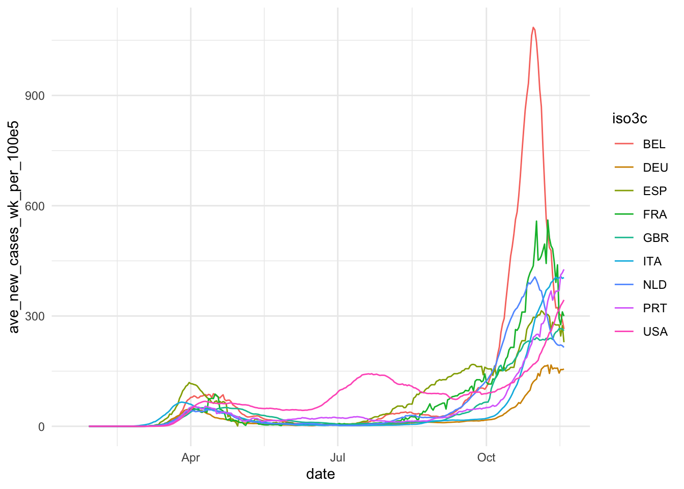
ggplot(ave_measures, aes(x = date, color = iso3c)) +
  geom_line(aes(y = ave_pos_test_rate)) +
  theme_minimal()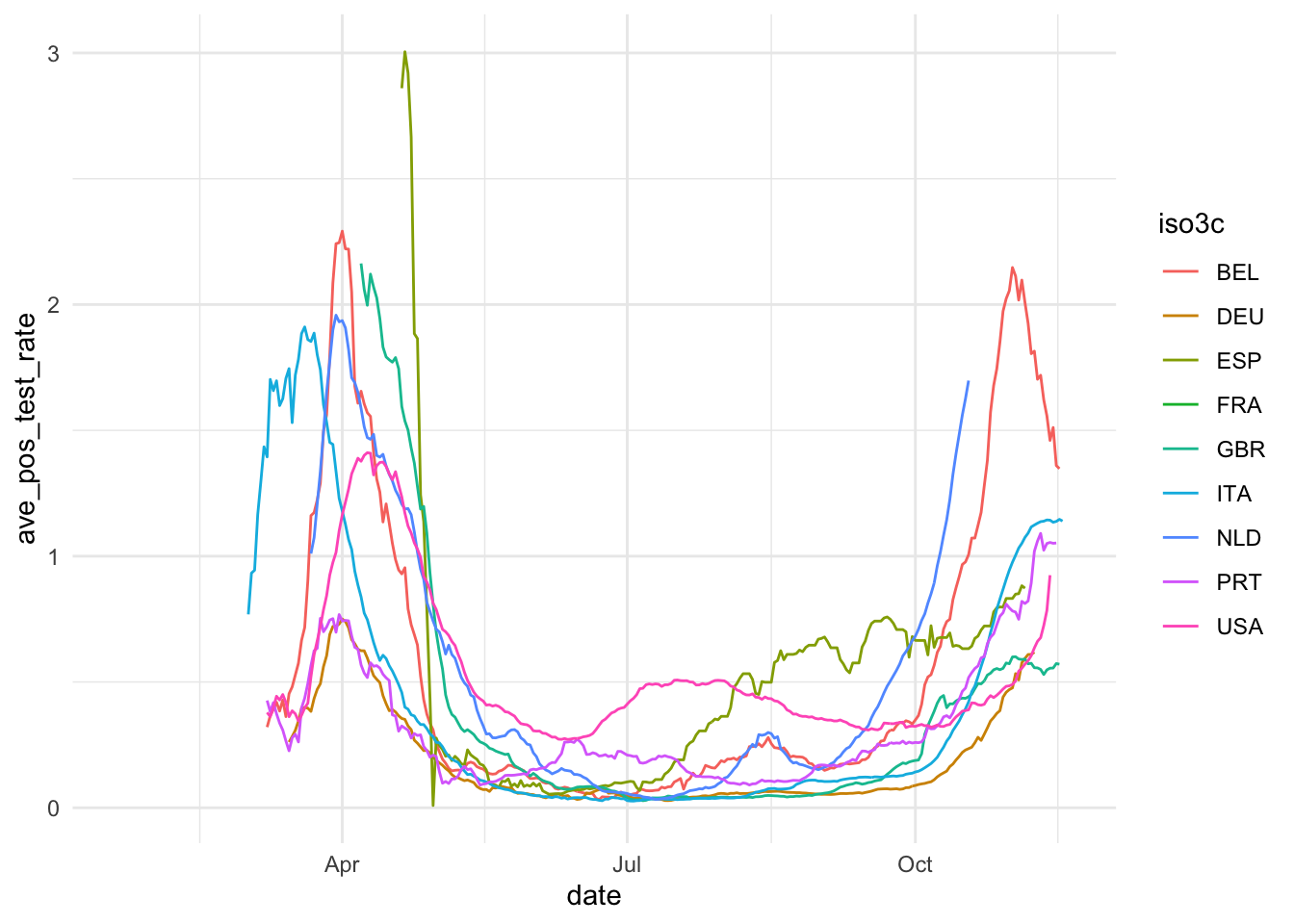
ggplot(ave_measures, aes(x = date, color = iso3c)) +
  geom_line(aes(y = ave_soc_dist_apple)) +
  theme_minimal()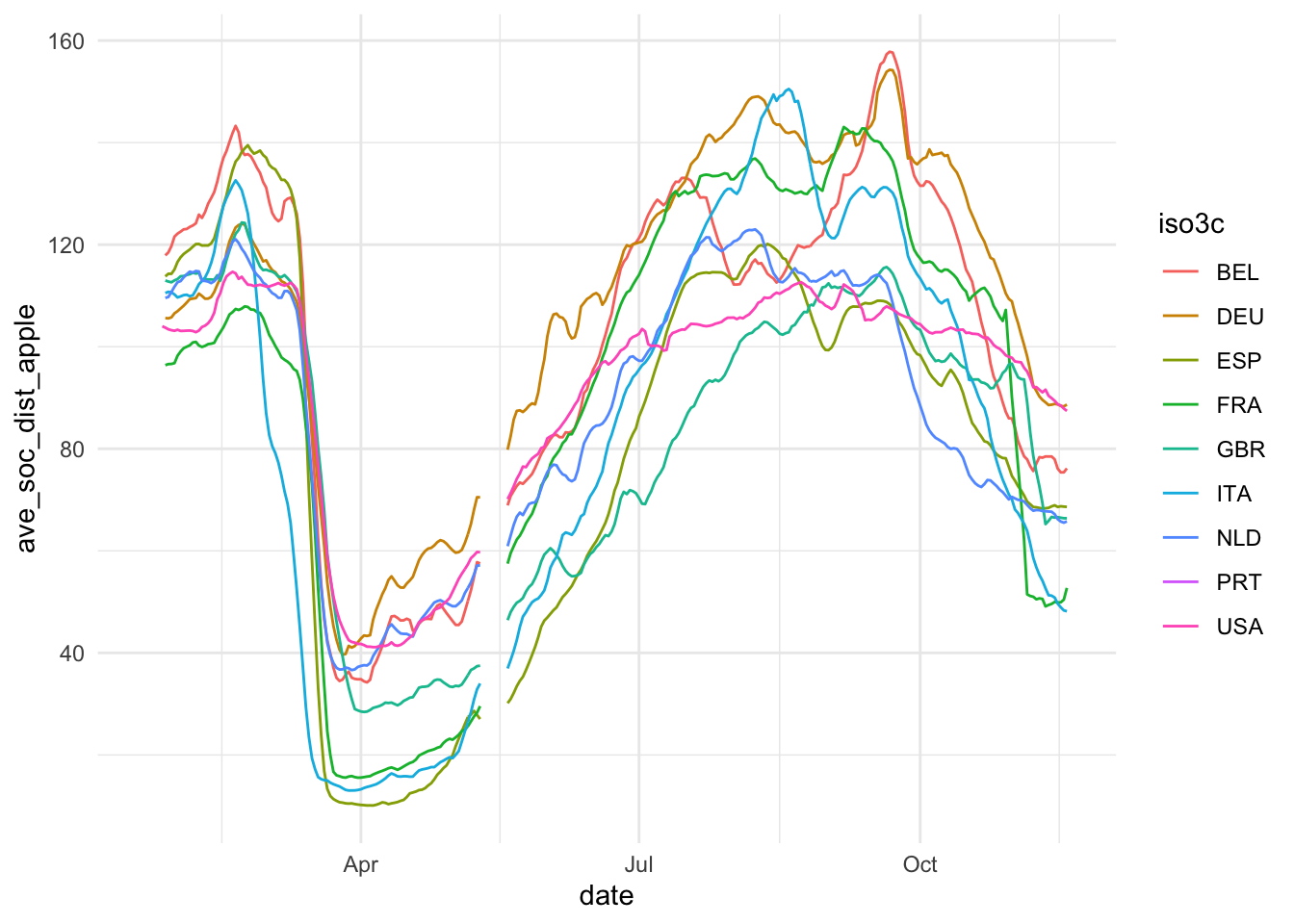
ggplot(ave_measures, aes(x = date, color = iso3c)) +
  geom_line(aes(y = ave_soc_dist_google)) +
  theme_minimal()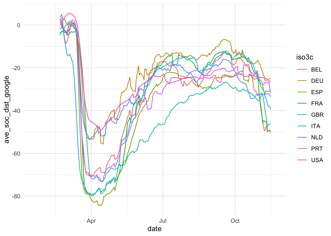
ggplot(
  ave_measures,
  aes(x = ave_soc_dist_apple, y = ave_soc_dist_google, color = iso3c)
) +
  geom_point(alpha = 0.2) +
  theme_minimal()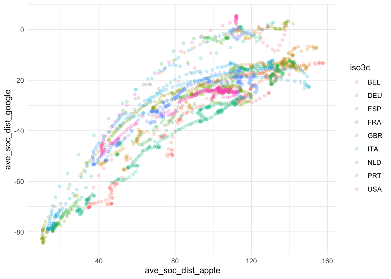
ggplot(
  ave_measures,
  aes(x = ave_new_cases_wk_per_100e5, y = ave_soc_dist_google, color = iso3c)
) +
  scale_x_continuous(trans = "log10") +
  geom_point(alpha = 0.2) +
  theme_minimal()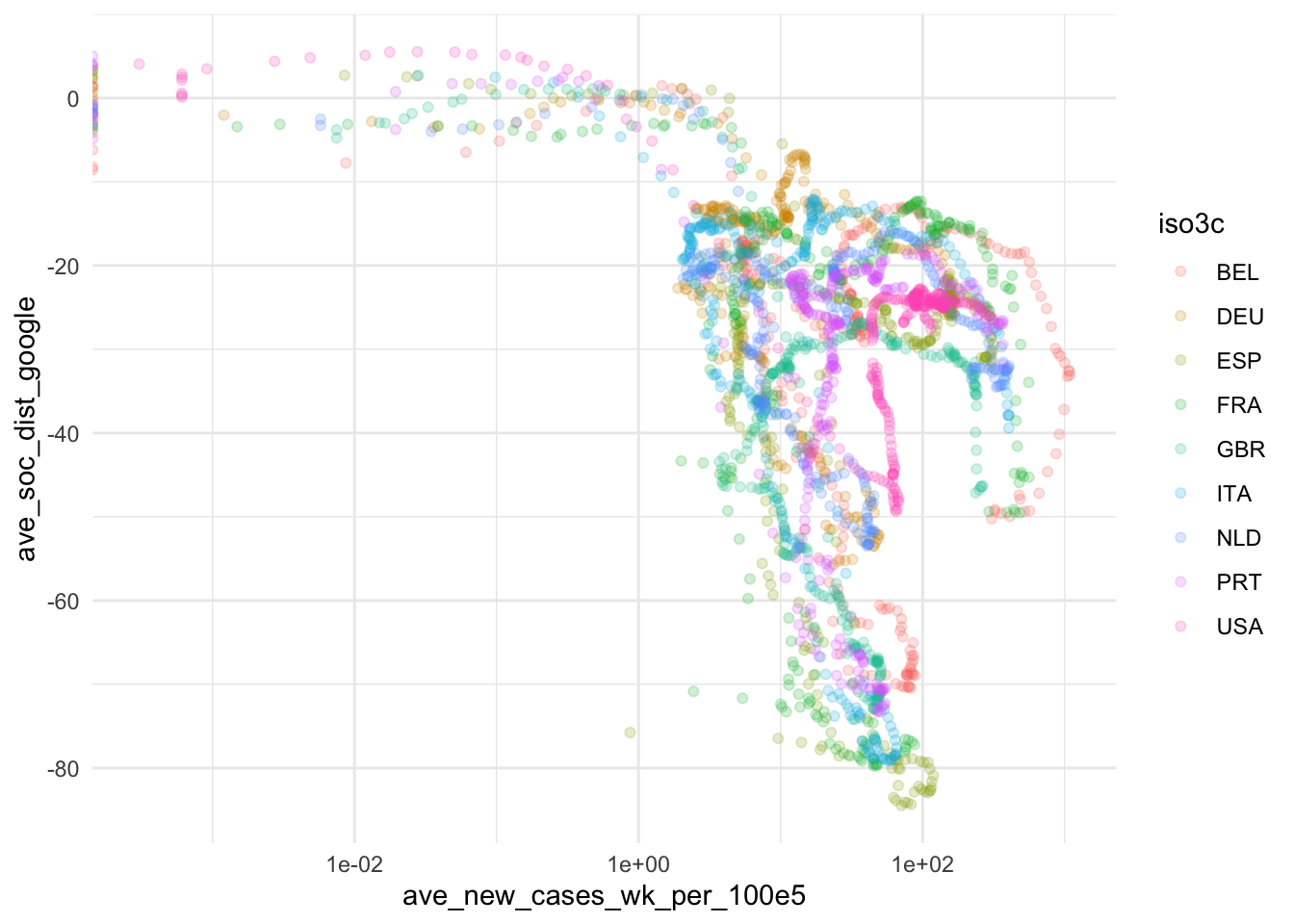
Based on this, we take some decisions. First we choose our variables: The 7-day average of new cases by 100,000 inhabitants will be used to assess the magnitude of the Covid19 spread and Google data will be used for measuring social distancing. The main reasons for our choices are that the testing data, while highly relevant, is too scarce to produce a reliable measure. The Apple data is conceptually of lower quality than the Google data and also has a two week gap where Apple changed its methodology. Unfortunately, the Google data has roughly one week lag, meaning that it currently contains data up until November 15. Selecting data always involves trade-offs. We will need to communicate these trade-offs to the reader.
Graphical story idea: Country drill down
It becomes obvious from the exploratory plot that
- The social distancing effect of the second wave is smaller compared to the social distancing effect of the first wave and
- that the effects vary significantly across countries
We decide to tell this story graphically. In principle, we could start with directly throwing country-level time-series data at people. However, we believe that this is a little bit hard to address. Instead, we decide to prepare a series of graphs that allow the reader to “zoom in” on the problem:
- The first graph will be a “global level” time-series line graph contrasting the waves with the social distancing effect. It should allow the reader to compare the social distancing effects of the two waves at the global level.
- The second graph will display this trend by country. To ease the display and to avoid the Spaghetti Graph effect, we will use a faceted version of a country-level line graph for this purpose. It will enable the reader to assess country-level differences.
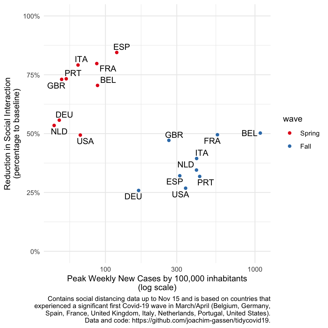
- The third graph will display the country level differences more pronouncedly by plotting the social distancing effect of each wave over its magnitude at the country-wave level. This scatter plot will show a common pattern how countries reacted two the waves in terms of social distancing and also a country that looks like an outlier (stay tuned).
Graph 1: global time series
The first visual focuses on the main takeaway that we feel deserves to be communicated: Social distancing during the first wave kicked in quicker and also seems to be more pronounced compared to the second wave. While it is still a little bit too early to tell, we believe that this is the main point that we should be making with our graphs. To make this point at the global level, we population-weight average the data across our sample countries.
library(grid)
library(gridExtra)
library(RColorBrewer)

ave_measures %>%
  group_by(date) %>%
  filter(
    !is.na(ave_new_cases_wk_per_100e5),
    !is.na(ave_soc_dist_google)
  ) %>%
  filter(n() == length(smp_countries)) %>%
  summarise(
    cases = weighted.mean(ave_new_cases_wk_per_100e5, population, na.rm = TRUE),
    soc_dist = weighted.mean(ave_soc_dist_google, population, na.rm = TRUE)/100,
    .groups = "drop"
  ) -> wwide


caption_text <- paste0(str_wrap(paste0(
  "Contains social distancing data up to ",
  format(
    max(ave_measures$date[!is.na(ave_measures$ave_soc_dist_google)]),
    "%b %d"
  ),
  " and is based on countries that experienced a significant first ",
  "Covid-19 wave in March/April ",
  "(", paste(smp_countries, collapse = ", "), "). ",
  "Data and code: https://github.com/joachim-gassen/tidycovid19."
), 80))

my_palette <- c(brewer.pal(8, "Set1"), "lightblue")

p_cases <- ggplot(wwide, aes(
  x = date, y = cases
)) +
  geom_line(color = my_palette[1]) +
  theme_minimal() +
  ylim(0, NA) +
  annotate(
    x = lubridate::ymd("2020-08-15"),
    y = 200,
    geom = "text",
    color = my_palette[1],
    label = "New weekly Covid19 infections\nby 100,000 inhabitants"
  ) +
  labs(x = "", y = "") +
  theme(
    legend.position = "none",
    panel.grid.minor = element_blank(),
    panel.grid.major.x = element_blank(),
    panel.grid.major.y = element_line(size = 0.5)
  )

p_soc_dist <- ggplot(wwide, aes(x = date, y = soc_dist)) +
  geom_line(color = my_palette[2]) +
  theme_minimal() +
  scale_y_continuous(labels = scales::percent) +
  annotate(
    x = lubridate::ymd("2020-08-15"),
    y = -.4,
    geom = "text",
    color = my_palette[2],
    label = "% of reduction in social interaction\n(assessed by Google Mobility Reports)"
  ) +
  labs(
    x = "",
    y = "",
    caption = caption_text
  ) +
  theme(
    legend.position = "none",
    axis.title.x = element_blank(), axis.text.x = element_blank(),
    panel.grid.minor = element_blank(),
    panel.grid.major.x = element_blank(),
    panel.grid.major.y = element_line(size = 0.5)
  )

grid.newpage()
grid.draw(rbind(ggplotGrob(p_cases), ggplotGrob(p_soc_dist), size = "last"))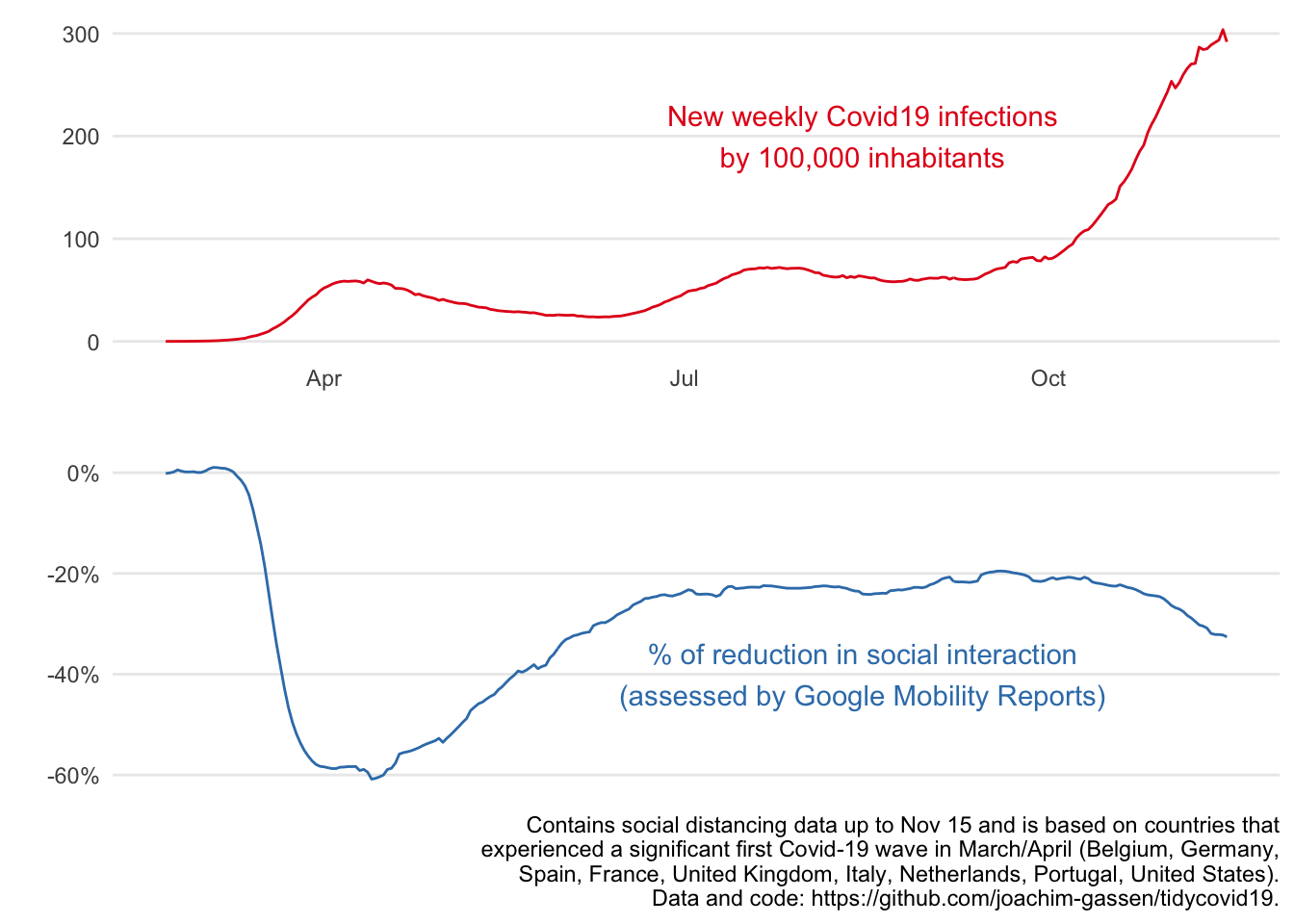
Graph 2: spaghetti facet plot
As a next step, to allow the reader to explore country-level differences, we simply facet the time-series plots, high-lightening the countries one-by-one to get rid of the spaghetti problem. A very informative display for an educated audience but maybe a little bit too data-rich for a general audience.
library(gghighlight)

p_cases <- ggplot(ave_measures) +
  geom_line(aes(date, ave_new_cases_wk_per_100e5, colour = iso3c)) +
  gghighlight() +
  labs(
    x = "",
    y = "New weekly Covid19 infections\nby 100,000 inhabitants"
  ) +
  theme_minimal() +
  scale_color_manual(values = my_palette) +
  theme(
    panel.grid.minor = element_blank(),
    panel.grid.major.x = element_blank(),
    panel.grid.major.y = element_line(size = 0.5)
  ) +
  facet_wrap(~ country)

p_soc_dist <- ggplot(ave_measures) +
  geom_line(aes(date, ave_soc_dist_google, colour = iso3c)) +
  gghighlight() +
  theme_minimal() +
  scale_color_manual(values = my_palette) +
  labs(
    x = "",
    y = "% of reduction in social interaction\n(assessed by Google Mobility Reports)",
    caption = caption_text
  ) +
  theme(
    panel.grid.minor = element_blank(),
    panel.grid.major.x = element_blank(),
    panel.grid.major.y = element_line(size = 0.5)
  ) +
  facet_wrap(~ country)

grid.newpage()
grid.draw(rbind(ggplotGrob(p_cases), ggplotGrob(p_soc_dist), size = "last"))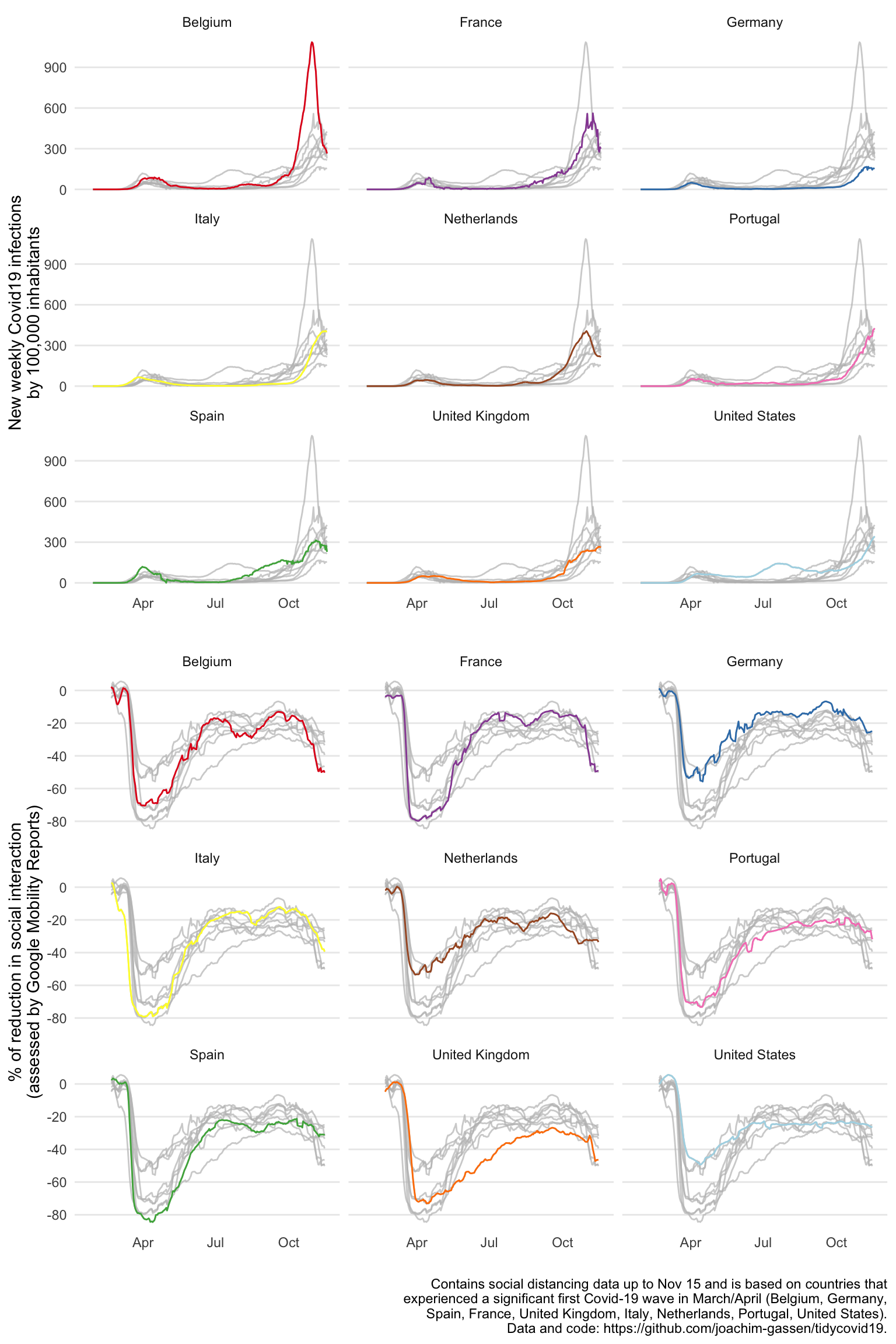
Graph 3: country-level correlation scatter
Finally, here is our last graph that focuses on the association. A grouped scatter plot is the classical display for that. The frequency reduction is very effective (compare it to the exploratory scatter plot above). To the experienced eye, the two starkly different associations become immediately apparent. Also, the U.S. seems to be negative outlier in the first and in particular second wave for all too obvious and soon to be gone reasons. We thought about including separate regression lines to document the different associations for both waves but felt that this cluttered the graph by stating the obvious.
library(ggrepel)

ave_measures %>%
  filter(date < lubridate::ymd("2020-06-01")) %>%
  summarise(
    cases = max(ave_new_cases_wk_per_100e5, na.rm = TRUE),
    soc_dist = -min(ave_soc_dist_google, na.rm = TRUE)/100,
    .groups = "drop"
  ) %>% mutate(wave = "Spring") %>%
  select(iso3c, wave, cases, soc_dist) -> spring_wave

ave_measures %>%
  filter(date > lubridate::ymd("2020-09-01")) %>%
  summarise(
    cases = max(ave_new_cases_wk_per_100e5, na.rm = TRUE),
    soc_dist = -min(ave_soc_dist_google, na.rm = TRUE)/100,
    .groups = "drop"
  ) %>% mutate(wave = "Fall") %>%
  select(iso3c, wave, cases, soc_dist) -> fall_wave

soc_dist_by_wave <- rbind(spring_wave, fall_wave)
soc_dist_by_wave$wave <- factor(soc_dist_by_wave$wave, c("Spring", "Fall"))

ggplot(soc_dist_by_wave, aes(
  x = cases, y = soc_dist, color = wave,
  label = iso3c
)) +
  geom_point() +
  geom_text_repel(color = "black") +
  scale_x_continuous(trans = "log10") +
  scale_y_continuous(labels = scales::percent, limits = c(0, 1)) +
  theme_minimal() +
  scale_color_manual(values = my_palette) +
  labs(
    x = "Peak Weekly New Cases by 100,000 inhabitants\n(log scale)",
    y = "Reduction in Social Interaction\n(percentage to baseline)",
    caption = caption_text
  )
Designing graphs to be more visually appealing
While the graphs above communicate our story (we think) they still have this “statistical program look and feel”. To take them production level, some final touches are needed. There is always a trade-off between doing this within R or in your layout software. For academic publications, we tend do the whole design in R. For general audience publications, moving to layout software rather sooner than later might be advisable.
When communicating to general audiences it is important to make sure the visual is clear and can stand by itself. In this example we applied several tweaks (using Adobe Illustrator) to the output from R:
- Remove chart junk: always get rid of unnecessary clutter, clean up your charts. In this case, the charts were surprisingly clean already. Nonetheless, a few simple tweaks make them easier on the eyes. We specifically added (visual) hierarchy: we made the axes less prominent (grey and thinner lines), removed unnecessary lines, and made the numbers on the axes grey and smaller.
- Check your axes: it is preferable to use “natural” increments, meaning 2-4-6-8 is preferred over 3-6-9, and 0-50-100% over 30-60-90%. In the case of our charts, we want to show a general trend, meaning no detail is required. For the reduction in social interaction 0-50-100% seems to suffice, no need to add more detail there.
- Add context: we added the text describing the data as an introduction to the visual. This way the visual can be a stand-alone, and if it is copied or shared by others, the context is not lost (as long as the image is not cropped ;-))
- Annotate: this is something we rarely see in scientific publications, but annotating a graph is a very user-friendly approach. Especially in this case, where we offer an explanatory visual (vs. exploratory visual). We want to communicate that “the effect of social distancing in the second wave is smaller compared to the first”, and we want to bring out this story most clearly. In the case of the Global Time Series visual, small annotations that compare the second and first wave help us tell our story. Of course, annotations should be used sparsely to avoid chart junk.
- No type at an angle: don’t set type at an angle, nobody wants to twist his neck reading a chart.
- Direct labeling: as you can see there is no legend with “spring=green” and “fall=yellow” for the scatterplot. We guess you didn’t miss it either? When possible, use direct labeling. Don’t make your audience do a color-coding exercise.
- Add chart junk: didn’t we just argue to keep chart junk to a minimum…? We sure did, but if you want your graph to stand out, a little chart junk can be very effective. A little detail that supports your story, like the little virus icons, can give it that touch that could make your graph stand out from the crowd. As always, it’s a matter of taste (and corporate design and branding). Optimizing your visual is a step that should not be skipped, a few simple tweaks can make a big difference.
So, without further ado this is the outcome of this last processing step.
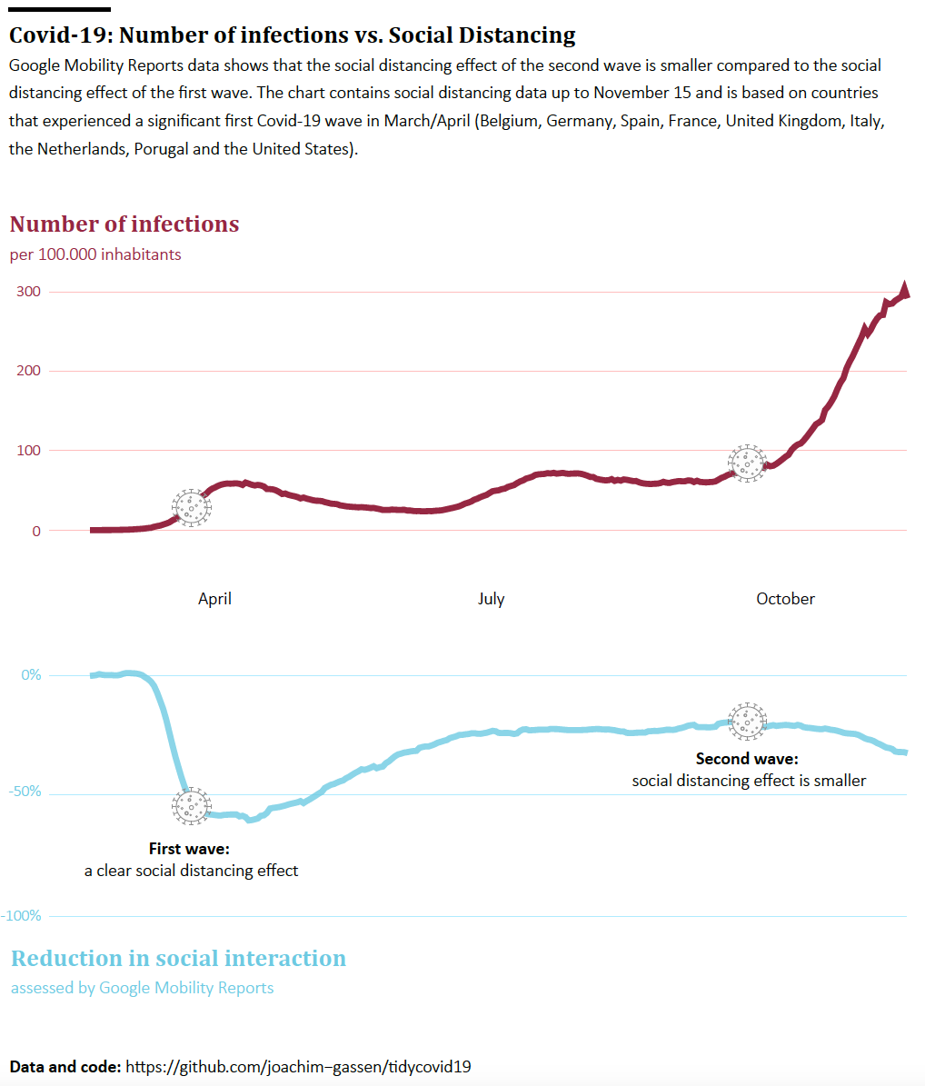
Finalized Graph 1
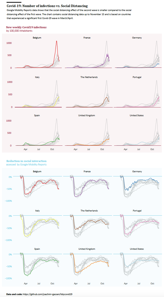
Finalized Graph 2
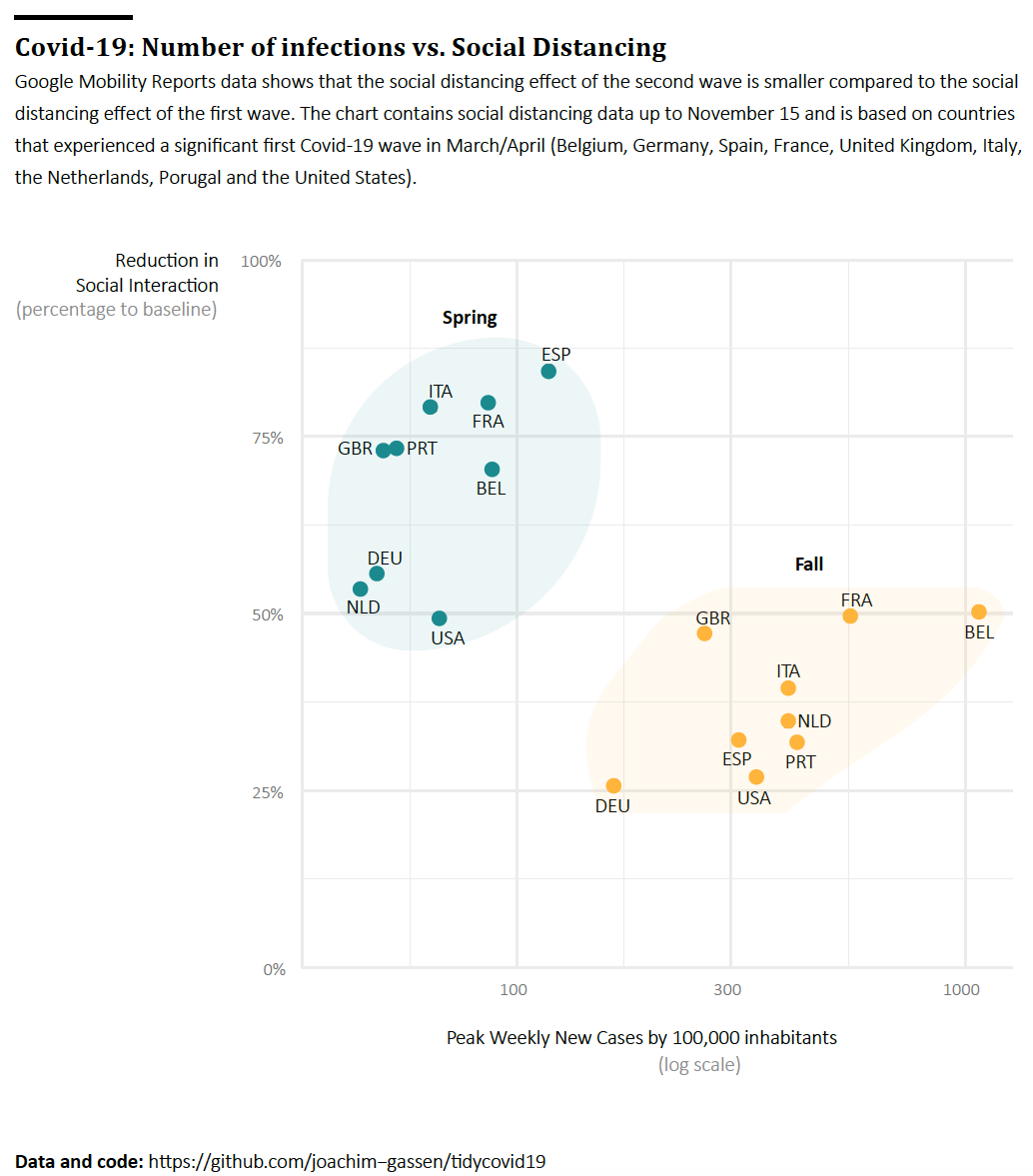
Finalized Graph 3
Nice, huh?
An interactive display
As a final goodie, we also played around with an interactive display that combines graph 2 and graph 3 into one interactive display, allowing readers to dive from country-wave level data into time series. This graphic is not neatly designed but gives you an intuition on how you can use interactive features to showcase complex data.
library(ggiraph)
library(grid)
library(gridExtra)

produce_country_wave_html <- function(ic) {
  tfile <- tempfile(fileext = ".png")
  png(tfile, width = 300, height = 250)

  p_cases <- ggplot(ave_measures) +
    geom_line(aes(date, ave_new_cases_wk_per_100e5, colour = iso3c)) +
    gghighlight(iso3c == ic) +
    labs(
      title = unique(ave_measures$country[ave_measures$iso3c == ic]),
      subtitle = "Weekly new cases",
      x = "",
      y = ""
    ) +
    theme_minimal() +
    scale_color_manual(values = my_palette) +
    theme(
      panel.grid.minor = element_blank(),
      panel.grid.major.x = element_blank(),
      panel.grid.major.y = element_line(size = 0.5),
      plot.title.position = "plot"
    )

  p_soc_dist <- ggplot(ave_measures) +
    geom_line(aes(date, ave_soc_dist_google, colour = iso3c)) +
    gghighlight(iso3c == ic) +
    theme_minimal() +
    scale_color_manual(values = my_palette) +
    labs(
      x = "",
      y = "",
      subtitle =  "% Reduction in social interaction"
    ) +
    theme(
      panel.grid.minor = element_blank(),
      panel.grid.major.x = element_blank(),
      panel.grid.major.y = element_line(size = 0.5),
      plot.title.position = "plot"
    )

  grid.arrange(rbind(ggplotGrob(p_cases), ggplotGrob(p_soc_dist), size = "last"))
  dev.off()

  txt <- RCurl::base64Encode(
    readBin(tfile, "raw", file.info(tfile)[1, "size"]),
    "txt"
  )
  html_snippet <- htmltools::HTML(sprintf('<img src="data:image/png;base64,%s">', txt))
  return(html_snippet)
}

html_lup <- tibble(
  iso3c = unique(ave_measures$iso3c),
  html_code = sapply(iso3c, produce_country_wave_html, USE.NAMES = FALSE)
)

df <- soc_dist_by_wave %>%
  left_join(html_lup, by = "iso3c")

p <- ggplot(df, aes(
  x = cases, y = soc_dist, color = wave,
  label = iso3c
)) +
  geom_point_interactive(aes(
    tooltip = html_code,
    data_id = iso3c
  ))  +
  geom_text_repel(color = "black") +
  scale_x_continuous(trans = "log10") +
  scale_y_continuous(labels = scales::percent, limits = c(0, 1)) +
  theme_minimal() +
  scale_color_manual(values = my_palette) +
  labs(
    x = "Peak Weekly New Cases by 100,000 inhabitants\n(log scale)",
    y = "Reduction in Social Interaction\n(percentage to baseline)",
    caption = caption_text,
    color = "Covid-19 Wave"
  ) +
  theme(
    legend.position = c(0.8, 0.8)
  )

tooltip_css <- "background-color:transparent;"
girafe(
  ggobj = p,
  options = list(
    opts_tooltip(
      css = tooltip_css
    )
  )
)
Conclusion
These are our ideas for a graphical story that compares the social distancing effects of the two large Covid-19 waves. What are yours? Let us know!
