{tidycovid19}: New data and documentation
A recent update to the {tidycovid19} package brings data on testing, alternative case data, some regional data and proper data documentation. Using all this, you can use the package to explore the associations of (the lifting of) governmental measures, citizen behavior and the Covid-19 spread.
Installation
The Package is hosted on Github. As the underlying data sources change their format and access methods often, I have no plans to publish the package on CRAN for the time being. So, to install the package, you need to have the {remotes} package installed. Then, you can install and attach {tidycovid19} along with some other packages that we will need below by:
remotes::install_github("joachim-gassen/tidycovid19")
library(tidycovid19)
library(tidyverse)
library(ggrepel)
library(gghighlight)
library(zoo)
Included Data Sources
By now, the packages contains the code to download data from nine authoritative data sources:
- Covid-19 data from the Johns Hopkins University CSSE Github Repo. This data has developed to a standard resource for researchers and the general audience interested in assessing the global spreading of the virus. The data is provided at country and sub-country levels.
- Covid-19 case data provided by the European Centre for Disease Prevention and Control. The data is updated daily and contains the latest available public data on the number of new Covid-19 cases reported per day and per country.
- Testing data collected by the ‘Our World in Data’ team. This team systematically collects data on Covid-19 testing from multiple national sources.
- Government measures dataset provided by the Assessment Capacities Project (ACAPS). These data allow researchers to study the effect of non-pharmaceutical interventions on the development of the virus.
- Oxford Covid-19 Government Response Tracker, an alternative data source for governmental interventions.
- Mobility Trends Reports provided by Apple related to Covid-19. The data is provided at country and sub-country levels.
- Google COVID-19 Community Mobility Reports data. This data is available at the country, regional and U.S. county level.
- Google Trends data on the search volume for the term “coronavirus” This data can be used to assess the public attention to Covid-19 across countries and over time within a given country. The data is available at the country, regional and city level but availability varies across countries.
- Country level information provided by the World Bank. These data allow researchers to calculate per capita measures of the virus spread and to assess the association of macro-economic variables with the development of the virus.
Each data can be downloaded separately, using its specific download function (download_..._data()). By default, the functions will download the data from the authoritative source and provide some diagnostic messages and a short data description. You can shut up the functions by adding the silent = TRUE parameter. If you use the cached = TRUE parameter, the data will be downloaded from the Github repository of the package, speeding things up considerably. The data in the Github repository is updated daily.
download_merged_data() provides a country-day data frame pulling together data from various sources. The data frame tidycovid19_variable_definitions contains variable definitions for the merged data frame.
merged <- download_merged_data(silent = TRUE, cached = TRUE)
tidycovid19_variable_definitions %>%
  select(var_name, var_def) %>%
  kable() %>%
kable_styling()| var_name | var_def |
|---|---|
| iso3c | Country name |
| country | ISO3c country code as defined by ISO 3166-1 alpha-3 |
| date | Calendar date |
| confirmed | Confirmed Covid-19 cases as reported by JHU CSSE (accumulated) |
| deaths | Covid-19-related deaths as reported by JHU CSSE (accumulated) |
| recovered | Covid-19 recoveries as reported by JHU CSSE (accumulated) |
| ecdc_cases | Covid-19 cases as reported by ECDC (accumulated) |
| ecdc_deaths | Covid-19-related deaths as reported by ECDC (accumulated) |
| total_tests | Accumulated test counts as reported by Our World in Data |
| tests_units | Definition of what constitutes a ‘test’ |
| soc_dist | Number of social distancing measures reported up to date by ACAPS, net of lifted restrictions |
| mov_rest | Number of movement restrictions reported up to date by ACAPS, net of lifted restrictions |
| pub_health | Number of public health measures reported up to date by ACAPS, net of lifted restrictions |
| gov_soc_econ | Number of social and economic measures reported up to date by ACAPS, net of lifted restrictions |
| lockdown | Number of lockdown measures reported up to date by ACAPS, net of lifted restrictions |
| apple_mtr_driving | Apple Maps usage for driving directions, as percentage*100 relative to the baseline of Jan 13, 2020 |
| apple_mtr_walking | Apple Maps usage for walking directions, as percentage*100 relative to the baseline of Jan 13, 2020 |
| apple_mtr_transit | Apple Maps usage for public transit directions, as percentage*100 relative to the baseline of Jan 13, 2020 |
| gcmr_retail_recreation | Google Community Mobility Reports data for the frequency that people visit retail and recreation places expressed as a percentage*100 change relative to the baseline period Jan 3 - Feb 6, 2020 |
| gcmr_grocery_pharmacy | Google Community Mobility Reports data for the frequency that people visit grocery stores and pharmacies expressed as a percentage*100 change relative to the baseline period Jan 3 - Feb 6, 2020 |
| gcmr_parks | Google Community Mobility Reports data for the frequency that people visit parks expressed as a percentage*100 change relative to the baseline period Jan 3 - Feb 6, 2020 |
| gcmr_transit_stations | Google Community Mobility Reports data for the frequency that people visit transit stations expressed as a percentage*100 change relative to the baseline period Jan 3 - Feb 6, 2020 |
| gcmr_workplaces | Google Community Mobility Reports data for the frequency that people visit workplaces expressed as a percentage*100 change relative to the baseline period Jan 3 - Feb 6, 2020 |
| gcmr_residential | Google Community Mobility Reports data for the frequency that people visit residential places expressed as a percentage*100 change relative to the baseline period Jan 3 - Feb 6, 2020 |
| gtrends_score | Google search volume for the term ‘coronavirus’, relative across time with the country maximum scaled to 100 |
| gtrends_country_score | Country-level Google search volume for the term ‘coronavirus’ over a period starting Jan 1, 2020, relative across countries with the country having the highest search volume scaled to 100 (time-stable) |
| region | Country region as classified by the World Bank (time-stable) |
| income | Country income group as classified by the World Bank (time-stable) |
| population | Country population as reported by the World Bank (original identifier ‘SP.POP.TOTL’, time-stable) |
| land_area_skm | Country land mass in square kilometers as reported by the World Bank (original identifier ‘AG.LND.TOTL.K2’, time-stable) |
| pop_density | Country population density as reported by the World Bank (original identifier ‘EN.POP.DNST’, time-stable) |
| pop_largest_city | Population in the largest metropolian area of the country as reported by the World Bank (original identifier ‘EN.URB.LCTY’, time-stable) |
| life_expectancy | Average life expectancy at birth of country citizens in years as reported by the World Bank (original identifier ‘SP.DYN.LE00.IN’, time-stable) |
| gdp_capita | Country gross domestic product per capita, measured in 2010 US-$ as reported by the World Bank (original identifier ‘NY.GDP.PCAP.KD’, time-stable) |
| timestamp | Date and time where data has been collected from authoritative sources |
Included Visualization Methods
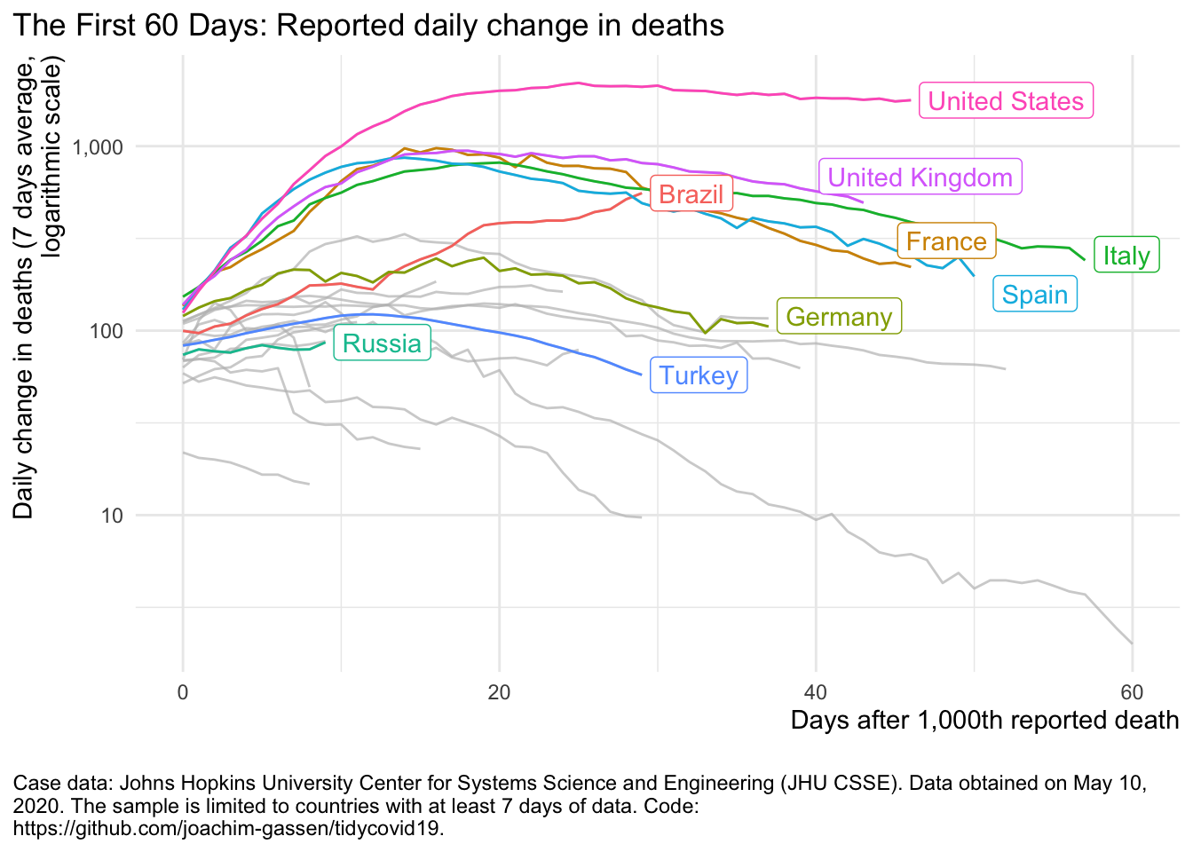
Based on this data, you can use the visualizations functions of the package to quickly produce visuals of the spread. The function plot_covid19_spread() allows many
customization options. See:
plot_covid19_spread(
  merged, type = "deaths", min_cases = 1000, edate_cutoff = 60,
  cumulative = FALSE, change_ave = 7,
  highlight = c("USA", "ESP", "ITA", "FRA", "GBR", "DEU", "BRA", "RUS", "TUR")
)
To customize it, you can also spin up its shiny variant, customize the plot until it fits your needs and then export the code to the clipboard with a simple click.
shiny_covid19_spread()For many countries, the function plot_covid19_spread() provides an alternative way on how to visualize the spread.
plot_covid19_stripes(merged, type = "deaths", min_cases = 1000, cumulative = FALSE)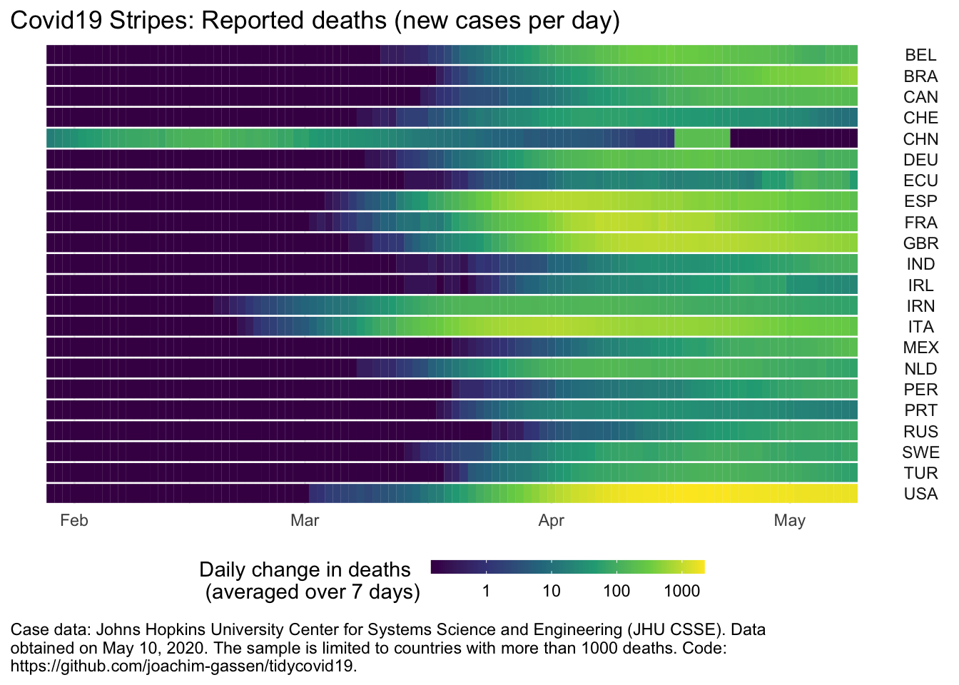
And, if you like maps (who does not?), you can also visualize the spread that way.
map_covid19(merged)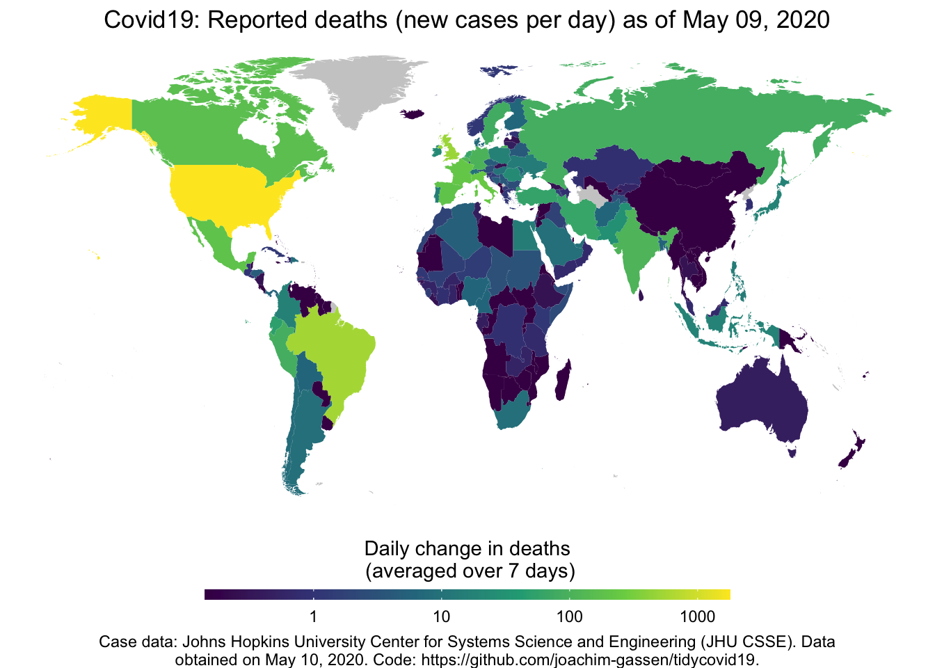
By the way, if you provide multiple days to map_covid19() it will produce an animated map, but this will take a while to complete.
Some stuff that you can do with the data
Governmental measures over time
The ACAPS data allows for a quick impression on governmental restrictions are implemented and lifted over time.
acaps <- download_acaps_npi_data(cached = TRUE, silent = TRUE)
df <- acaps %>%
  rename(date = date_implemented) %>%
  mutate(nobs = 1*(log_type == "Introduction / extension of measures") -
           1*(log_type != "Introduction / extension of measures")) %>%
  select(iso3c, date, log_type, category, nobs) %>%
  filter(date <= "2020-05-10")

ggplot(df, aes(x = date, fill = category, weight = nobs)) +
  geom_histogram(data = df %>% filter(log_type == "Introduction / extension of measures"),
                 position = "stack", binwidth = 24*3600*7) +
  geom_histogram(data = df %>% filter(log_type != "Introduction / extension of measures"),
                 position = "stack", binwidth = 24*3600*7) +
  theme_minimal() +
  labs(title = "Implementation and Lifting of Interventions over Calendar Time",
       x = NULL,
       y = "Number of interventions",
       fill = "Intervention") +
  theme(legend.position = c(0.25, 0.8),
        legend.background = element_rect(fill = "white", color = NA),
        legend.title = element_text(size = 8),
        legend.text = element_text(size = 7))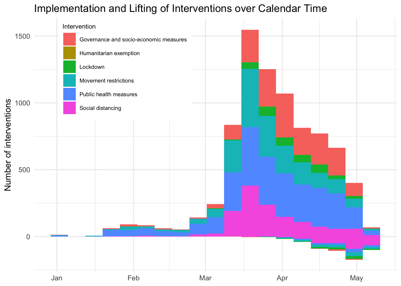
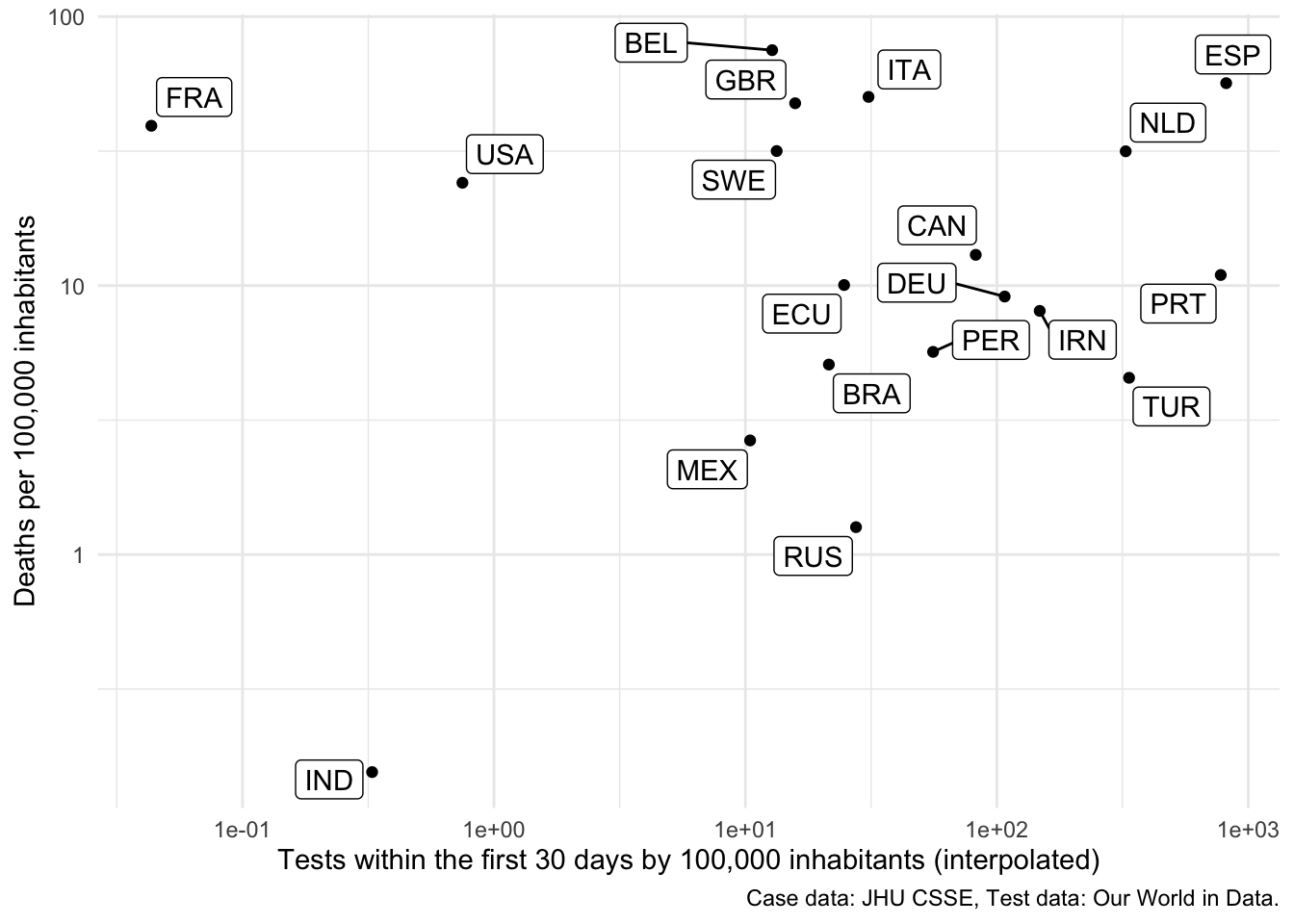
Association between testing and deaths
Is there an association between testing during the fist 30 days of the spread and the amount of deaths that a country observes?
early_tests <- merged %>%
  group_by(iso3c) %>%
  filter(population > 10e6) %>%
  filter(confirmed > 0) %>%
  filter(!all(is.na(total_tests))) %>%
  mutate(total_tests = na.approx(c(0, total_tests), rule = 2)[-1]) %>%
  filter(date - min(date) < 30) %>%
  summarise(early_tests = unique(1e5*max(total_tests, na.rm = TRUE)/population)) %>%
  filter(!is.na(early_tests))

deaths <- merged %>%
  group_by(iso3c) %>%
  filter(deaths > 1000) %>%
  filter(population > 10e6) %>%
  summarise(deaths = unique(1e5*max(deaths, na.rm = TRUE)/population))

deaths %>% left_join(early_tests, by = "iso3c") %>%
  filter(!is.na(early_tests)) %>%
  ggplot(aes(x = early_tests, y = deaths)) +
  geom_point() +
  theme_minimal() +
  geom_label_repel(aes(label = iso3c)) +
  scale_x_log10() +
  scale_y_log10() +
  labs(
    x = "Tests within the first 30 days by 100,000 inhabitants (interpolated)",
    y = "Deaths per 100,000 inhabitants",
    caption = "Case data: JHU CSSE, Test data: Our World in Data."
  )
Regional variance in individual behavior
Do the social distancing measures work differently in East and West Germany?
gcmr <- download_google_cmr_data(type = "country_region", cached = TRUE, silent = TRUE)

east_regions <- c("Berlin", "Brandenburg", "Mecklenburg-Vorpommern",
          "Saxony", "Saxony-Anhalt", "Thuringia")

df <- gcmr %>%
  filter(iso3c == "DEU") %>%
  mutate(east = ifelse(region %in% east_regions, "East Germany", "West Germany")) %>%
  select(-iso3c, -region, -timestamp) %>%
  group_by(date, east) %>%
  summarise_all(mean)

ggplot(df, aes(x = date, y = retail_recreation, color = east)) +
  geom_line() +
  theme_minimal() +
  labs(
    x = NULL,
    y = "Percentage change of visits in retail shopping\nand recreational areas",
    caption = "Movement data: Google CMR."
  ) +
  gghighlight(TRUE, label_key = east)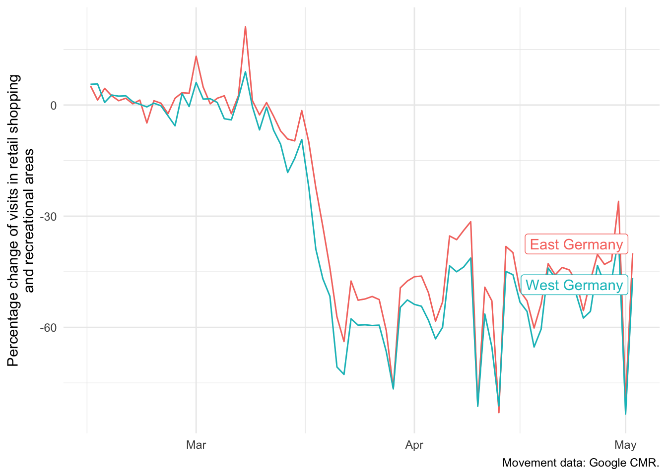
The same analysis for Apple Data (but without Berlin as it is classified as a city in Apple data)
amtr <- download_apple_mtr_data(type = "country_region", cached = TRUE, silent = TRUE)

east_regions <- c("Brandenburg", "Mecklenburg-Vorpommern",
          "Saxony", "Saxony-Anhalt", "Thuringia")

df <- amtr %>%
  filter(iso3c == "DEU") %>%
  mutate(east = ifelse(region %in% east_regions, "East Germany", "West Germany")) %>%
  select(-iso3c, -region, -timestamp) %>%
  group_by(date, east) %>%
  summarise_all(mean)

ggplot(df, aes(x = date, y = driving, color = east)) +
  geom_line() +
  theme_minimal() +
  labs(
    x = NULL,
    y = "Percentage change of Apple Map requests\nfor driving directions",
    caption = "Movement data: Apple MTR."
  ) +
  gghighlight(TRUE, label_key = east)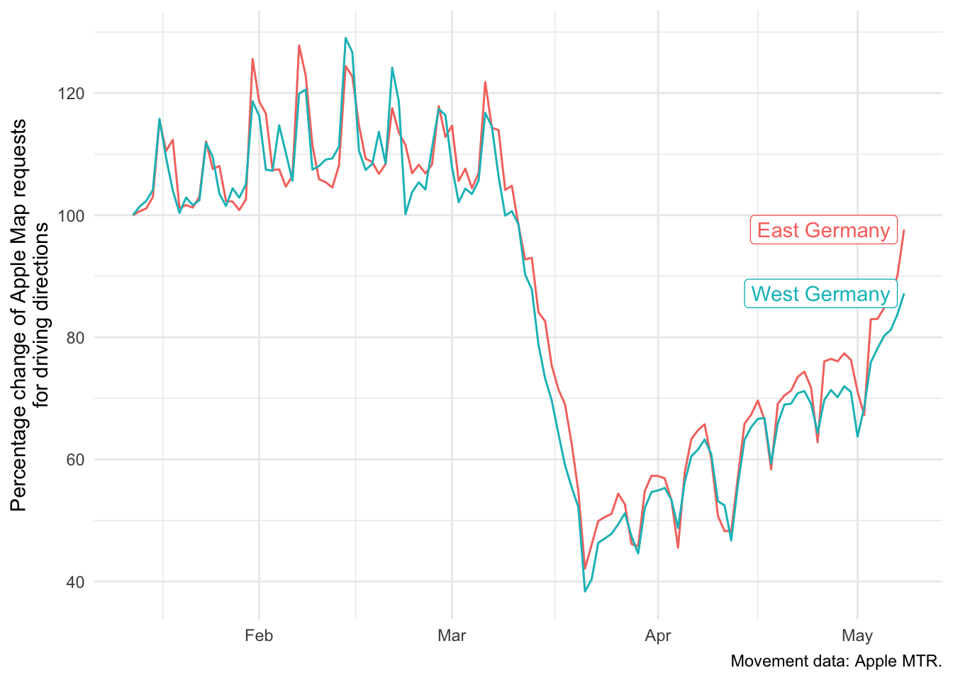
Compare Apple Mobility Trend Reports across major European cities
For driving directions:
amtr <- download_apple_mtr_data(type = "country_city", cached = TRUE, silent = TRUE)

cities <- c("Berlin", "London", "Madrid",
            "Paris", "Rome", "Stockholm")

df <- amtr %>%
  filter(city %in% cities) %>%
  select(-iso3c, -timestamp) %>%
  group_by(date, city) %>%
  summarise_all(mean)

ggplot(df, aes(x = date, y = driving, color = city)) +
  geom_line() +
  theme_minimal() +
  labs(
    x = NULL,
    y = "Percentage change of Apple Map\nrequests for driving directions",
    caption = "Movement data: Apple MTR."
  ) +
  gghighlight(TRUE, label_key = city)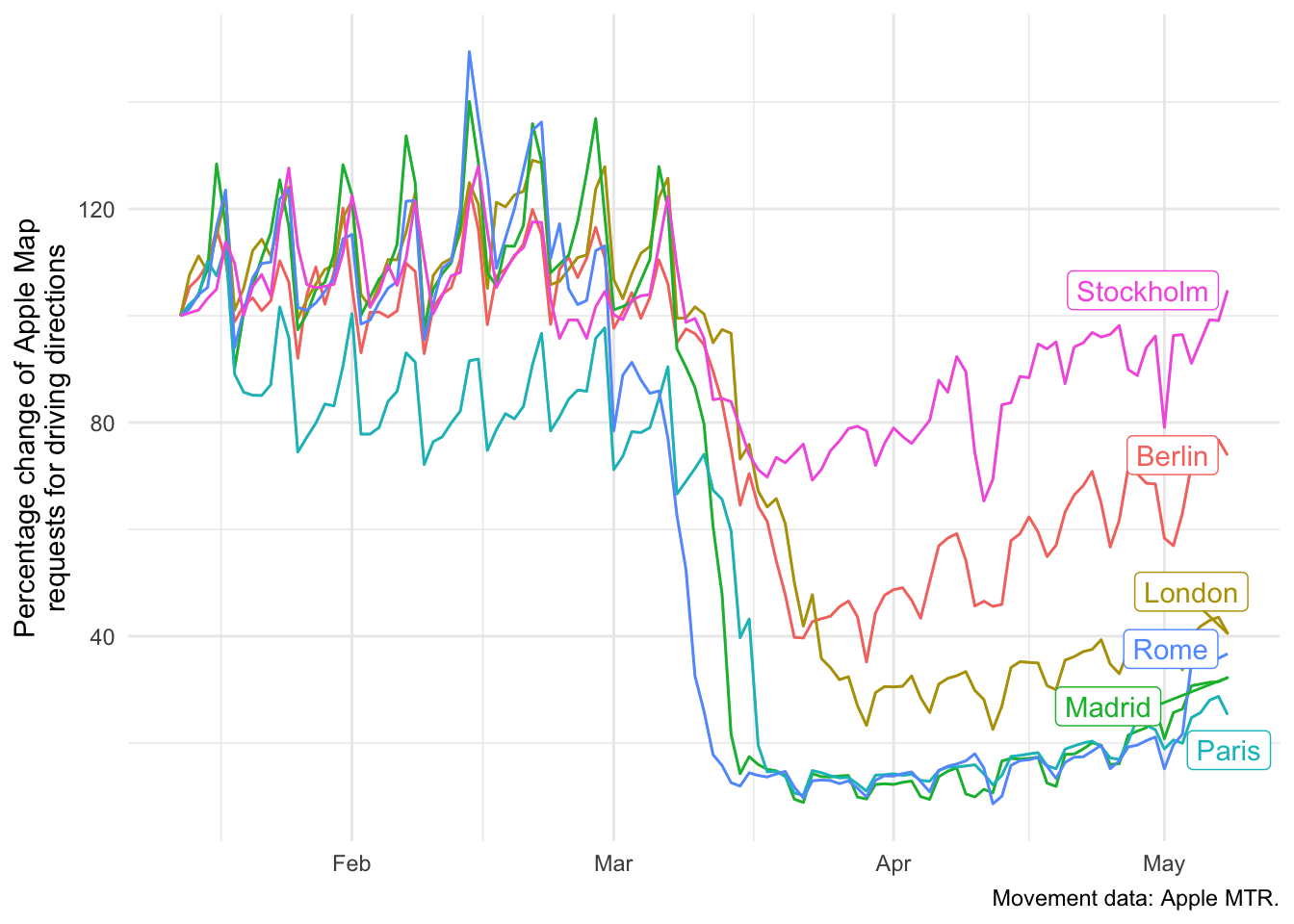
And for public transport directions:
ggplot(df, aes(x = date, y = transit, color = city)) +
  geom_line() +
  theme_minimal() +
  labs(
    x = NULL,
    y = "Percentage change of Apple Map requests\nfor public transport directions",
    caption = "Movement data: Apple MTR."
  ) +
  gghighlight(TRUE, label_key = city)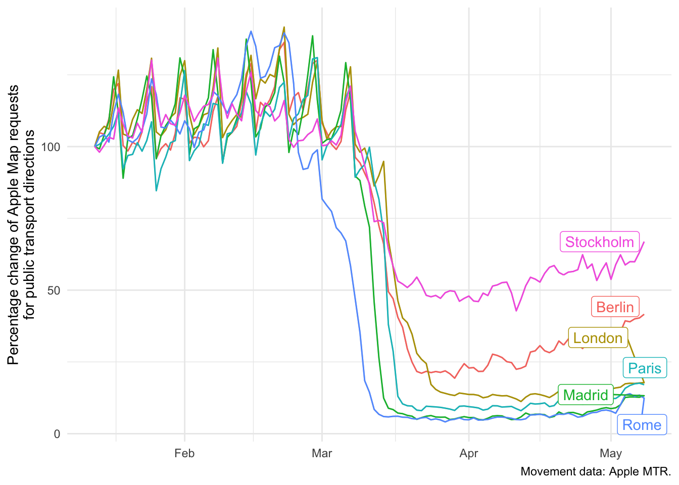
Wrapping Up
I hope that this quick walk through helped you to assess the old and new content of the {tidycovid19} package. There are some more use cases in the file example_code.R of the tidycovid19 Github repository.
Everybody: Enjoy, stay well and keep #FlattenTheCurve!
