{tidycovid19}: New visualizations and data on lifting of governmental measures
As the Covid-19 pandemic is affecting more and more countries around the globe, I included additional visualizations options into the {tidycovid19} package so that it becomes easier to compare the spread of the virus across countries. Also, I use this post to take a quick look on some countries that start lifting their governmental measures. See for yourself:
As we all know, the Covid-19 pandemic spreads around the globe. While traditional time-series based displays (like the ones provided by plot_spread_covid19() and show-cased in this blog post and this shiny app are very helpful to study the spread of the virus over a limited set of countries, the graphs quickly become overwhelming when you want to compare multiple countries.
This is why I decided to include two additional visualization approaches into the {tidycovid19} package: Maps and Covid-19 Stripes. Let me start with the latter.
Stripe displays (is there a more official name? I borrowed this term from the well-known Warming Stripes display) are an excellent tool to quickly identify patterns in time-series data. Also, I find them visually appealing. So, meet the “Covid-19 Stripes”. Below, you see the smoothed daily number of deaths for countries that have more than 10,000 confirmed cases in total.
# remotes::install_github("joachim-gassen/tidycovid19")

library(tidyverse)
library(tidycovid19)

merged <- download_merged_data(cached = TRUE, silent = TRUE)

plot_covid19_stripes(
  merged,
  type = "confirmed",
  min_cases = 10000,
  sort_countries = "start"
)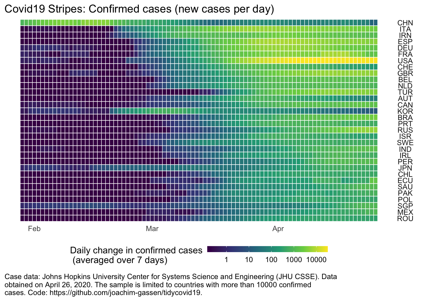
You can quickly glance that at least some countries are experiencing declining case rates. This is very good news but we know this already from similar displays. How can plot_covid19_stripes() help to discover new information in the data? Scroll down the admittedly longer visual below that lists more countries and take mental note of all countries that seem to have comparably strong growth rates relative to their neighbors (the country stripes are sorted by the timing of the outbreak).
merged <- download_merged_data(cached = TRUE, silent = TRUE)

plot_covid19_stripes(
  merged,
  type = "confirmed",
  min_cases = 100,
  sort_countries = "start"
)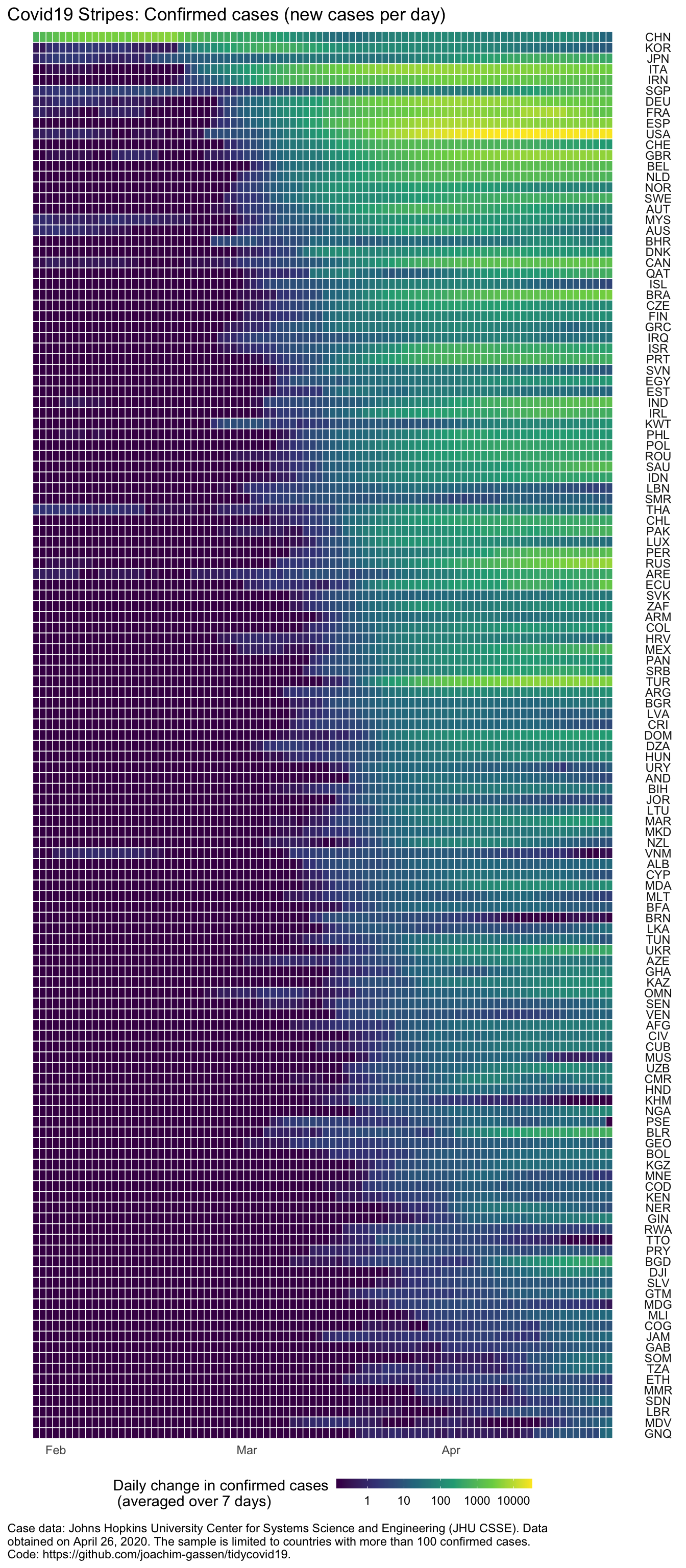
If your eyes work similarly to mine, you might have registered the U.S., Great Britain, Canada, Brazil, Israel, Portugal, India, Ireland, Peru, Russia, Turkey, Ukraine, Belarus, and Bangladesh. What do have at least some of these countries have in common? Although I tempted to speculate, I will leave this question to the political scientists.
I love maps but I normally argue that maps are overrated as data displays. Most of us have a reasonably good ideas where countries are located so why waste ink on showing us something that we already know? But then again, when phenomena spread world-wide it makes sense to track this spread over time with maps. The new function map_covid19() provides this functionality. Using the various measures provided by the data collected with the package, you can map things in levels, in changes, in absolute levels as well as deflated by population. For, example, here you see a current map for the current number of active cases, relative to the population.
map_covid19(merged, type = "active", per_capita = TRUE, cumulative = TRUE)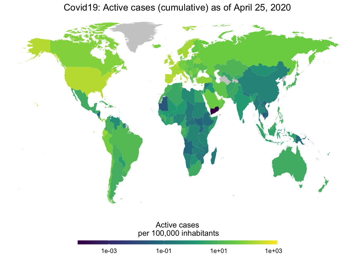
You can also focus on a certain region when you like. Here we take a look at new confirmed cases across Europe.
map_covid19(merged, type = "confirmed", per_capita = TRUE,
            region = "Europe")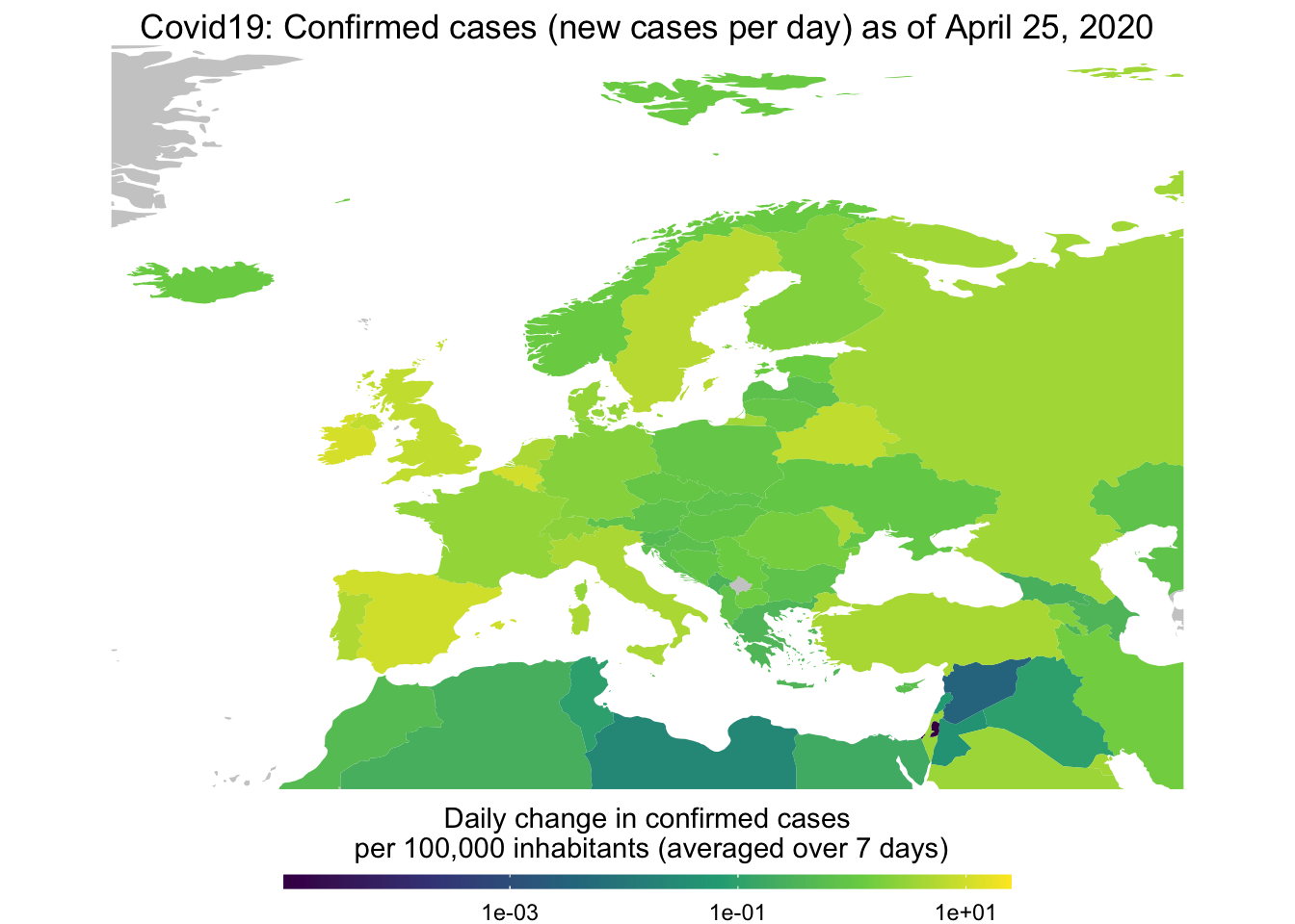
Finally, you use the function to create animated choropleth maps to show the spread of Covid-19 over time. The GIF below shows active cases per capita over time.
map_covid19(merged, type = "active", cumulative = TRUE, per_capita = T,
            dates = unique(merged$date))
## A vector of dates found. Will create animation. This will take a while...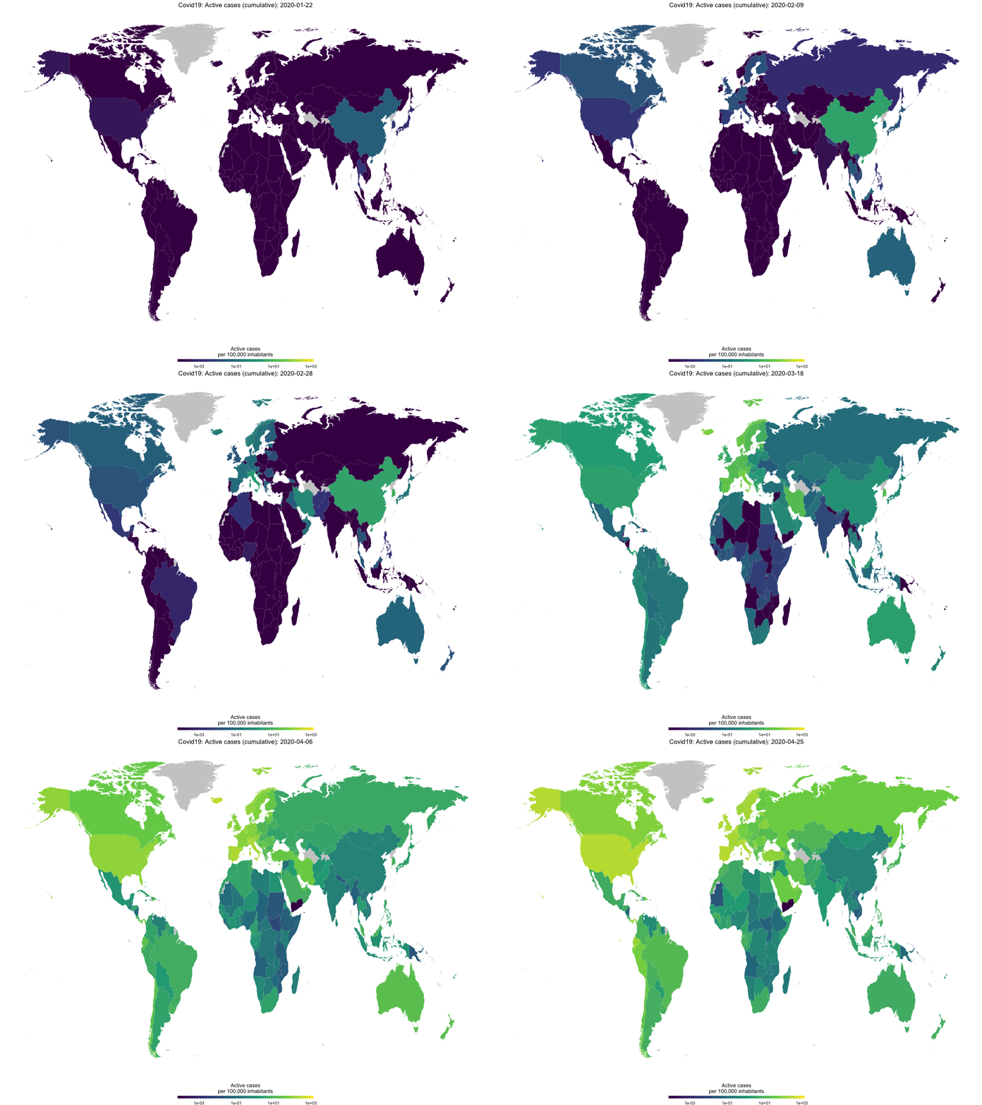
To end on a high note: The data on Government measures provided by ACAPS allow us to single out those countries that are starting to lift restrictions. Let’s look at some countries.
library(gghighlight)
library(lubridate)
##
## Attaching package: 'lubridate'## The following object is masked from 'package:base':
##
## dateacaps <- download_acaps_npi_data(cached = TRUE, silent = TRUE)
merged %>%
select(iso3c, date) %>%
left_join(
acaps %>%
filter(log_type != "Phase-out measure") %>%
mutate(date = as.Date(date_implemented)) %>%
group_by(iso3c, date) %>%
summarise(n_phase_in = n()),
by = c("iso3c", "date")
) %>%
left_join(
acaps %>%
filter(log_type == "Phase-out measure") %>%
mutate(date = as.Date(date_implemented)) %>%
group_by(iso3c, date) %>%
summarise(n_phase_out = n()),
by = c("iso3c", "date")
) %>%
group_by(iso3c) %>%
mutate_at(vars(n_phase_in, n_phase_out), ~cumsum(ifelse(is.na(.), 0, .))) %>%
mutate(share_out = n_phase_out/n_phase_in) %>%
select(iso3c, date, n_phase_in, n_phase_out, share_out) %>%
filter(!is.na(share_out)) -> phase_out
merged %>%
left_join(phase_out, by = c("iso3c", "date")) %>%
group_by(iso3c) %>%
filter(max(confirmed) > 10000) %>%
mutate(max_share = max(share_out, na.rm = TRUE)) %>%
ungroup() -> merged_phase_out
ggplot(
merged_phase_out %>% filter(!is.na(share_out)),
aes(x = date, y = share_out, color = iso3c)
) +
geom_line() +
gghighlight(max_share > 0.04) +
guides(color = FALSE) +
theme_minimal()## Warning: Tried to calculate with group_by(), but the calculation failed.
## Falling back to ungrouped filter operation...## label_key: iso3c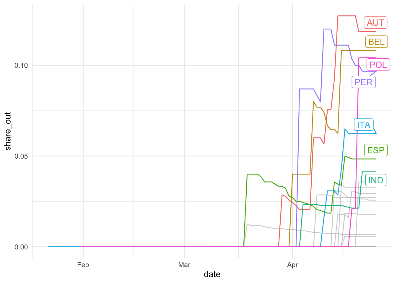
So, for at least some countries, the a reasonably share of measures have been lifted, with Austria leading the field. Which areas do these lifted restrictions affect?
acaps %>%
  filter(log_type == "Phase-out measure") %>%
  mutate(week = floor_date(date_implemented, "weeks", week_start = 1)) %>%
  group_by(week, category) %>%
  summarize(nli = n()) %>%
  select(week, category, nli) -> df

ggplot(df, aes(x = week, y = nli, fill = category)) +
  geom_col(position = "stack", stat = "sum") + theme_minimal() +
  labs(title = "Phase-Out of Interventions over Calendar Time",
       x = "Date",
       y = "Weekly Number of Phase-Out Measures")
## Warning: Ignoring unknown parameters: stat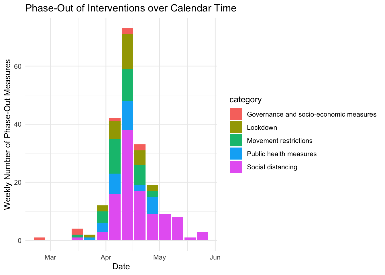
Last question: How does the spread pattern look when we sort by the share of lifted measures?
merged_phase_out %>%
  select(iso3c, max_share) %>%
  distinct() %>%
  arrange(-max_share) -> sortdf

merged_phase_out$iso3c <- factor(merged_phase_out$iso3c, level = sortdf$iso3c)
plot_covid19_stripes(merged_phase_out, type = "confirmed")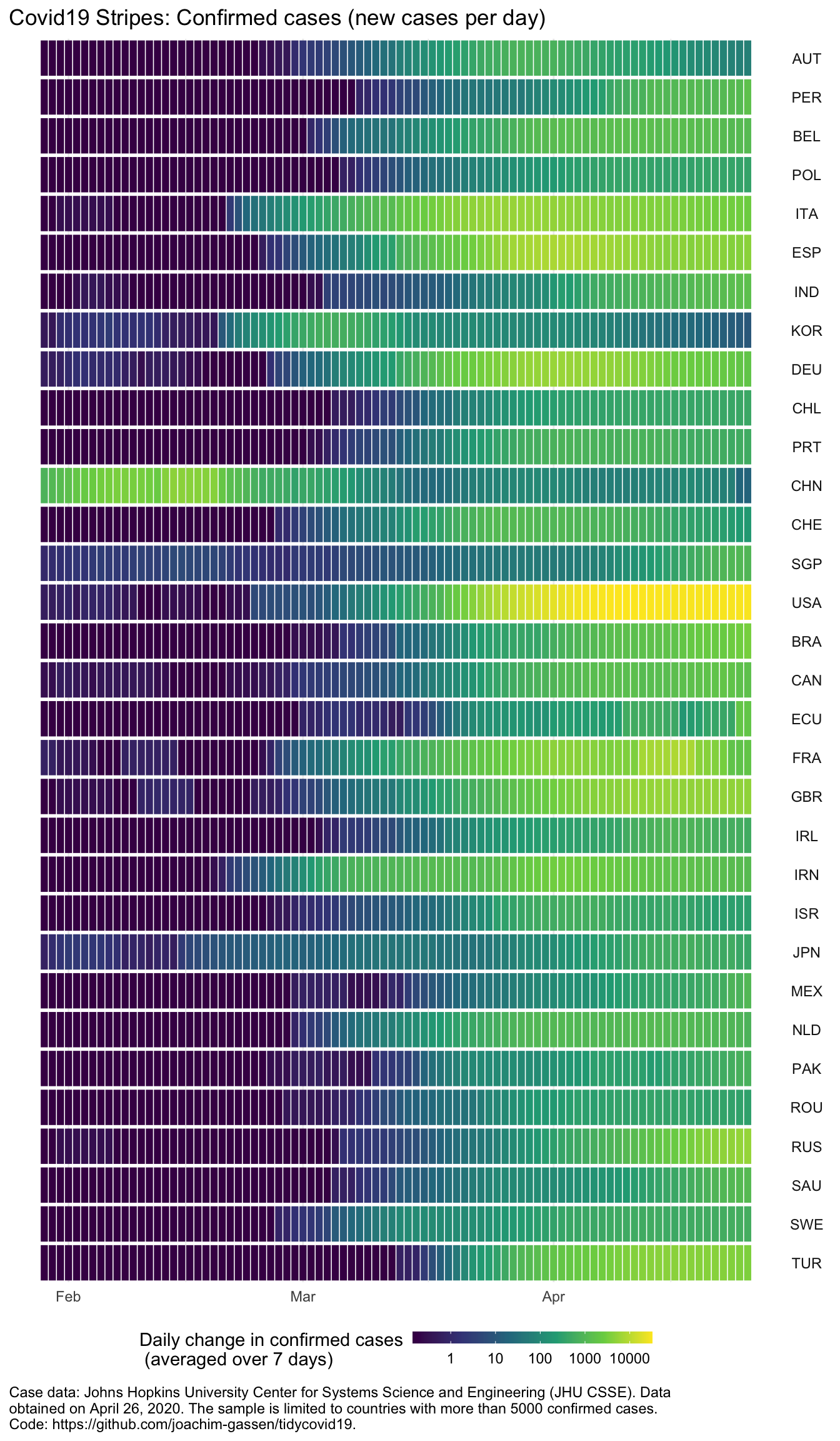
Hmmm. While for most of the countries that have lifted many restrictions it seems as if indeed they have seen slowing spreads recently, there are some countries that lift restrictions albeit still growing or constant new case numbers.
This is it. If you feel like using the data and the visualization functions for your own analyses, take a look at the tidycovid19 repository containing all the code of the package.
Everybody: Enjoy, stay well and keep #FlattenTheCurve!
