Covid-19: Explore Your Visualizer Degrees of Freedom
Setting up the stage
Everybody seems to be starring at plots outlining the spread of the pandemic these days. One thing that caught my interest is how relative small differences in design choices can influence the message that a visual displays. Using the ‘Financial Times Plots’ graphs developed by John Burn-Murdoch as an example, I explore the visualizer degrees of freedom.
I use my {tidycovid19} package to pull and plot the data.
# remotes::install_github("joachim-gassen/tidycovid19")
suppressPackageStartupMessages({
  library(tidyverse)
  library(tidycovid19)
})

covid19_dta <- download_merged_data(silent = TRUE, cached = TRUE)

plot_covid19_spread(covid19_dta)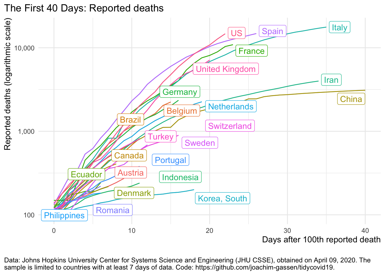
The plot_covid19_spread() function allows customizing the plot along multiple dimensions. By default it plots, using data from CSSE team of Johns Hopkins University, the cumulative development of reported deaths over country by ‘event time’ starting with the day of the 100th death, using a log scale for the y-axis.
Factors that you can customize are
- the data that you want to plot (deaths, confirmed cases, recovered cases or ‘active cases’ meaning the difference of confirmed and recovered cases),
- the starting point of the X axis
- how many days you want to plot,
- how many days of data the countries need to have to be included,
- whether you want to use a log or linear scale for the Y axis,
- whether you want the data to be scaled by population or not,
- whether you want to look at cumulative cases or at daily changes of cases,
- if you want to look at daily changes, the period over which to average these changes,
- governmental interventions that you want to highlight in the graph and
- countries that you want to highlight
Assuming three different sensible variants for the numeric choices and leaving out the highlighting option, these choice generate a whooping 2,592 degrees of freedom. Many graphs to choose the one that communicates the data most fairly. In the following, I play the devils advocate. I try to produce one graph where the situation looks very bad and one graph where things look as bright as possible. Doing so, I focus on large European countries and the U.S.
If you want to see whether you can do better (I am sure that you can), you can use the shiny app that is icluded with the package. It allows you to customize all parameters on the fly and then copy the code to plot the resulting graph to the clipboard.
The negative view
We will focus on deaths mostly as these are less likely to be influenced by variation in testing protocols across countries. To impose a negative view we use a linear scale as this clearly communicates the exponential growth component. A first attempt:
plot_covid19_spread(
  covid19_dta, type = "deaths", min_cases = 100, min_by_ctry_obs = 7,
  edate_cutoff = 35, per_capita = FALSE, log_scale = FALSE,
  cumulative = TRUE, change_ave = 7,
  highlight = c("FRA", "DEU", "ITA", "ESP", "GBR", "USA"),
  intervention = NULL
)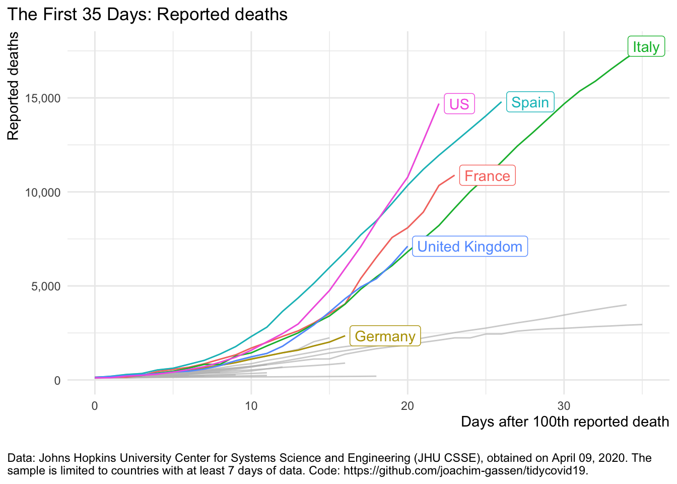
Now this looks as if all countries are roughly on the same trajectory. Let’s assume that we want to single out the U.S.
plot_covid19_spread(
  covid19_dta, type = "deaths", min_cases = 500, min_by_ctry_obs = 7,
  edate_cutoff = 20, per_capita = FALSE, log_scale = FALSE,
  cumulative = TRUE, change_ave = 7,
  highlight = c("FRA", "DEU", "ITA", "ESP", "GBR", "USA"),
  intervention = NULL
)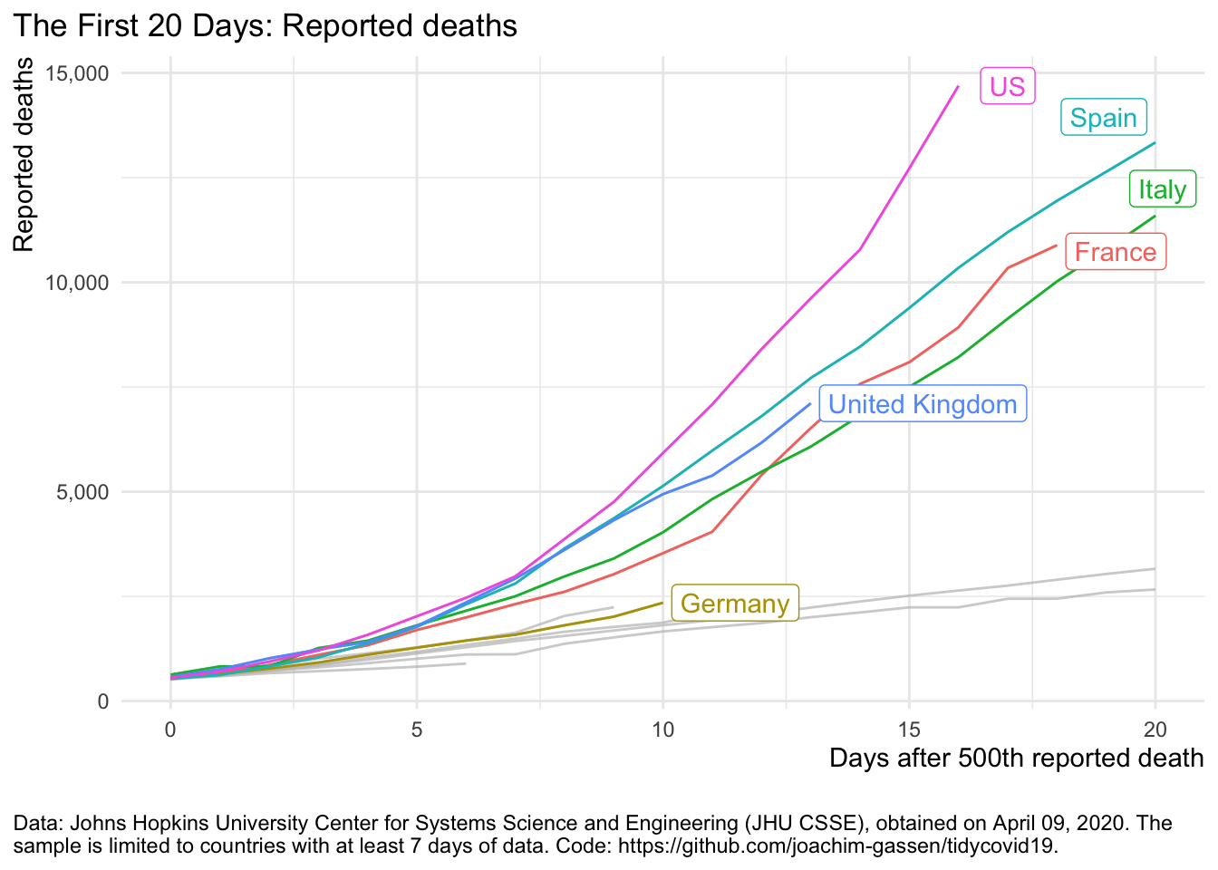
By moving the X axis starting point we focus the viewers attention on the the period where deaths were growing faster in the U.S. compared to other regions of the world. Can we also make Spain look bad?
plot_covid19_spread(
  covid19_dta, type = "deaths", min_cases = 1, min_by_ctry_obs = 7,
  edate_cutoff = 30, per_capita = FALSE, log_scale = FALSE,
  cumulative = TRUE, change_ave = 7,
  highlight = c("FRA", "DEU", "ITA", "ESP", "GBR", "USA"),
  intervention = NULL
)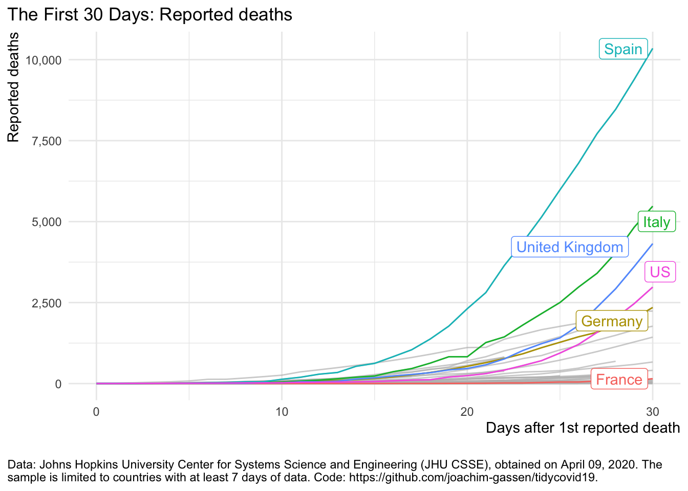
Now this looks horrible for Spain. BTW: I used a cheap trick in the two last graphs. Guess what: I cut off the X axis. See for yourself:
plot_covid19_spread(
  covid19_dta, type = "deaths", min_cases = 1, min_by_ctry_obs = 7,
  edate_cutoff = 55, per_capita = FALSE, log_scale = FALSE,
  cumulative = TRUE, change_ave = 7,
  highlight = c("FRA", "DEU", "ITA", "ESP", "GBR", "USA"),
  intervention = NULL
)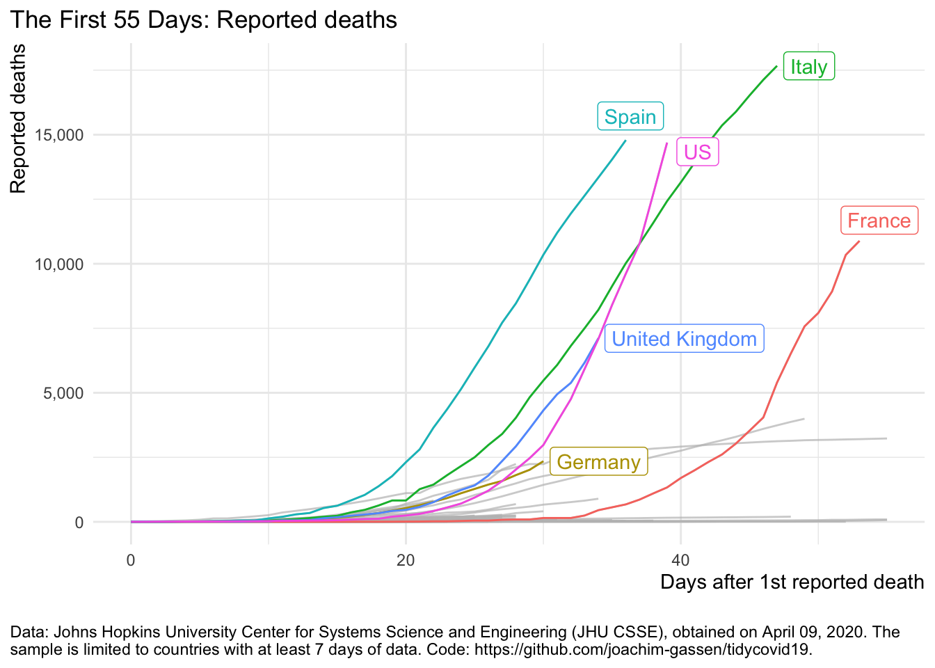
You see, by shifting around the X axis you can more or less focus on certain regions of the curves where a given country has had, relatively speaking, the fastest growth rate.
The next graph is extremely unfair as I am also changing the data that I present. I now focus on the daily change of active cases, meaning the difference of confirmed and recovered cases.
plot_covid19_spread(
  covid19_dta, type = "active", min_cases = 1000, min_by_ctry_obs = 20,
  edate_cutoff = 40, per_capita = FALSE, log_scale = FALSE,
  cumulative = FALSE, change_ave = 7,
  highlight = c("FRA", "DEU", "ITA", "ESP", "GBR", "USA"),
  intervention = NULL
)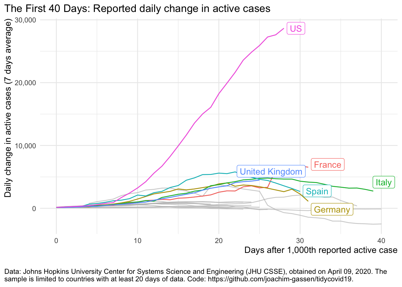
It communicates the impression that the situation in the U.S. is dwarfing the situation in Europe which clearly is not the case. Time to become less pessimistic and switch the focus on the more positive side of things.
The positive view
To make things look better, let’s first switch to the log scale for Y axis. We return to focus on deaths.
plot_covid19_spread(
  covid19_dta, type = "deaths", min_cases = 100, min_by_ctry_obs = 7,
  edate_cutoff = 40, per_capita = FALSE, log_scale = TRUE,
  cumulative = TRUE, change_ave = 7,
  highlight = c("FRA", "DEU", "ITA", "ESP", "GBR", "USA"),
  intervention = NULL
)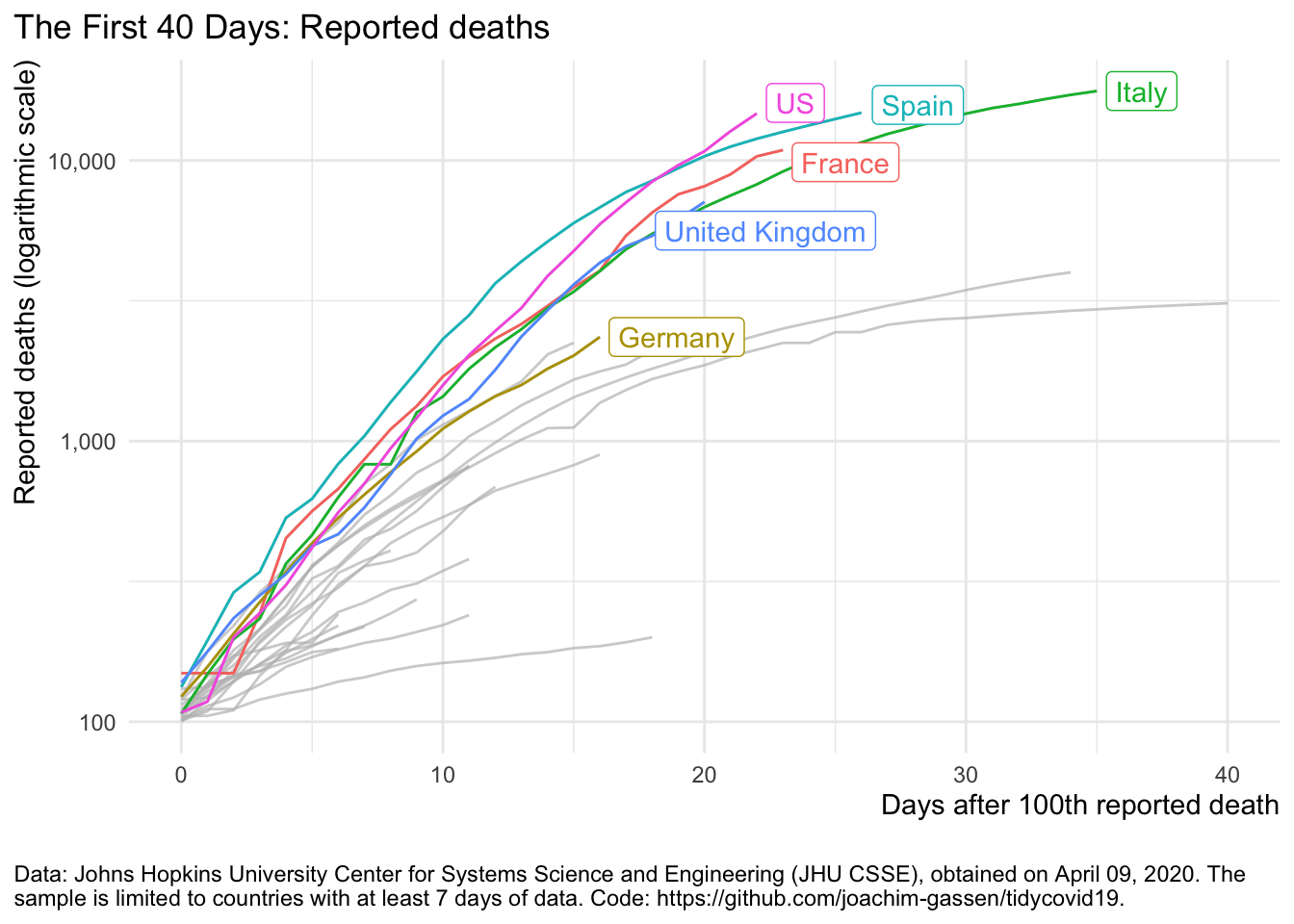
The log scale enables us to see the declining growth rates. This is good news that is far less obvious without the log scaled Y axis. Can we make this change in growth more pronounced? Yes. Let’s look at daily new cases.
plot_covid19_spread(
  covid19_dta, type = "deaths", min_cases = 500, min_by_ctry_obs = 7,
  edate_cutoff = 40, per_capita = FALSE, log_scale = TRUE,
  cumulative = FALSE, change_ave = 1,
  highlight = c("FRA", "DEU", "ITA", "ESP", "GBR", "USA"),
  intervention = NULL
)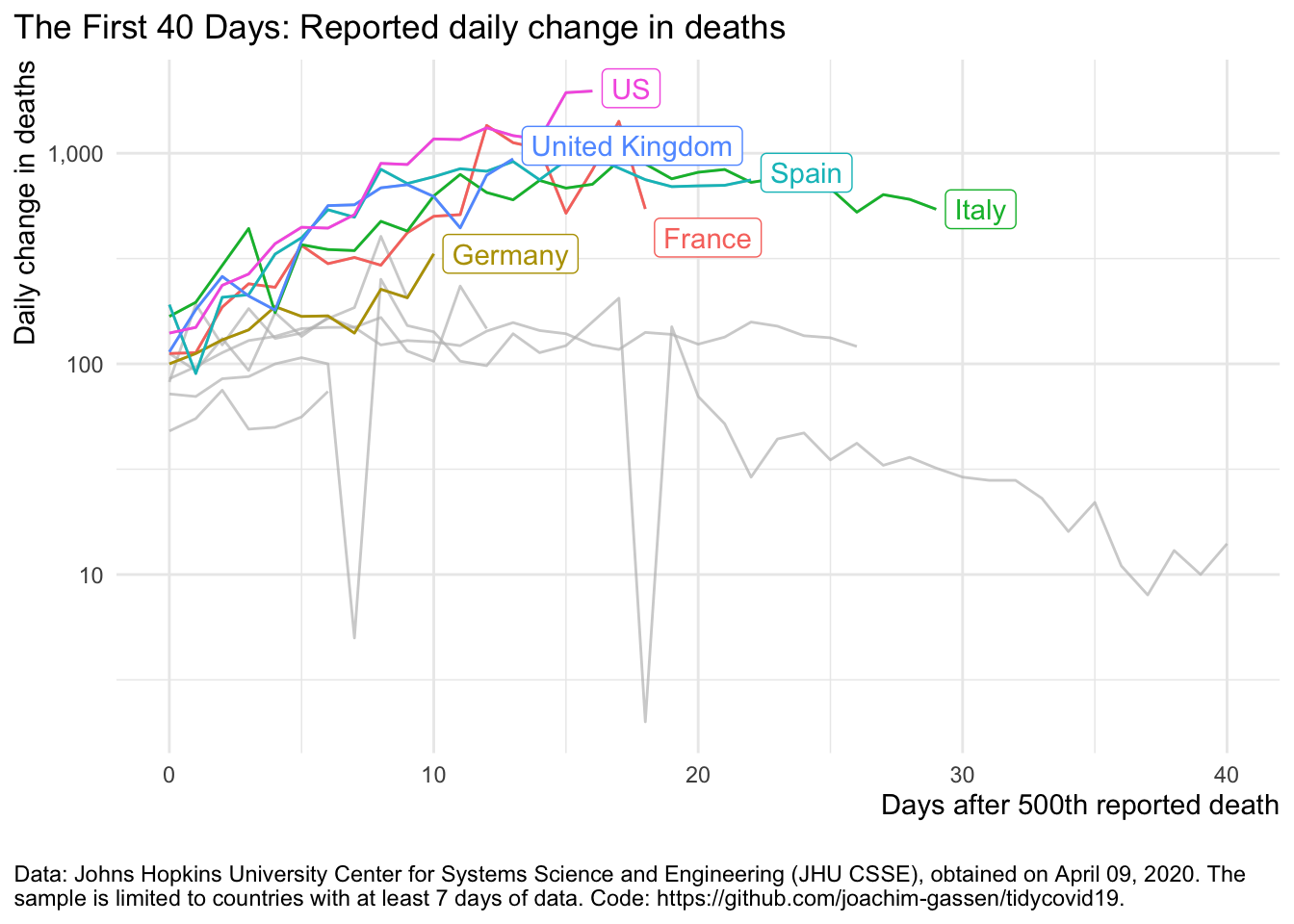
Uuh uuh. This looks messy. Daily changes are noisy, also because of data collection reasons. Let’s smooth this over seven days.
plot_covid19_spread(
  covid19_dta, type = "deaths", min_cases = 500, min_by_ctry_obs = 7,
  edate_cutoff = 30, per_capita = FALSE, log_scale = TRUE,
  cumulative = FALSE, change_ave = 7,
  highlight = c("FRA", "DEU", "ITA", "ESP", "GBR", "USA"),
  intervention = NULL
)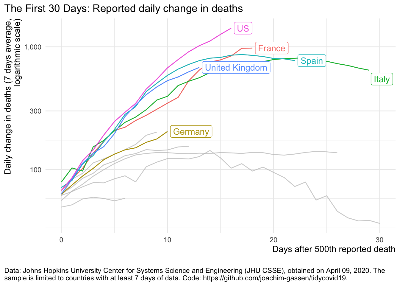
Ah. This looks better. Now you can see that Italy and Spain have “flattened the curve”. It is easy to miss-understand this graph in a way that fewer people are affected by the pandemic. This is not the case. There are still many people dying and confirmed and active cases are mostly on the rise but there is a trend in Italy and Spain that fewer people die every day. This certainly is good news. For the U.S. however, unfortunatley, things do not look that good yet.
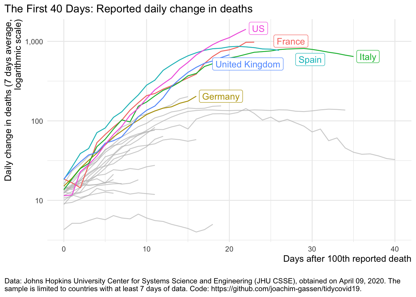
For the last graph, let’s assume that we would like to put less emphasis on the differences across countries and more on the overall trend.
plot_covid19_spread(
  covid19_dta, type = "deaths", min_cases = 100, min_by_ctry_obs = 7,
  edate_cutoff = 40, per_capita = FALSE, log_scale = TRUE,
  cumulative = FALSE, change_ave = 7,
  highlight = c("FRA", "DEU", "ITA", "ESP", "GBR", "USA"),
  intervention = NULL
)
Summing up
Even using the same data, graphs can communicate very differently. Getting a ‘neutral’ message to the reader is far from trivial. One also has to factor in the level of experience that a reader has, e.g., with different axis scales. Visualizations without guidance can be particularly misleading. Interactive visualizations like the one provided by the shiny app of the {tidycovid19} package can be helpful to explore the data and their inherent visualization degrees of freedom but are most likely more suitable for an experienced audience.
Everybody: Enjoy, stay well and keep #FlattenTheCurve!
