From one Regression to Hundreds Within Seconds: A Shiny Specification Curve
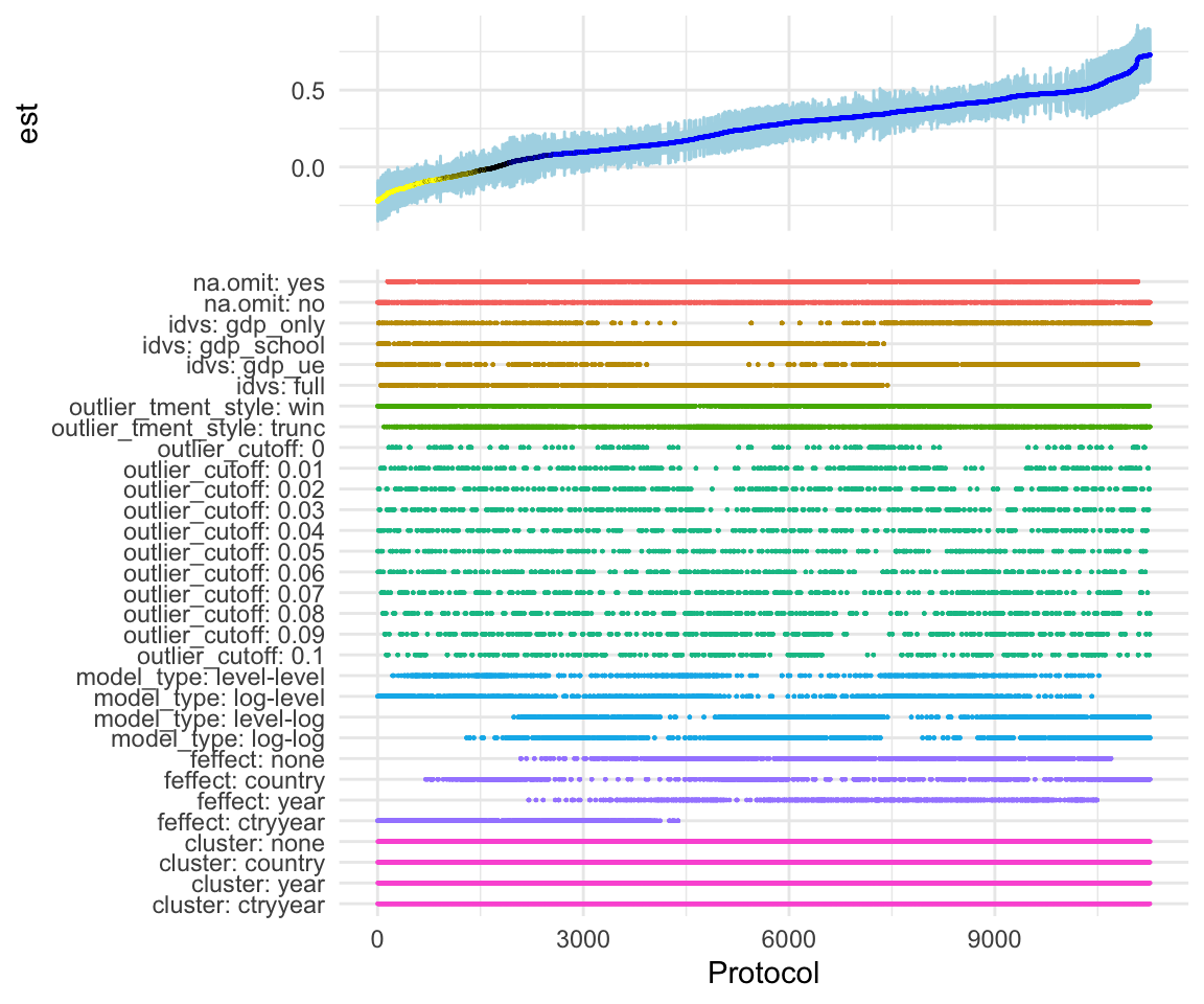
Online appendices detailing the robustness of empirical analyses are paramount but they never let readers explore all reasonable researcher degrees of freedom. Simonsohn, Simmons and Nelson suggest a ‘specification curve’ that allows readers to eyeball how a main coefficient of interest varies across a wide arrange of specifications. I build on this idea by making it interactive: A shiny-based web app enables readers to explore the robustness of findings in detail along the whole curve.
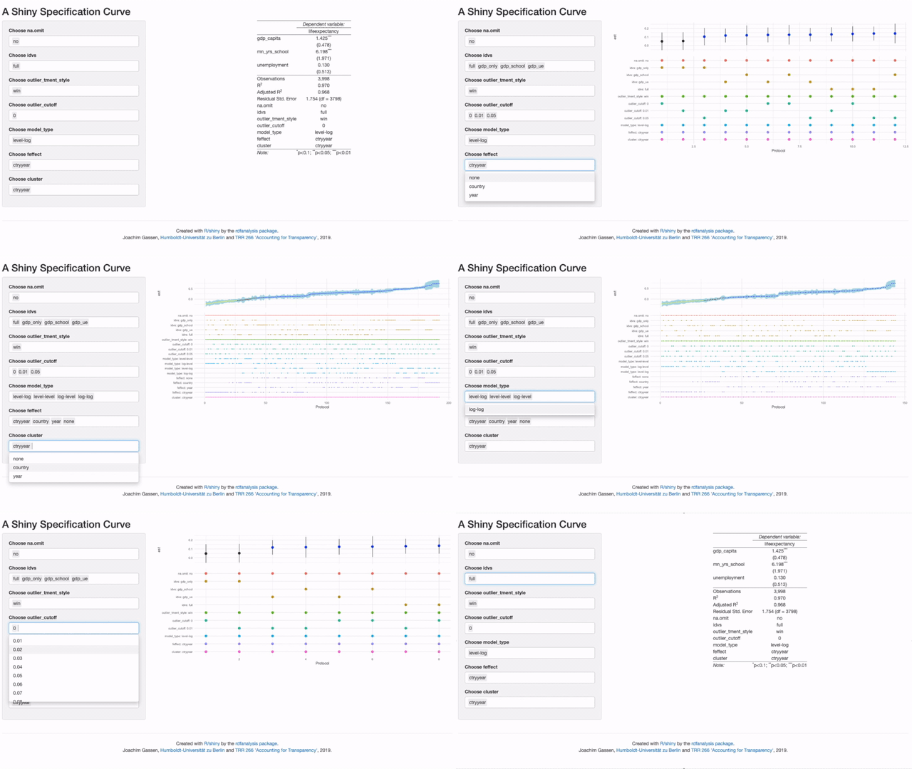
Following up on two blog articles that introduced the in-development ‘rdfanalysis’ package, the app is new extension of this package. In essence, it let’s you change the research design choices that you want to display and then redraws the curve on the fly.
In its simple version, it just needs a data frame with each row containing an estimate and its choices. In most cases, you also want to include lower and upper bounds of the estimate as well so that the specification curve can display a nice confidence interval ribbon. As an example, the first few rows of data used in the example below look as follows:
# devtools::install_github("joachim-gassen/rdfanalysis")
library(rdfanalysis)
load(url("https://joachim-gassen.github.io/data/rdf_ests.RData"))
kable(head(ests), format.args = list(digits = 3))| na.omit | idvs | outlier_tment_style | outlier_cutoff | model_type | feffect | cluster | est | lb | ub |
|---|---|---|---|---|---|---|---|---|---|
| yes | gdp_only | win | 0 | level-level | none | none | 0.362 | 0.3466 | 0.3783 |
| no | gdp_only | win | 0 | level-level | none | none | 0.386 | 0.3737 | 0.3983 |
| yes | gdp_school | win | 0 | level-level | none | none | 0.131 | 0.1159 | 0.1452 |
| no | gdp_school | win | 0 | level-level | none | none | 0.075 | 0.0644 | 0.0855 |
| yes | gdp_ue | win | 0 | level-level | none | none | 0.370 | 0.3543 | 0.3860 |
| no | gdp_ue | win | 0 | level-level | none | none | 0.325 | 0.3116 | 0.3378 |
This is the type of data that exhaust_design() from the rdfanalysis package
will generate. If you create your own data, you need to inform
plot_rdf_spec_curve() which columns in your data frame contain choices. You
do this by setting attribute in the data frame. In the case above, choices are
included in columns 1 to 7. So that you would set the attribute as follows:
attr(ests, "choices") <- 1:7Once you have such a data frame, you can plot your specification curve:
attr(ests, "choices") <- 1:7
plot_rdf_spec_curve(ests, "est", "lb", "ub") 
Nice. But how does one create the interactive display? Easy. Just call
shiny_rdf_spec_curve(), giving your data and the additional parameters that
you would hand over to plot_rdf_spec_curve() as a list:
shiny_rdf_spec_curve(ests, list("est", "lb", "ub")) You will see that the app will take a while to display the initial specification curve. This is because it is based on 11,264 specifications. Once you start to drill down, the app will become more responsive.
When you focus on only a few specifications you might think “Hey this is nice but
I would rather like to see the actual regression results for these cases”.
This can be done! You can use the workflow of the rdfanalysis package so that
the app will present the actual model results as soon as you zoomed in on a handful
of specifications. While you at it you can also specify your preferred
specification (e.g., the one that you presented in your paper).
design <- define_design(steps = c("read_data",
                                  "select_idvs",
                                  "treat_extreme_obs",
                                  "specify_model",
                                  "est_model"),
                        rel_dir = "vignettes/case_study_code")

shiny_rdf_spec_curve(
  ests, list("est", "lb", "ub"),
  design, "vignettes/case_study_code",
  "https://joachim-gassen.github.io/data/wb_new.csv",
  default_choices = list(na.omit = "no",
                         idvs = "full",
                         outlier_tment_style ="win",
                         model_type = "level-log",
                         outlier_cutoff = 0,
                         feffect = "ctryyear",
                         cluster = "ctryyear"))
Please note that the code above will only run when you have forked the
rdfanalysis repo and set the working directory to its root.
Finally, you can add a title and a short info text by setting the title and
abstract parameters and, voilà: Your interactive and exhaustive robustness
section.
Kudos to Nate Breznau for bringing up the idea to use shiny to visualize the specification curve. See my former post for more detail on the case and on how to drill deeper into the findings. Feel free to use the in-development ‘rdfanalysis’ package to exhaust the researcher degrees of freedoms in your own projects. If you have remarks about this project, I would love to hear from you. Use the comment section below or reach out via email or twitter.
Enjoy!

