11,264 Regressions in One Tidy Plot
Following up on a recent blog article that discussed how to use R to explore your researcher degrees of freedom, this post introduces a specification curve plot as suggested in Simonsohn, Simmons and Nelson. With this plot, you can eyeball how various researcher degrees of freedom affect your main outcome of interest.
In a recent post, I introduced my in-development R package ‘rdfanaylsis’ that provides a coding environment allowing researchers to specify their researcher degrees of freedom ex ante and to systematically explore their effects on their findings ex post. Using a prominent topic from health economics and demographics (the association of national income with life expectancy) I identified a set of seven research design choices that in combination describe 11,264 different model specifications, referred to as researcher degrees of freedom.
The ‘rdfanaylsis’ package allows systematically exhausting all these choices and generates a large set of estimates. A key challenge is now to make all these related findings digestible for the reader. While the package offers plots to ‘drill-down’ into the data, it did not provide a quick ‘one-stop’ visual.
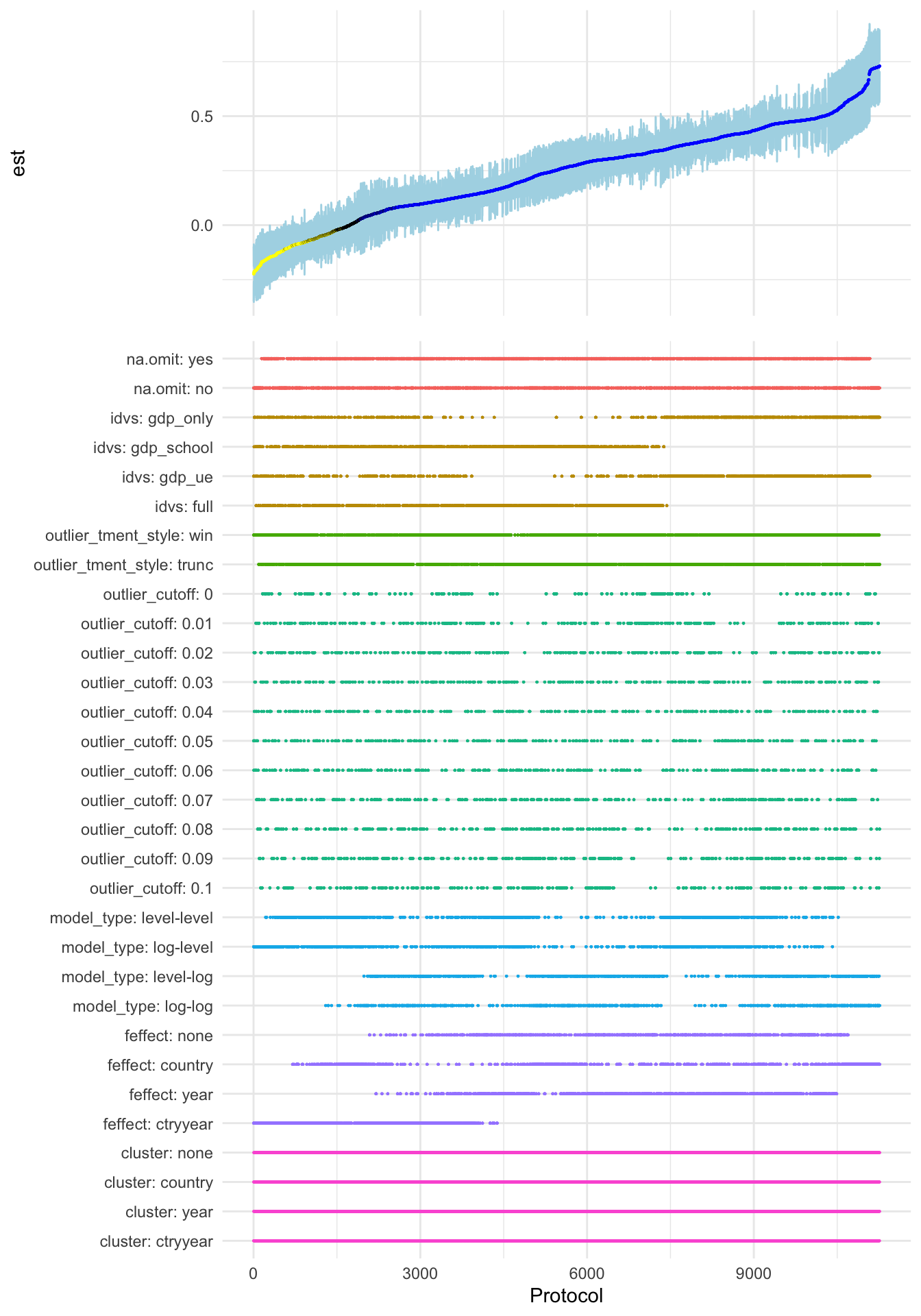
In their working paper, Simonsohn, Simmons and Nelson suggest a specification curve plot that in my opinion provides an excellent visual to eyeball the variance of generated estimates. The newly implemented function plot_rdf_spec_curve() generates a ‘ggplot’-based variant of their approach. See below:
devtools::install_github("joachim-gassen/rdfanalysis")
library(rdfanalysis)
load(url("https://joachim-gassen.github.io/data/rdf_ests.RData"))
plot_rdf_spec_curve(ests, "est", "lb", "ub") 
Figure 1: Effect of a 10 % increase in national income on life expectancy in years:
A specification curve visualizing your researcher degrees of freedom
The top part of the plot visualizes the range of the estimates and their confidence intervals. The estimates measure the association of a 10 % increase in national income with the nation’s average life expectancy at birth in years. You see a relatively wide range of estimates (from -0.22 to 0.73 years) with the majority (80.0 %, indicated in blue) being significantly positive. This finding is consistent with a positive effect of national income on life expectancy.
In the bottom part, you can get a quick idea about which design choices are influential for the magnitude of the result: It is the list of the included control variables, the model specification (in terms of log-transformation of dependent and independent variables), and the fixed effect structure. On the other hand, outliers and their treatments seem to have only a limited impact on the findings and, naturally, the clustering of standard errors only affects the confidence intervals and not the estimates. The fact that the fixed effect structure and the control variables are influential clearly hints at the endogenous nature of national income and should caution the reader against interpreting the findings of the analysis in a causal way.
See my former post for more detail on the case and on how to drill deeper into the findings. Feel free to use the in-development ‘rdfanalysis’ package to exhaust the researcher degrees of freedoms in your own projects. If you have remarks about this project, I would love to hear from you. Use the comment section below or reach out via email or twitter.
Enjoy!
