Meet {tidycovid19}: Yet another Covid-19 related R Package
I have decided that the world needs another Covid-19 related R package. Not sure whether you agree, but the new package facilitates the direct download of various Covid-19 related data (including data on governmental measures) directly from authoritative sources. It also provides a flexible function and accompanying shiny app to visualize the spreading of the virus. Play around with the shiny app here if you like or hang around to learn more about the package.
Why yet another package on Covid-19?
There are at least two R packages that provide data and infrastructure related to Covid-19:
{nCov2019}: This package has a focus on Chinese data but also contains data on other countries and regions. It contains a shiny dashboard.{conronavirus}: This package provides the Johns Hopkins University CSSE dataset together with a dashboard
Other than the two packages above, the key objective of the {tidycovid19} package is to provide transparent access to various data sources. It does not contain any data per se. Instead, it provides functions to pull data from publicly available sources.
However, to save processing time and bandwidth, for those interested in speedy downloads it alternatively provides the option to download the data from the cached data in the Github repository (stored in the directory cached_data). The cached data will be updated daily.
If you rather want to start your own project by customizing the download code to fit your needs, I suggest that you take a look at my Github repository “tidy_covid19” (mind the underscore). This repo presents a forkable code infrastructure for Covid 19 projects using the same data infrastructure.
The disclaimer from my previous blog post continues to apply. I am not and Epidemiologist. My motivation to develop this package is to help researchers interested in studying the spread of the virus and the effects of non-pharmaceutical interventions on the virus spread. To reach this objective, the package pulls data from various sources. T
Here are the download functions offered by the package:
download_jhu_csse_covid19_data(): Downloads and tidies Covid-19 data from the Johns Hopkins University CSSE Github Repo. This data has developed to a standard resource for researchers and the general audience interested in assessing the global spreading of the virus. The data is aggregated to the country level.download_acaps_npi_data(): Downloads and tidies the Government measures dataset provided by the Assessment Capacities Project (ACAPS). These relatively new data allow researchers to study the effect of non-pharmaceutical interventions on the development of the virus.download_google_trends_data(): Uses {gtrendsR} to Download and tidy Google Trends data on the search volume for the term “coronavirus” (Thank you to Yan Ouaknine for bringing up that idea!). This data can be used to assess the public attention to Covid-19 across countries (see plot below) and over time within a given country.download_wbank_data(): Downloads and tidies additional country level information provided by the World Bank using the {wbstats} package. These data allow researchers to calculate per capita measures of the virus spread and to assess the association of macro-economic variables with the development of the virus.download_merged_data(): Downloads all data sources and creates a merged country-day panel sample.
All functions can be called with the parameter cached = TRUE to download the cached data instead of assessing the original data sources. So, a quick way to use the data is to do the following.
# remotes::install_github("joachim-gassen/tidycovid19")
suppressPackageStartupMessages({
  library(tidycovid19)
  library(dplyr)
  library(ggplot2)
  library(ggrepel)
})

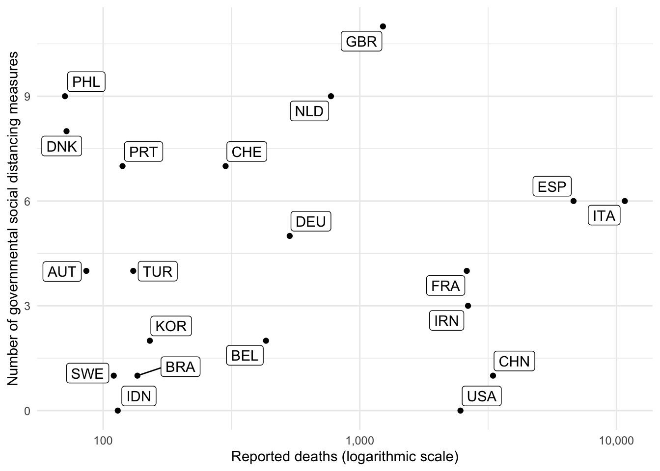
merged_dta <- download_merged_data(cached = TRUE)
## Downloading cached version of merged data...done. Timestamp is 2020-03-30 06:43:14merged_dta %>%
group_by(country) %>%
mutate(
reported_deaths = max(deaths),
soc_dist_measures = max(soc_dist)
) %>%
select(country, iso3c, reported_deaths, soc_dist_measures) %>%
distinct() %>%
ungroup() %>%
arrange(-reported_deaths) %>%
head(20) -> df
ggplot(df, aes(x = reported_deaths, y = soc_dist_measures)) +
geom_point() +
geom_label_repel(aes(label = iso3c)) +
theme_minimal() +
scale_x_continuous(trans='log10', labels = scales::comma) +
labs(x = "Reported deaths (logarithmic scale)",
y = "Number of governmental social distancing measures",
annotation = "Data from JHU CSSE and ACAPS.") 
Visualization
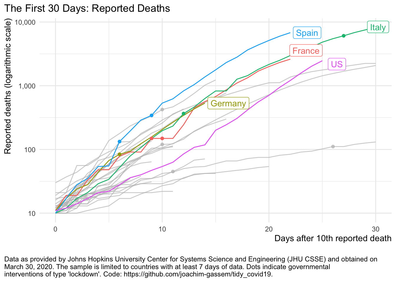
The focus of the package lies on data collection and not on visualization as there are already many great tools floating around. The function plot_covid19_spread() however, allows you to quickly visualize the spread of the virus in relation to governmental intervention measures. It is inspired by the insightful displays created by John Burn-Murdoch from the Financial Times and offers various customization options.
plot_covid19_spread(merged_dta, highlight = c("ITA", "ESP", "FRA", "DEU", "USA"),
                    intervention = "lockdown")
Shiny App
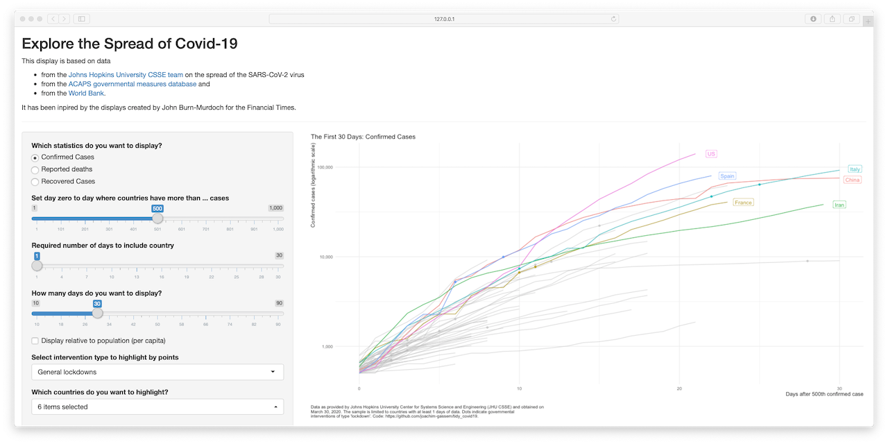
Sorry, I could not resist. The options of the plot_covid19_spread() make the
implementation of a shiny app a little bit to tempting to pass. The command
shiny_covid19_spread() starts the app. You can check it out online if you like.

Wrapping up
This is it for the time being. I hope that the package might be helpful to those doing Covid-19 related research. If you have suggestions and/or feedback, consider opening an Issue on Github
Stay well and keep #FlattenTheCurve!
