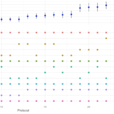
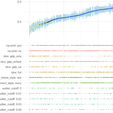
Online appendices detailing the robustness of empirical analyses are paramount but they never let readers explore all reasonable researcher degrees of freedom. Simonsohn, Simmons and Nelson suggest a ‘specification curve’ that allows readers to eyeball how the main coefficient of interest varies across a wide arrange of specifications. I build on this idea by making it interactive: A shiny-based web app enables readers to explore the robustness of findings in detail along the whole curve.