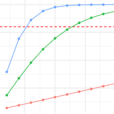
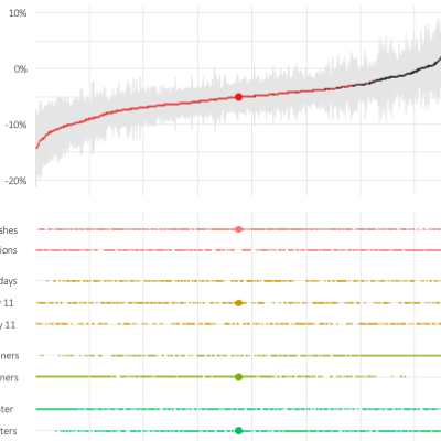
When preparing the analysis for our recent preregistered field experiment on the effect of carbon foodprint labels, we decided to implement an (interactive) specification curve analysis to present insights on how large our researcher degrees of freedom were, even after preregistration. This blog post introduces the idea and links you to the GitHub repo, where you can reproduce and explore our analyis relatively quickly using GitHub Codepaces.
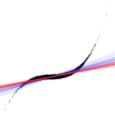
Building on a current working papers of David Veenman and myself, and using ‘fancy’ animations, we discuss the issues related to non-random outliers in empirical archival research work and whether robust regression methods can be viewed as a pancea (spoiler: they can’t). Building on these insights we suggest a work-flow for archival work that helps us to take outlier treatment to the next level.
Designing empirical research to be easily reproducible is no easy task. The new ’treat’ repository, developed by the Open Science Data Center of the TRR 266 Accounting for Transparency, accompanied by a series of short videos, leads the way, step by step.
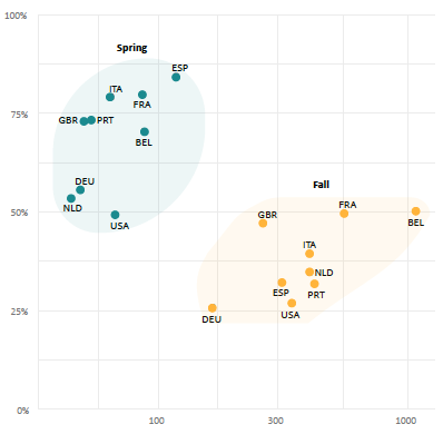
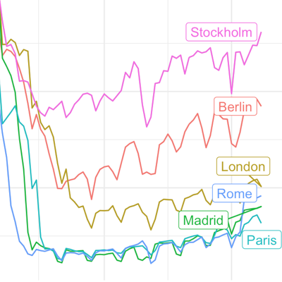
OK. We are at home. Again. Given that large parts of Europe and the U.S. are currently experiencing a second large wave of Covid-19 cases and that most European jurisdictions have reacted with more or less rigorous lockdown regulations, one wonders about the effects of these regulations on social distancing compared to the one in March/April. This graphical primer on this topic is the outcome of a recent data visualization workshop that we run for the TRR 266.
A recent update to the {tidycovid19} package brings data on testing, alternative case data, some regional data and proper data documentation. Using all this, you can use the package to explore the associations of (the lifting of) governmental measures, citizen behavior and the Covid-19 spread.
As the Covid-19 pandemic is affecting more and more countries around the globe, I included additional visualizations options into the {tidycovid19} package so that it becomes easier to compare the spread of the virus across countries. Also, I use this post to take a quick look on some countries that start lifting their governmental measures. See for yourself!
Yesterday, I came across the Google “COVID-19 Community Mobility Reports“. In these reports, Google provides some statistics about changes in mobility patterns across geographic regions and time. The data seem to be very interesting to assess the extent of how much governmental interventions and social incentives have affected our day-to-day behavior around the pandemic. Unfortunately, the data comes in by-country PDFs. What is even worse, the daily data is only included as line graphs in these PDFs. Well, who does not like a challenge if it is for the benefits of open science?