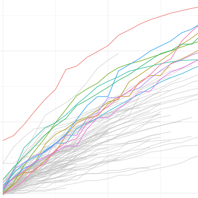
Following up on prior posts I now document on how to obtain and merge data on government measures (like social distancing measures or lockdown rules) provided by the Assessment Capacities Project (ACAPS) with the Covid-19 data from the Johns Hopkins CSSE team. In the longer run, this merged data can be used to study the impact of interventions on the global spread of the virus.
This is a follow-up blog post to reflect that the Johns Hopkins CSSE team has just adjusted the time-series table structure in their github repository. Currently, they only seem to provide time series data on confirmed cases and deaths. The data of the old post is still available but won’t be updated.
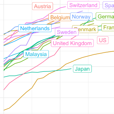
This short blog post presents code to tidy the Covid-19 case data provided by the Johns Hopkins University at the country level. I wrote the code for an R Tutorial that I am currently drafting for locked down students. I thought that I share the code snippet in case somebody wants to work with country level Covid-19 data, in particular by merging it with additional sources.
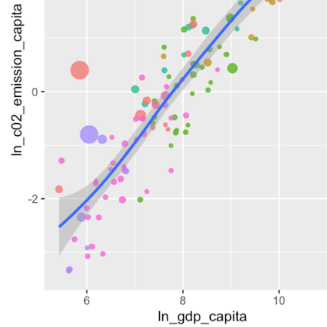
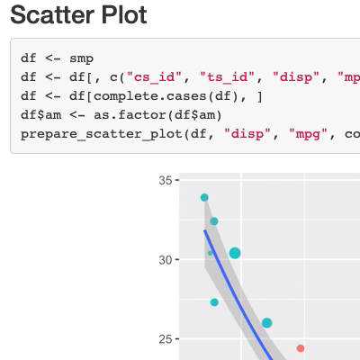
Assume that you have some new data that you want to explore. The new CRAN version of the ‘ExPanDaR’ package helps by providing a (customized) R notebook containing all building blocks of an exploratory data analysis with a few clicks. Let me show you how to do this by taking a quick look at country-level CO2 emissions.
Closing down for the year, I finally wrapped up a new ‘ExPanDaR’ version that now allows exploring all sorts of data interactively and generates notebooks containing the analysis on the fly. So here comes my little Christmas present for the wonderful RStats community!
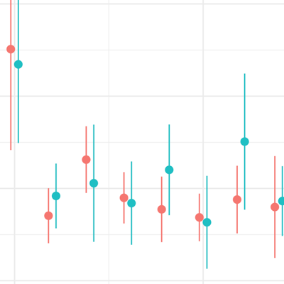
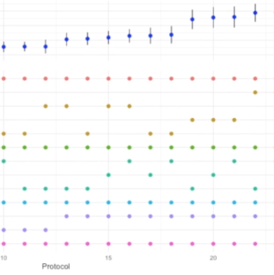
Online appendices detailing the robustness of empirical analyses are paramount but they never let readers explore all reasonable researcher degrees of freedom. Simonsohn, Simmons and Nelson suggest a ‘specification curve’ that allows readers to eyeball how the main coefficient of interest varies across a wide arrange of specifications. I build on this idea by making it interactive: A shiny-based web app enables readers to explore the robustness of findings in detail along the whole curve.
When starting a course you want to learn something about the background of your students. What do you do when the course is too large for an introduction round? Run a shiny survey!