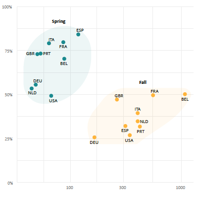
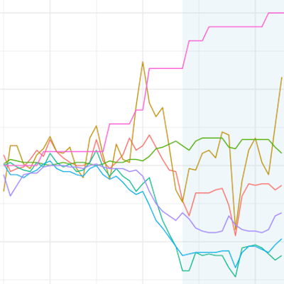
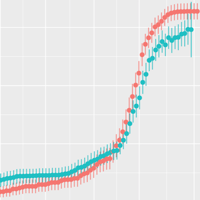
A recent update to the {tidycovid19} package brings data on testing, alternative case data, some regional data and proper data documentation. Using all this, you can use the package to explore the associations of (the lifting of) governmental measures, citizen behavior and the Covid-19 spread.
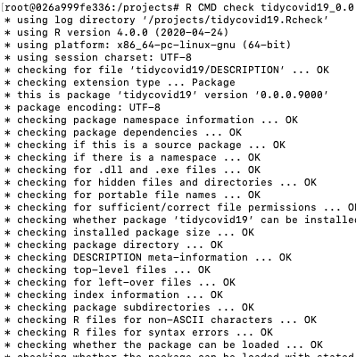
As a package maintainer you might be observing an increasing number of questions raised by people that have recently migrated to R 4.0.0 and are now trying to get your package to work. While migrating to a new version is always tempting maybe you don’t feel like disrupting your development environment just now as you have even more fun things to do. Fear not! A quick docker container can help you to test your package and its functionality without touching your main environment. Let me show you how.
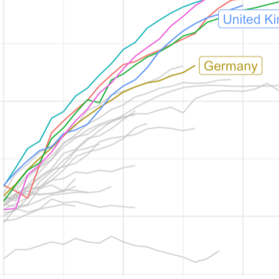
As the Covid-19 pandemic is affecting more and more countries around the globe, I included additional visualizations options into the {tidycovid19} package so that it becomes easier to compare the spread of the virus across countries. Also, I use this post to take a quick look on some countries that start lifting their governmental measures. See for yourself!
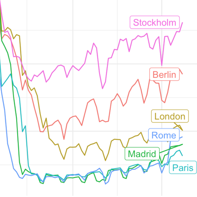
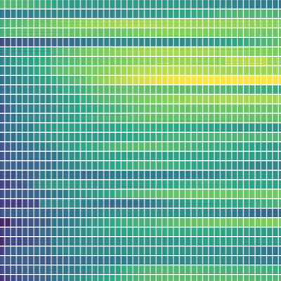
Yesterday, I came across the Google “COVID-19 Community Mobility Reports“. In these reports, Google provides some statistics about changes in mobility patterns across geographic regions and time. The data seem to be very interesting to assess the extent of how much governmental interventions and social incentives have affected our day-to-day behavior around the pandemic. Unfortunately, the data comes in by-country PDFs. What is even worse, the daily data is only included as line graphs in these PDFs. Well, who does not like a challenge if it is for the benefits of open science?
Everybody seems to be starring at plots outlining the spread of the pandemic these days. One thing that caught my interest is how relative small differences in design choices can influence the message that a visual displays. Using the Financial Times Plots graphs developed by John Burn-Murdoch as an example, I explore the visualizer degrees of freedom.
Assessing the impact of Non-Pharmaceutical Interventions on the spread of Covid-19 requires data on Governmental measures. Luckily, the Assessment Capacities Project (ACAPS) and the Oxford Covid-19 Government Response Tracker both provide such data. In this blog post, I explore the new data provided by the Oxford initiative and compare it against the data provided by ACAPS that is already included in my {tidycovid19} package.
I have decided that the world needs another Covid-19 related R package. Not sure whether you agree, but the new package facilitates the direct download of various Covid-19 related data (including data on governmental measures) directly from authoritative sources. It also provides a flexible function and accompanying shiny app to visualize the spreading of the virus. Play around with the shiny app here if you like or hang around to learn more about the package.