Prepares a Quantile Trend Graph
prepare_quantile_trend_graph.RdReads a data frame and plots the quantiles of the specified variable by an ordered factor (normally the time-series indicator)
prepare_quantile_trend_graph(
  df,
  ts_id,
  quantiles = c(0.05, 0.25, 0.5, 0.75, 0.95),
  var = utils::tail(colnames(df[sapply(df, is.numeric) & colnames(df) != ts_id]), n =
    1),
  points = TRUE
)
Arguments
| df | Data frame containing the ordered factor and the numerical variable to be plotted |
|---|---|
| ts_id | a string containing the column name of the ordered factor (normally the time-series indicator) |
| quantiles | a numerical vector containing the quantiles that are to be plotted |
| var | a string containing the column name of the variable
to be plotted. Defaults to the last numerical variable of the data frame
that is not |
| points | Do you want points to indicate the statistics? Defaults to |
Value
A list containing two items:
- "df"
A data frame containing the plotted quantiles
- "plot"
The plot as returned by
ggplot
Examples
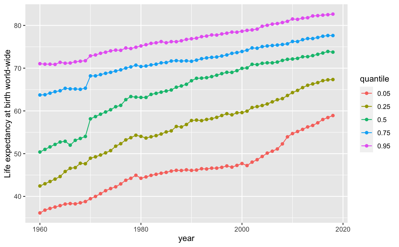
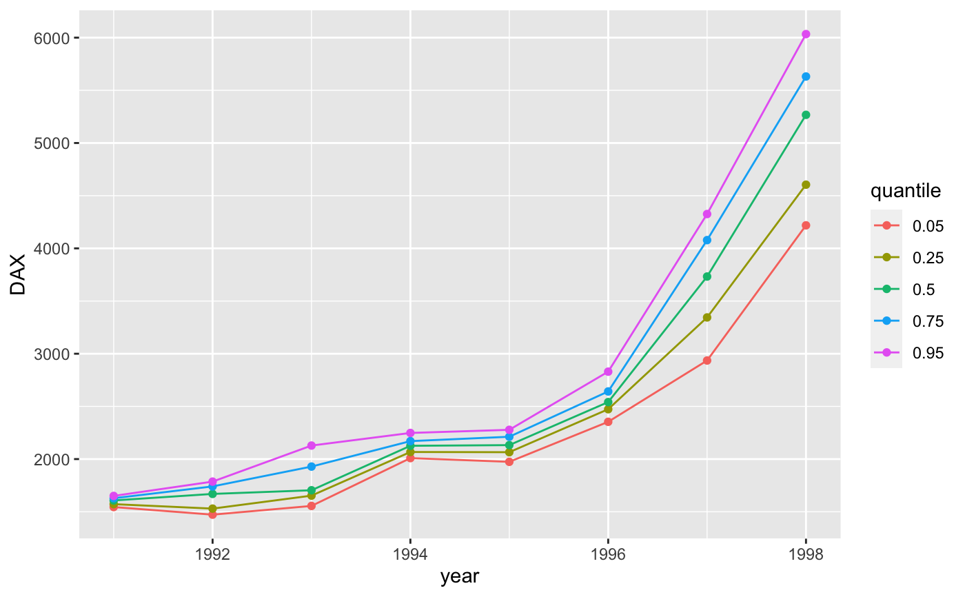
prepare_quantile_trend_graph(worldbank, "year", var = "SP.DYN.LE00.IN")$plot +
  ggplot2::ylab("Life expectancy at birth world-wide")df <- data.frame(year = floor(stats::time(datasets::EuStockMarkets)),
                 DAX = datasets::EuStockMarkets[,"DAX"])
graph <- prepare_quantile_trend_graph(df, "year", c(0.05, 0.25, 0.5, 0.75, 0.95))
graph$plot