
A Primer on Power Simulations when Evaluating Experimental Designs
When you design experiments, you need to know how many participants it takes to get informative results. But what makes results informative? Simply put: A precise effect estimate, meaning an estimate that is unbiased and has a narrow confidence interval. Your randomized design and careful measurement should ensure that your effect estimate is unbiased. But how can you be confident that your estimate’s confidence interval is narrow “enough”?
Let’s look at an artificial example. Assume that you are designing an experiment that studies whether a certain information treatment makes people more likely to invest into a given firm’s stock. You measure this investment likelihood as a stated preference on a discrete scale from 0 to 100 %. Let’s simulate some baseline data, meaning the data for participants that do not receive the information treatment.
library(tidyverse)
library(truncnorm)
set.seed(42)

sim_data <- function(n = 100, mean = 50, sd = 20) {
  y <- rtruncnorm(n, 0, 100, mean, sd)
  tibble(
    y = round(y)
  )
}

baseline <- sim_data()
ggplot(baseline, aes(x = y)) + geom_histogram(bins = 20) + theme_minimal()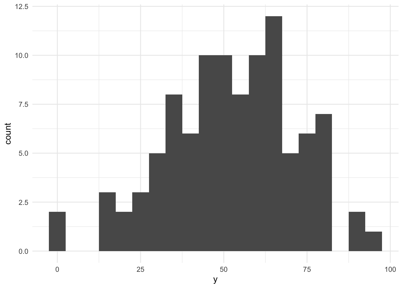
As you can see, we had to make assumotions about the sample size (100), the distribution (truncated normal), its mean (50), and its standard deviation (20) to simulate data. These are crucial assumptions for all that follows. The resulting histogram shows that we have quite a variance in our investment likelihood.
Based on our assumed distribution of our dependent variable under no treatment, we next have to formulate our assumptions about a likely effect size for our information treatment. Often, effect sizes are expressed in % Standard Deviation, also labelled as Cohen’s-d. We start with the expectation that our expected effect size is 10, meaning a Cohen’s-d value of 0.5. Such an effect is traditionally referred to as a “medium-sized effect” (small (d = 0.2), medium (d = 0.5), and large (d >= 0.8)). Let’s simulate the treated sample and plot a visual.
treated <- sim_data(mean = 60)

smp <- bind_rows(
  baseline %>% mutate(tment = FALSE) %>% select(tment, y),
  treated %>% mutate(tment = TRUE) %>% select(tment, y)
)

ggplot(smp, aes(x = tment, y = y)) + geom_boxplot() + theme_minimal()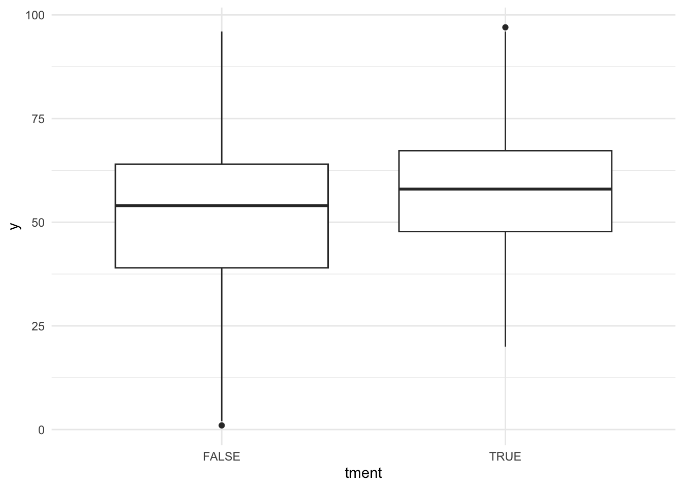
Based on the boxplot you might want to guess that there is a treatment effect and this is exactly how Cohen has once defined a “medium” effect. It should be “visible to the naked eye of a careful observer”. But is it significant in terms of a convential t-Test?
tt <- t.test(y ~ !tment, data = smp)
print(tt)
##
## Welch Two Sample t-test
##
## data: y by !tment
## t = 1.8965, df = 195.86, p-value = 0.05936
## alternative hypothesis: true difference in means between group FALSE and group TRUE is not equal to 0
## 95 percent confidence interval:
## -0.1970289 10.0770289
## sample estimates:
## mean in group FALSE mean in group TRUE
## 57.16 52.22Only marginally. And this brings us back to the topic of narrow confidence intervals and power. For the test above, the confidence interval ranges from -0.2 to 10.08. Assuming that we are mostly interested in learning whether our effect is different from zero at the conventional level of 95%, then this confidence interval is just a little to wide (it includes zero).
But this might be just bad luck resulting from the simulated data draw, right? Power conceptually asks the question how likely it is that we would find a significant test result given our test design and assumptions about the data generating process as outlined above. We can derive the power for our fictuous experiment by running a Monte Carlo Simulation on our setting. This is not that hard to do:
sim_run <- function(effect_size = 0.5, cell_size = 100, mean = 50, sd = 20) {
  df <- bind_rows(
    sim_data(n = cell_size, mean = mean, sd = sd) %>%
      mutate(tment = FALSE) %>% select(tment, y),
    sim_data(n = cell_size, mean = mean + effect_size*sd, sd = sd) %>%
      mutate(tment = TRUE) %>% select(tment, y)
  )
  tt <- t.test(y ~ !tment, data = df)
  tibble(
    effect_size = effect_size,
    cell_size = cell_size,
    mean = mean,
    sd = sd,
    t.stat = tt$statistic,
    p.value = tt$p.value,
    est = unname(tt$estimate[1] - tt$estimate[2]),
    lb = unname(tt$conf.int[1]),
    ub = unname(tt$conf.int[2])
  )
}

sim_runs <- bind_rows(replicate(1000, sim_run(), simplify = FALSE))
Based on this simulation, we can now plot a distribution of our 1,000 effect estimates and also infer how often their confidence interval is strictly positive, meaning how often we can reject the null hypothesis of no effect.
ggplot(sim_runs, aes(x = est)) + geom_density() + theme_minimal()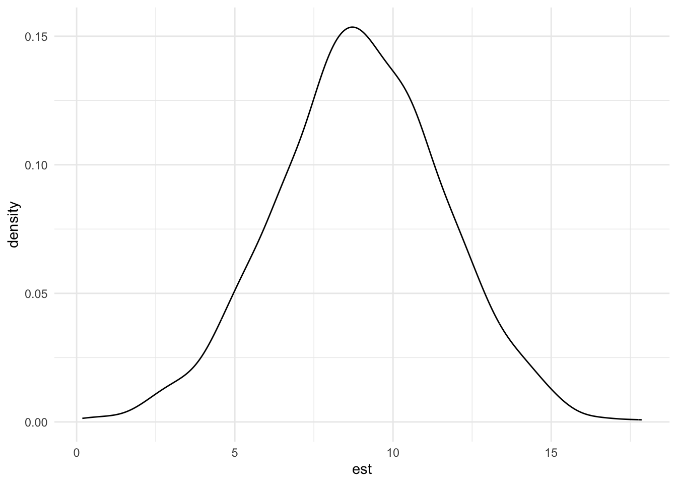
pwr <- mean(sim_runs$lb > 0)
pwr
## [1] 0.915So, in 91.5% of our simulated cases, the effect estimate was significantly positive at a two-sided significance level of 95%.1 Conventionally, experimentalists try to achieve a power of at least 80%. This implies that with cell sizes of 100 participants we should be comfortably high-powered to detect a medium effect size.
Now: How would the power change when we change the assumed parameters, for example the cell or the effect size? To assess this quickly, one can use power functions of the underlying test statistics. These functions are based on assumptions that might differ from the ones that we used in our simulated data generating process. For example, we model a dependent variable that is discrete and based on a truncated normal distribution while the power function for two-sample t-tests assumes the data to be normally distributed. Let’s compare the function-based power estimate for our effect size with the power estimate derived from our Monte Carlo Simulation.
library(pwr)
pwr.t.test(n = 100, d = 0.5, sig.level = .05)
##
## Two-sample t test power calculation
##
## n = 100
## d = 0.5
## sig.level = 0.05
## power = 0.9404272
## alternative = two.sided
##
## NOTE: n is number in *each* groupThis is reasonably close but a little bit higher than the simulation power estimate of 91.5%. One very convenient feature of the pwr functions in R is that they will always calculate the missing parameter (power in our case above). For example, to infer the cell size that you need to reach a power of 80%:
pwr.t.test(power = 0.8, d = 0.5, sig.level = .05)##
## Two-sample t test power calculation
##
## n = 63.76561
## d = 0.5
## sig.level = 0.05
## power = 0.8
## alternative = two.sided
##
## NOTE: n is number in *each* groupWe would need 64 people per cell. Let’s see how our function-based power estimate changes when we change the effect size.
my_power_fct <- function(effect_size = 0.5, cell_size = 100) {
  rv <- pwr.t.test(n = cell_size, d = effect_size, sig.level = .05)
  tibble(
    effect_size = effect_size,
    cell_size = cell_size,
    power = rv$power
  )
}
df <- bind_rows(lapply(seq(0.1, 0.8, by = 0.1), my_power_fct))
ggplot(df, aes(x = effect_size, y = power)) +
  geom_hline(yintercept = 0.8, lty = 2, color = "red") +
  geom_line() + geom_point() + theme_minimal()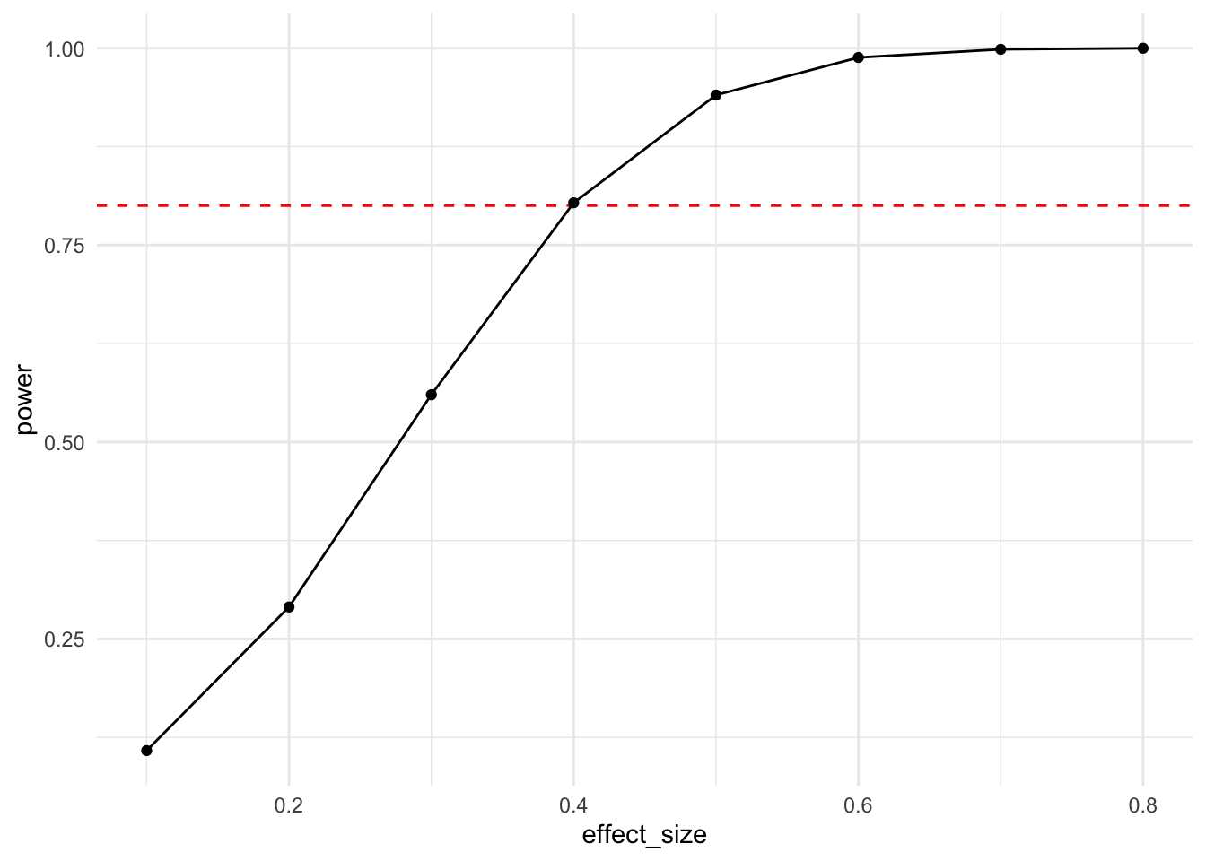
You can infer from this effect size power curve that with a cell size of 100 participants and under normality assumptions, one is able to reasonably reliably detect an effect size of around 0.4 standard deviations.
Another informative power curve is the one that plots power relative to cell size.
df <- bind_rows(
  lapply(seq(10, 120, by = 10), function(x) my_power_fct(cell_size = x))
)
ggplot(df, aes(x = cell_size, y = power)) +
  geom_hline(yintercept = 0.8, lty = 2, color = "red") +
  geom_line() + geom_point() + theme_minimal()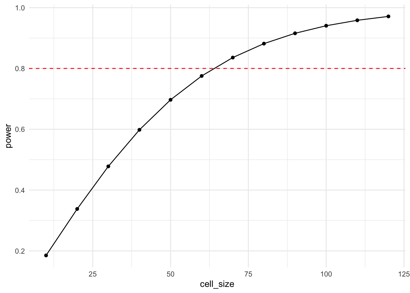
And, if you want to increase the cognitive load of your visual, you can combine the two.
df <- expand_grid(
  cell_size = seq(10, 120, by = 10),
  effect_size = c(0.2, 0.5, 0.8)
) %>%
  mutate(
    power = pmap_dbl(
      list(n = cell_size, d = effect_size),
      function(n, d) pwr.t.test(n = n, d = d, sig.level = .05)$power
    )
  )

ggplot(df, aes(x = cell_size, y = power, color = factor(effect_size))) +
  geom_hline(yintercept = 0.8, lty = 2, color = "red") +
  geom_line() + geom_point() +
  labs(color = "effect_size") +
  theme_minimal()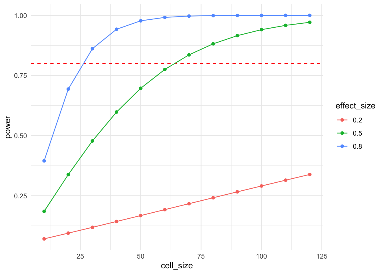
Now, given that power functions exist for many standard test designs, what is the point of infering power from simulations? The answer is that these are more flexible and allow us to incorporate details of our experimental design that power functions are unable to capture. In our case above, we have a non-normally distributed dependent variable. Let’s compare the function-based power curve with the one derived from simulations. To verify that both methods in principle give the same power curve, we also add another power simulation that uses a normally distributed dependent variable.
function_power_est <- bind_rows(lapply(
  seq(10, 120, by = 10),
  function(x) my_power_fct(cell_size = x) %>%
    mutate(method = "function")
))

mc_sim_power <- function(effect_size = 0.5, cell_size = 100, runs = 1000) {
  bind_rows(
    bind_rows(
      replicate(runs, sim_run(effect_size, cell_size), simplify = F)
    ) %>%
      group_by(effect_size, cell_size) %>%
      summarise(power = mean(lb > 0), .groups = "drop")
  )
}

sim_power_est_d100 <- bind_rows(lapply(
  seq(10, 120, by = 10),
  function(x) mc_sim_power(cell_size = x) %>%
    mutate(method = "simulation_d100")
))

sim_data <- function(n = 100, mean = 50, sd = 20) {
  tibble(y = rnorm(n, mean, sd))
}
sim_power_est_norm <- bind_rows(lapply(
  seq(10, 120, by = 10),
  function(x) mc_sim_power(cell_size = x) %>%
    mutate(method = "simulation_norm")
))

df <- bind_rows(function_power_est, sim_power_est_d100, sim_power_est_norm)

ggplot(df, aes(x = cell_size, y = power, color = method)) +
  geom_hline(yintercept = 0.8, lty = 2, color = "red") +
  geom_line() + geom_point() +
  theme_minimal() +
  theme(legend.position = "bottom")
As you see, the simulation using a normally distributed dependent variable yields a power curve that is virtually identical to the function-based power curve. The original simulation yields marginally lower power values. This is caused by the truncation of the dependent variable to be within 0 and 100. As you can also see from the estimate distribution above, this truncation affects treated observations (mean = 60) more than control observations (mean = 50), marginally reducing power and slightly biasing the effect size measurement downwards. This is a good example for why simulations are helpful in the experimental design stage. They not only allow you to estimate power but they can also help to spot other design issues that you might want to address prior to running your design.
If you wonder why the estimate distribution does not center around the true effect size of 10: Well spotted! Keep reading until the end ;-).↩︎
