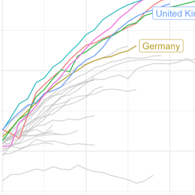
Everybody seems to be starring at plots outlining the spread of the pandemic these days. One thing that caught my interest is how relative small differences in design choices can influence the message that a visual displays. Using the Financial Times Plots graphs developed by John Burn-Murdoch as an example, I explore the visualizer degrees of freedom.
